AI safety field *visual* impact analysis
By hannarchy @ 2026-09-24T13:20 (+1)
![Screen Recording 2026-09-24 at 5.29.07 pm.mov [video-to-gif output image]](https://res.cloudinary.com/cea/image/upload/f_auto,q_auto/v1/mirroredImages/qHDztEnX5EFdsgu5C/vriqazpex2rtkjtsgw7t)
I made a terrain style visualisation of AI safety impact of around 3,466 works organised by citation count! The data was extracted from Arxiv and LessWrong posts based on a dictionary of keywords that appear in AI safety works. Additionally, I think its important to see how the field has “evolved” over time so I added a time functionality to slide and see the hills forming.
- The map is based on how particular works overlap based on embedding space level clustering organised across 18 sub-fields. The height is based on the citation count for that particular area which is log-compressed and summed across the neighbourhood, so a hill is tall because of volume and impact.
- I have also added functionality to filter based on
- citation count
- individual researcher (shows you their works on the map to understand what work they might be doing; 3,989 named authors are on the map
- clicking or searching for a work zooms into it and lists the ten works nearest it, so you can see what surrounds it
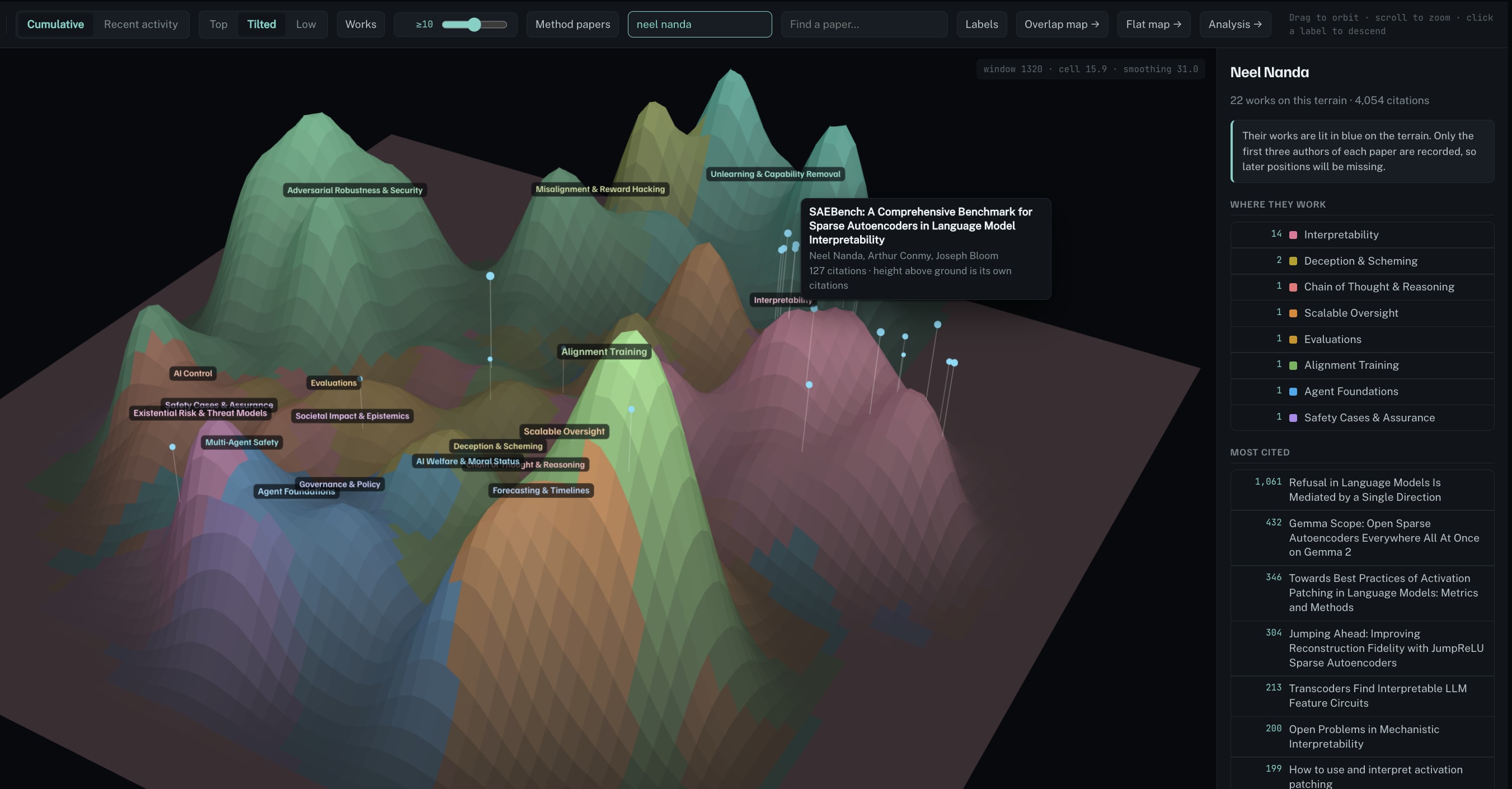
The terrain itself is papers only, because Semantic Scholar doesn’t index LessWrong. The forum side of the dataset feeds the researcher profiles rather than the hills. The slider runs from 2021Q1–2026Q3.
Some interesting high level observations
- Alignment training and scalable oversight are very high citation presently (followed by adversarial robustness and Interpretability). Most of that sits in a handful of 2022–23 papers: InstructGPT (24,222), DPO (10,596), Anthropic’s helpful-and-harmless RLHF paper (4,365) and Constitutional AI (3,709).
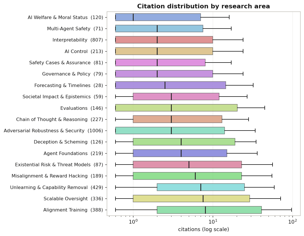
- Adversarial robustness and Interpretability actually have far more works (1006 and 807, against 388 and 336), they just get cited less per paper.
- One field is denser, the other lands harder per paper.
I made a box plot of the different areas by citation
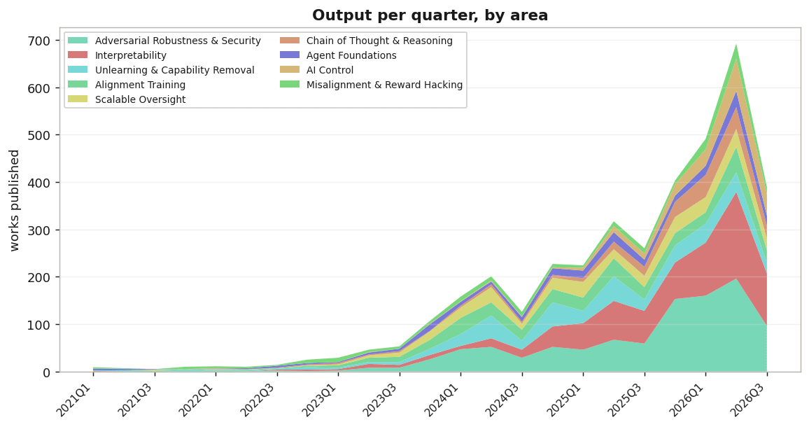
And here I show stacked graph analysis on the key different areas by volume of work.
Drawbacks of this visualisation
(1) Citation count doesn’t necessarily == impact and the research community may just cite each other in a feedback loop regardless of whether its actually contributing to “safety”. It’s a very skewed measure too as the top 1% of works hold 40% of all citations in the set.
(2) In the modern scenario of the peer-reviewed venue ecosystem is under heavy strain; a lot of the safety community put out blogposts on LessWrong/ Effective Altruist / Alignment forum, etc either as precursory to a publication or because they prefer it. This is hard to compare to citation count and the peer-reviewed venues. Hence I do not include them in the terrain but they are available in a seperate dataset I will release soon after more filtering.
Inspiration
This work was inspired from my SPAR Atlas project where I made a KG kind of structure to show how the different projects are related. This received interest internally which inspired me to look wider into AI safety field analysis and I explored EA posts talking about where AI safety researchers go and AI Safety field growth analysis. I used claude to do a lot of heavy lifting, such as making the scraper, writing the embeddings analysis etc but the key inspiration is about making a terrain to understand the space a bit more interactively. This is still a work in progress so I would appreciate any and all feedback on anything I might be missing, what more analysis/features would be helpful or any improvements I can make.