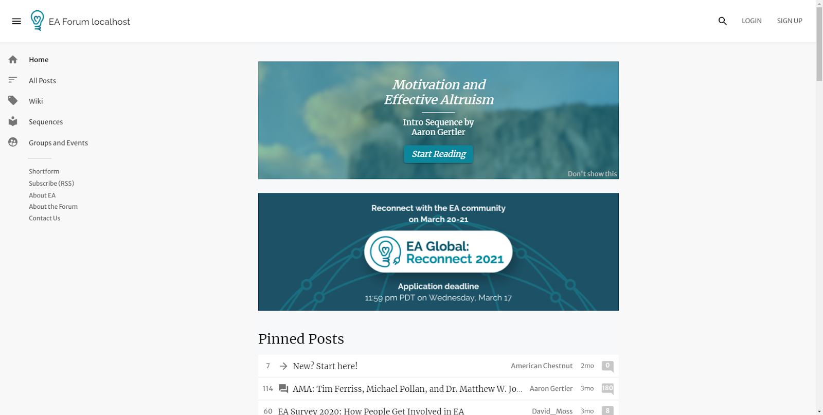
[PR FAQ] Banner highlighting valuable EA resources
By Jonathan Mustin @ 2021-08-09T10:38 (+8)
The EA Forum team is sharing our project proposals publicly on the Forum, as an experiment during August. They’re written as though the product were already finished, but for now, they are only proposals. See here for a description of PR FAQs.
We appreciate hearing comments from everyone, even if they are brief opinions like “I'd be happy to see this" or "I quickly skimmed the post and it doesn’t seem like this is something I would use, but I’m not sure”.
New Forum Banner Promotes Valuable Resources
A new banner highlights a different EA resource every week
We are rolling out a banner that will display at the top of the Forum’s front page. This will promote a featured resource we expect readers to find useful. This might include events, courses, groups, or other community resources.
The EA network contains many groups, events, and other helpful tools for learning and career growth —but it isn't always easy to find out about them when you're new to EA.
Our ‘Start Here’ post partially addresses this discoverability problem, but it can only contain so much information while remaining approachable. This banner aims to make a wide variety of resources more accessible, without overwhelming newcomers.
FAQs
As a user, how can I request that a resource be featured?
If you would like your resource to be featured, you can reach out to Aaron Gertler.
Can I find a list of all current and past featured resources?
Yes. This list will exist in a post that will be linked at the bottom of each banner.
How can I hide the banner if I don't want to see it?
Users can dismiss individual banners, or stop all banners from showing up, from the front page. (There will also be an option in your profile settings to turn banners back on, in case you change your mind.)
Internal FAQ
Will this display alongside existing banners (e.g. EA Global)?
Using our current banner setup, even two simultaneous banners take up almost all of the page before the fold.

This is a bad user experience. To prevent this, we’ll show only one banner at a time, with more time-sensitive or high-priority banners taking precedence.
How long will each resource remain up?
We'll show a new resource each week.
Larks @ 2021-08-09T15:45 (+23)
I find the recent tendency on the internet to use a huge amount of screen space for banners and the like quite annoying. I would almost definitely want to turn this off, and recommend making this very easy for people to do.
vaidehi_agarwalla @ 2021-08-10T07:49 (+3)
I think there should be a way to easily navigate or find high quality intro resources (eg lesswrong sequences seem like a good example of non-obtrusive but easy to find) but the banner seems a bit salesy.
D0TheMath @ 2021-08-09T14:40 (+2)
This seems cool. I think I’d learn quite a bit about what orgs & resources exist if this was implemented, but also worry it may take up too much space, and I’ll decide to turn it off out of annoyance.
Miranda_Zhang @ 2021-08-09T22:17 (+1)
I think the current proposal looks a bit clunky and may lead to annoyance, as others have noted. Might there be a less obtrusive option, e.g. making the graphic smaller or adding a text banner on the top?
Or maybe placing it to the left- or right-hand sides? Almost like an ad. (Not sure if that would feel worse to people, though!)