EA Survey 2024: Geography
By Jamie E, David_Moss @ 2025-08-04T10:27 (+85)
Summary
- Countries
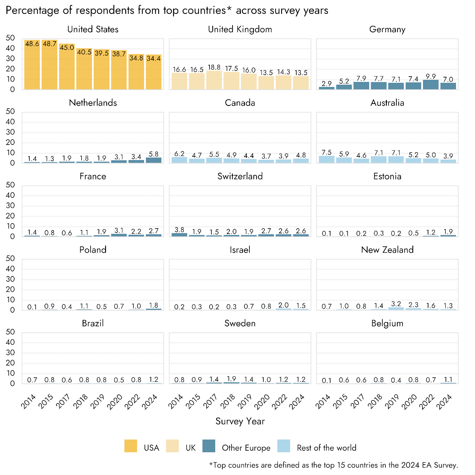
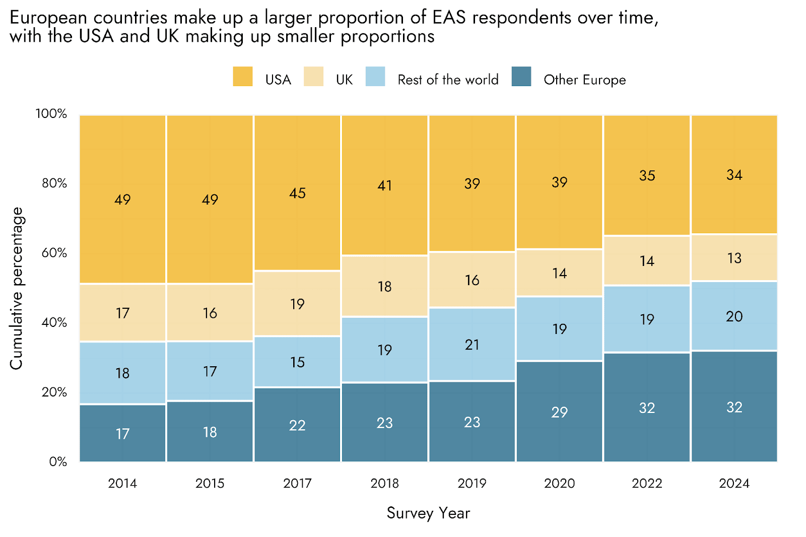
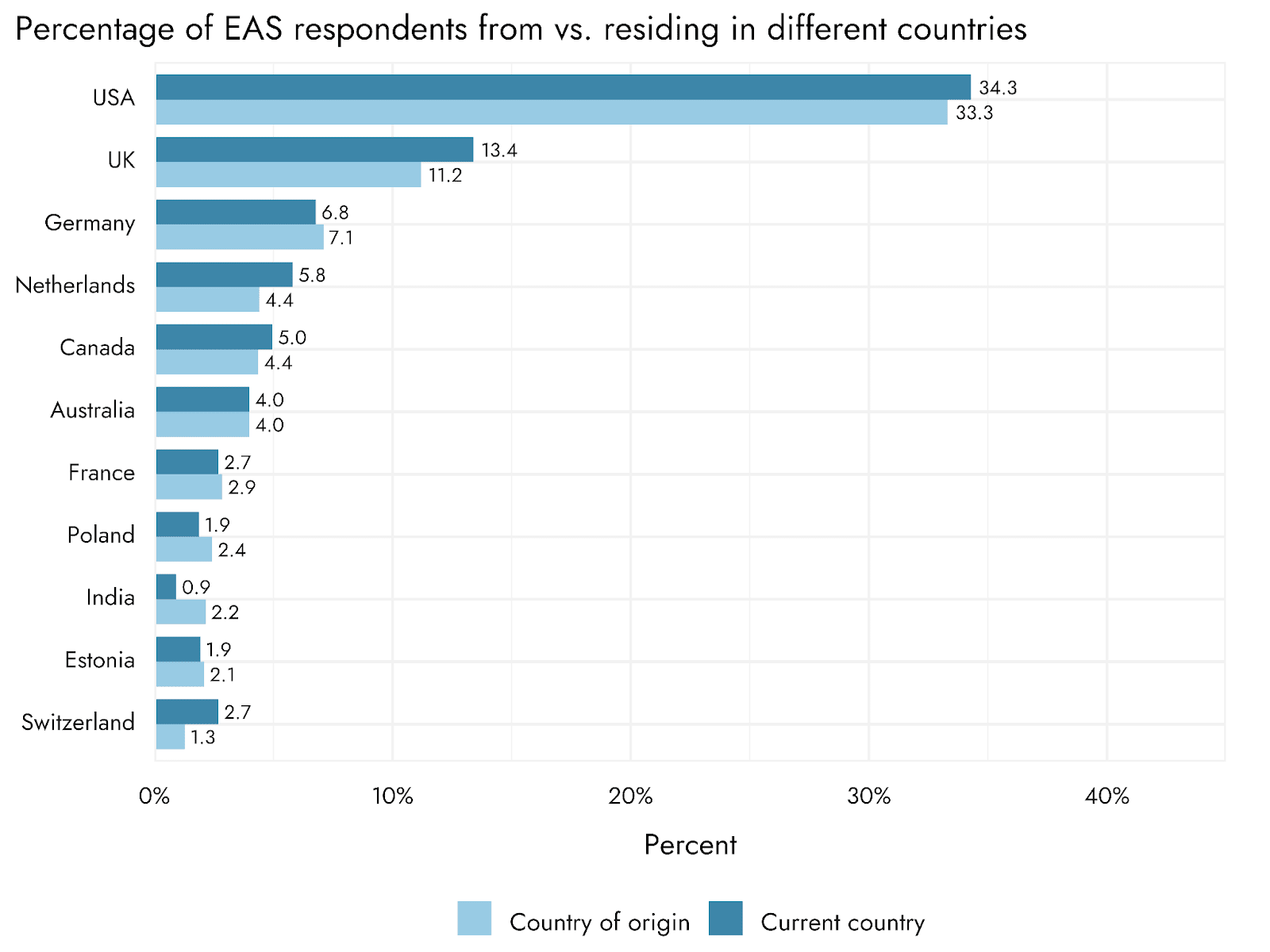
- The USA (34.4%) and the UK (13.5%) remain the countries with the largest proportions of EA respondents. We observed that 32% of respondents came from Europe (excluding the UK), while 20% came from the rest of the world. In previous years, we observed a decline in the percentage of respondents from these countries. This trend seems like it might have decreased or plateaued since 2022.
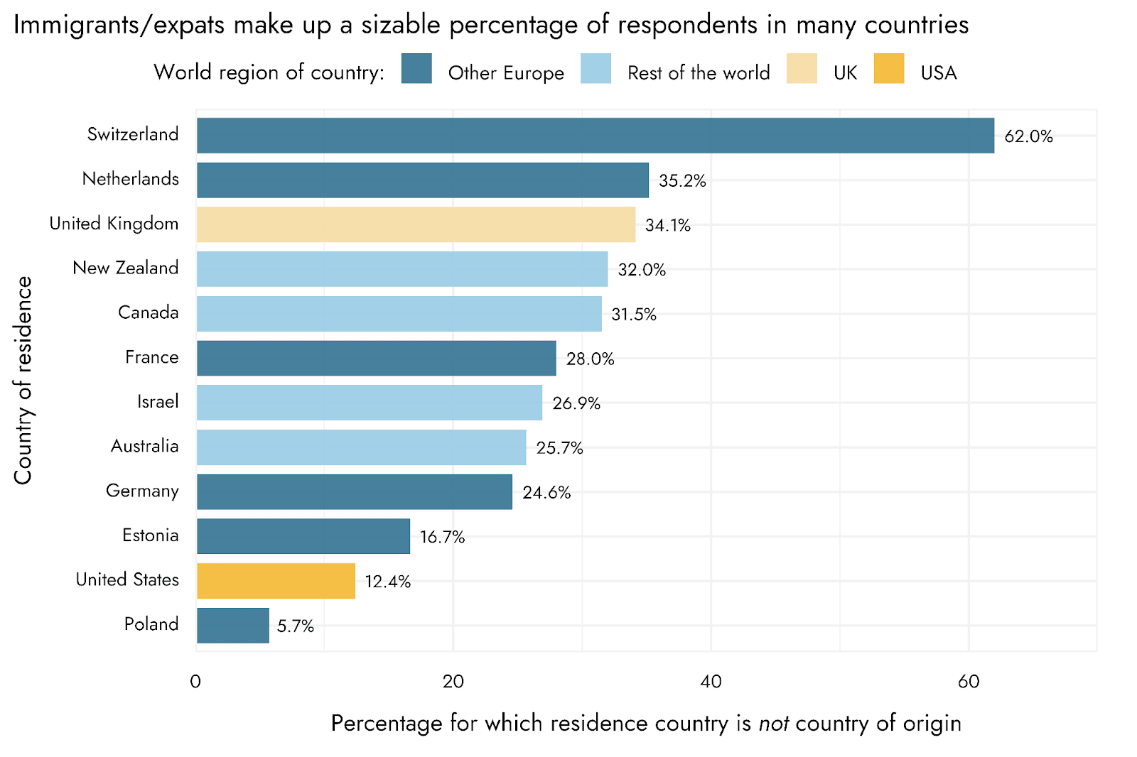
- This year, for the first time, we looked at EAs’ countries of origin as well as their current countries of residence. In absolute terms, we see large flows into the USA and UK, but Switzerland shows by far the highest relative level of in-flows, with 62% of respondents having a different country of origin.
- Cities
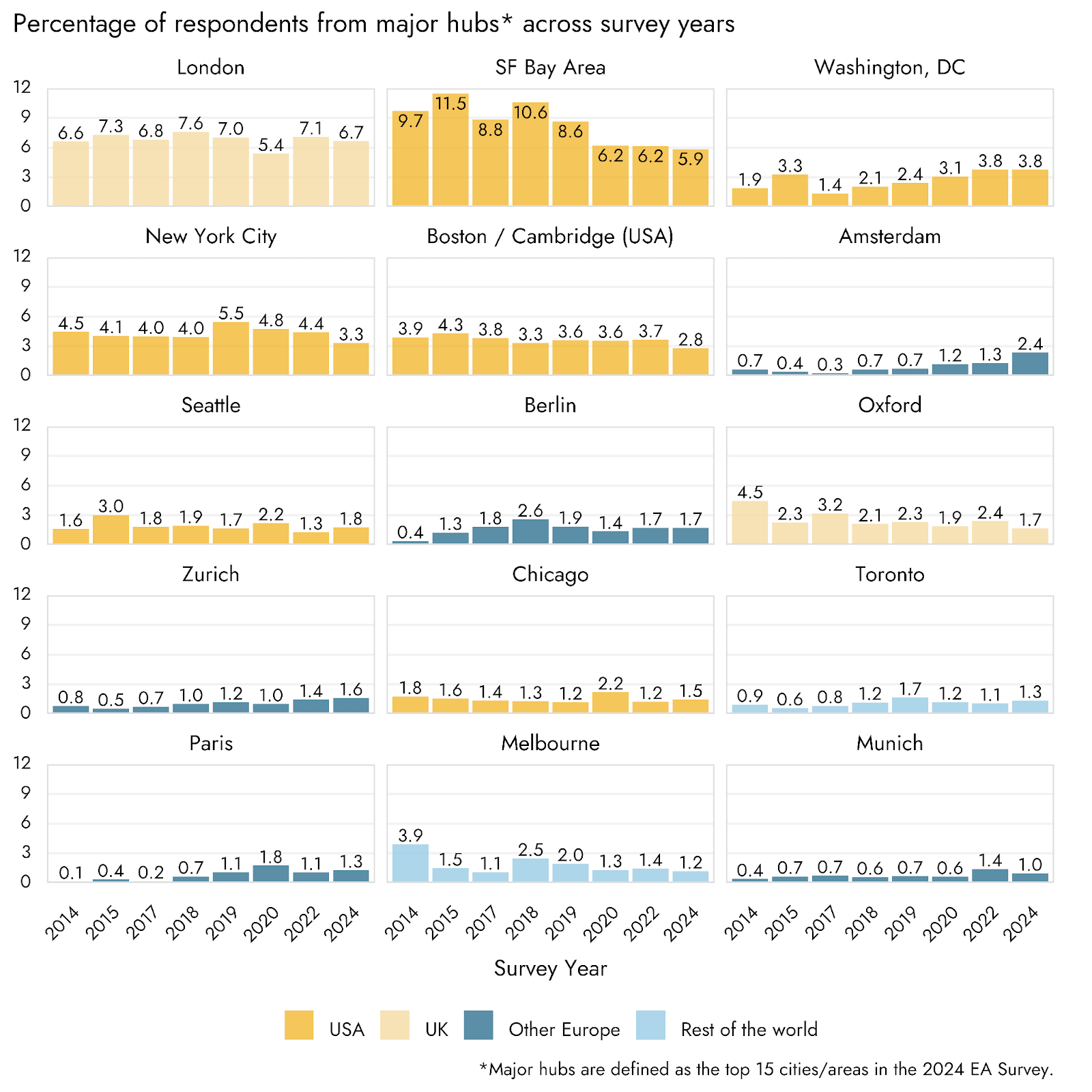
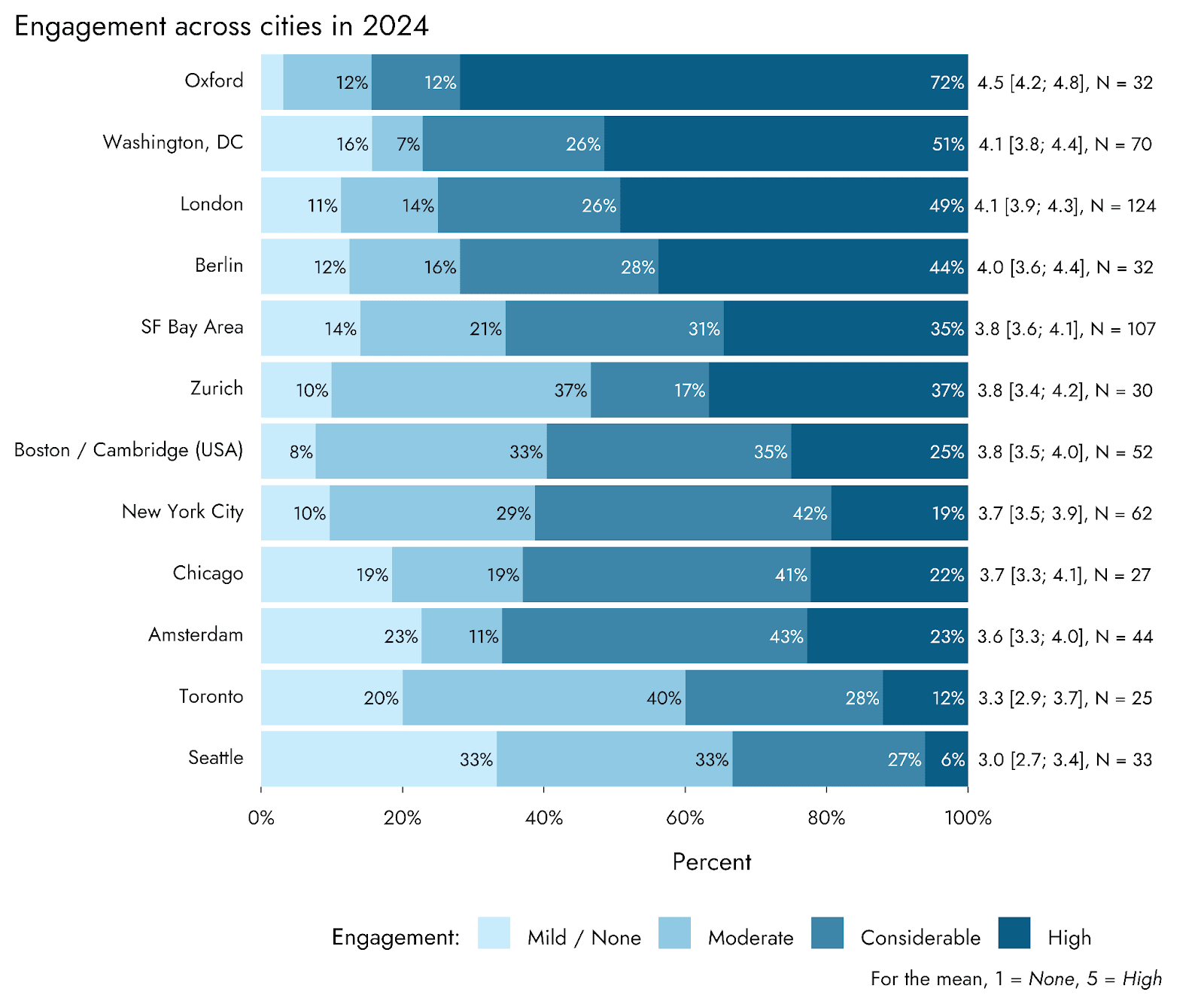
- This year, London was the city with the most respondents (6.7%), followed by the SF Bay Area (5.7%), DC (3.8%) and NYC (3.3%). Interestingly, our results show that a majority of EAs live outside of major hubs.
- Differences across countries
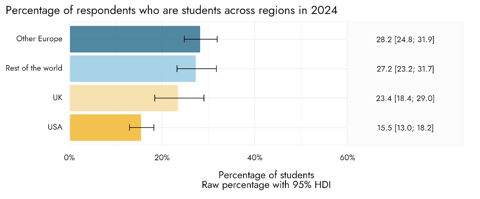
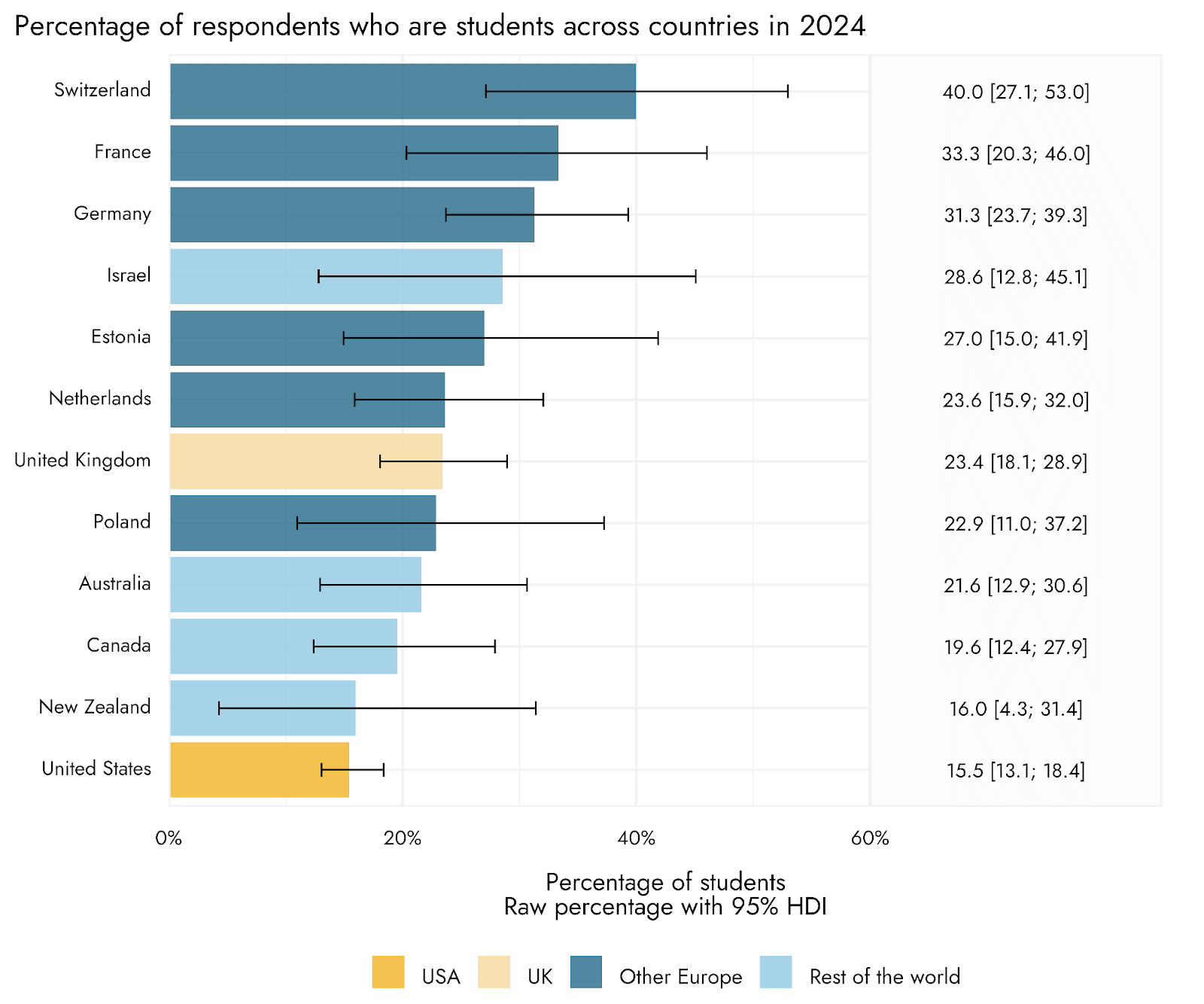
- We find that respondents from the US were substantially less likely to be students (15.5%) than those from other regions (23.4% in the UK, 28.2% in Europe).
- The UK has significantly higher engagement levels (41% highly engaged) compared to Europe (28%), the USA (24%), and the rest of the world (25%).
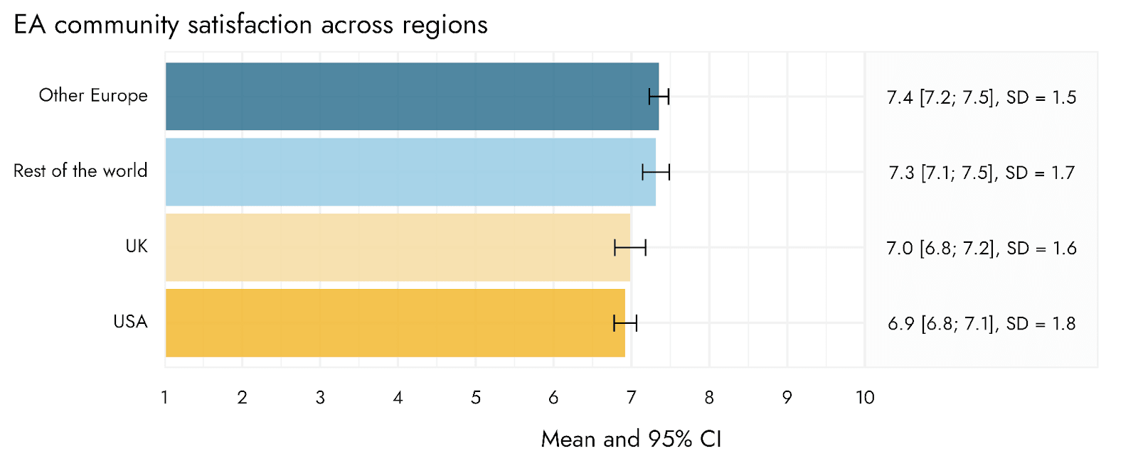
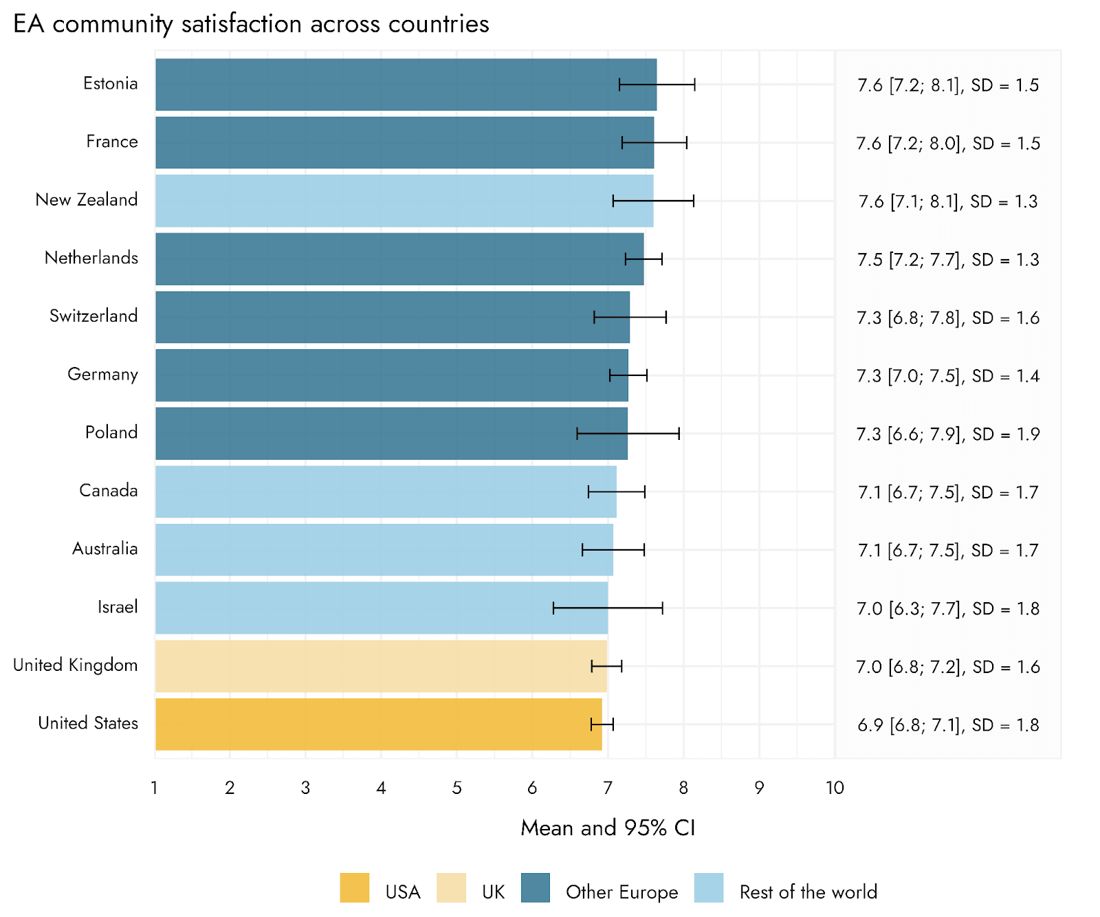
- Satisfaction with the EA community was marginally lower in the UK (7.0) and USA (6.9) compared to Europe (7.4). However, this is likely partly explained by a negative association between length of time in EA and satisfaction, and the USA and UK having respondents with longer time in EA.
- The overall ordering of cause prioritization across geographic areas was relatively consistent. However, we observe that AI risk was prioritized relatively more highly in the UK than the US.
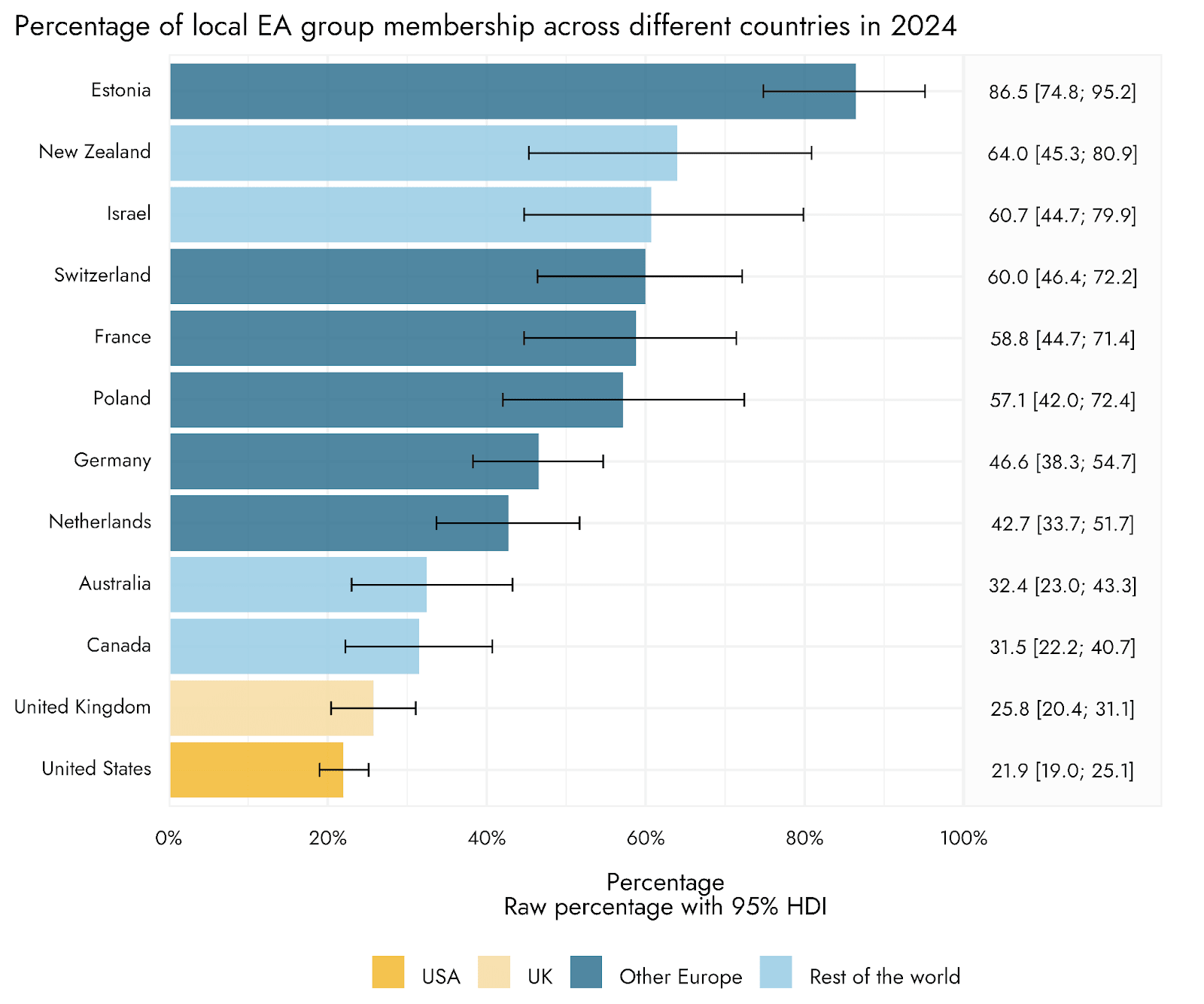
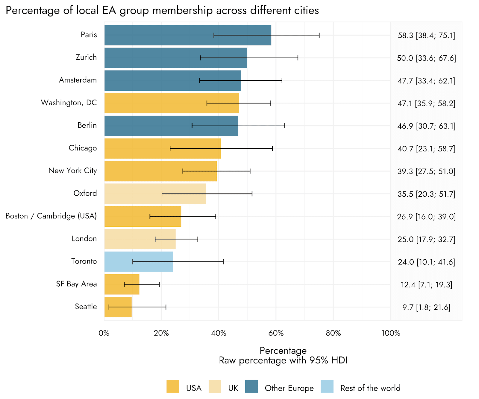
- The percentage of respondents who were members of a local group varied dramatically across countries and cities: The USA (21.9%) and the UK (25.8%) were two of the countries with the lowest percentage of EA group members, while many countries had 40-80%. Similarly, percentages for different cities vary from <10% to >50%.
Totals per country
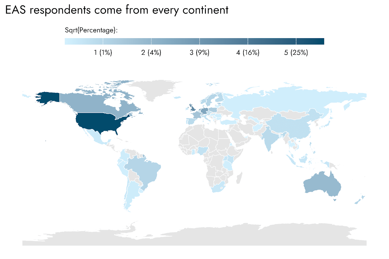
As was the case in 2022, in 2024 the respondents to the Effective Altruism Survey (EAS) represent countries from every continent (excluding Antarctica).
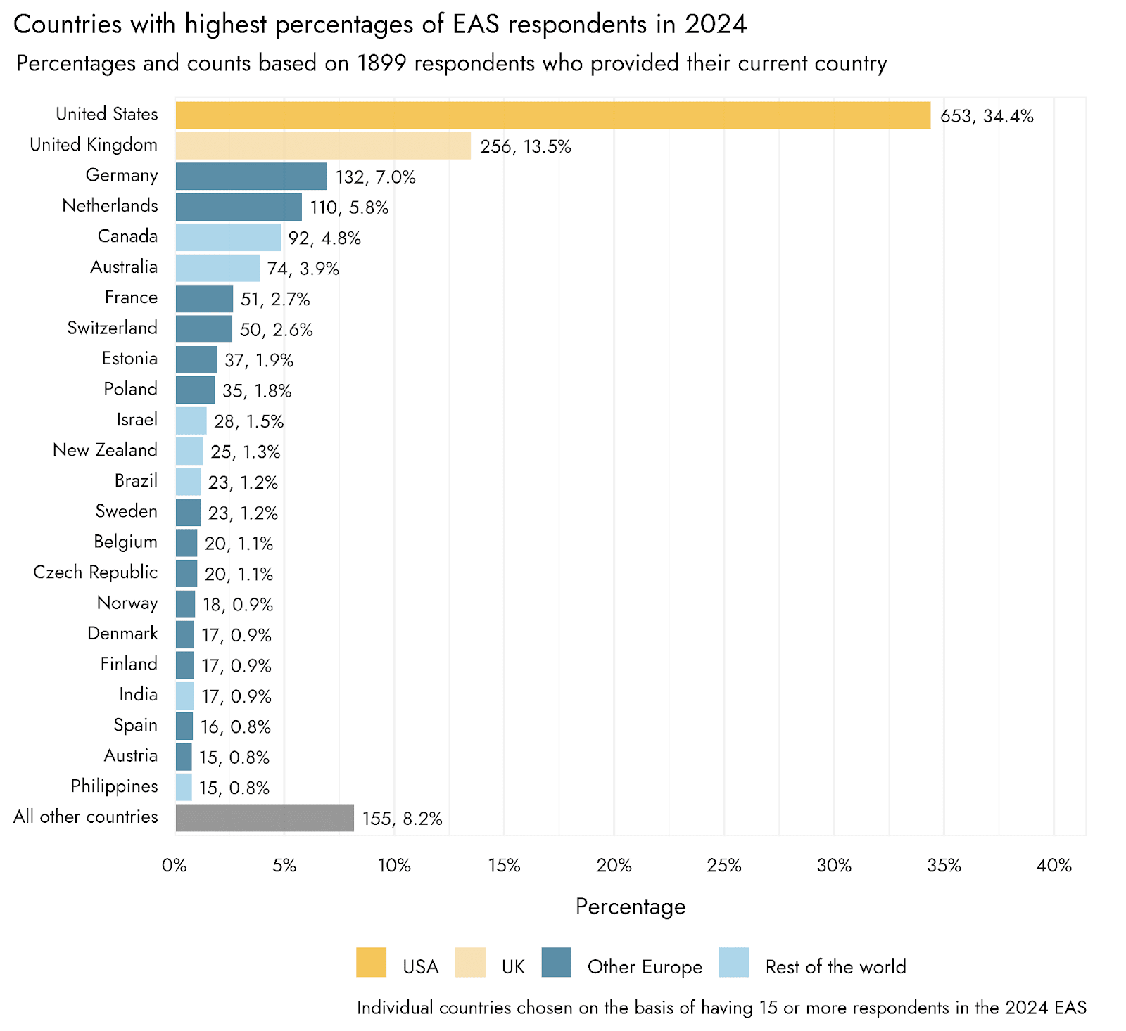
The United States remains, by far, the country with the greatest number of residents filling in the EA Survey (34% of respondents), followed by the United Kingdom (13.5%). The third and fourth most common countries of residence in the EA Survey were both Western European - Germany and the Netherlands - which respectively represented 7.0% and 5.8% of the 2024 EA Survey respondents. Canada and Australia - both countries in which English is either a first or a widely spoken language - respectively represented 4.8% and 3.9% of respondents. As has been seen in previous years, areas of the globe that stand out as having no or relatively few respondents are South East Asia, Africa, and the Middle East.
Changes over time
Movement between countries
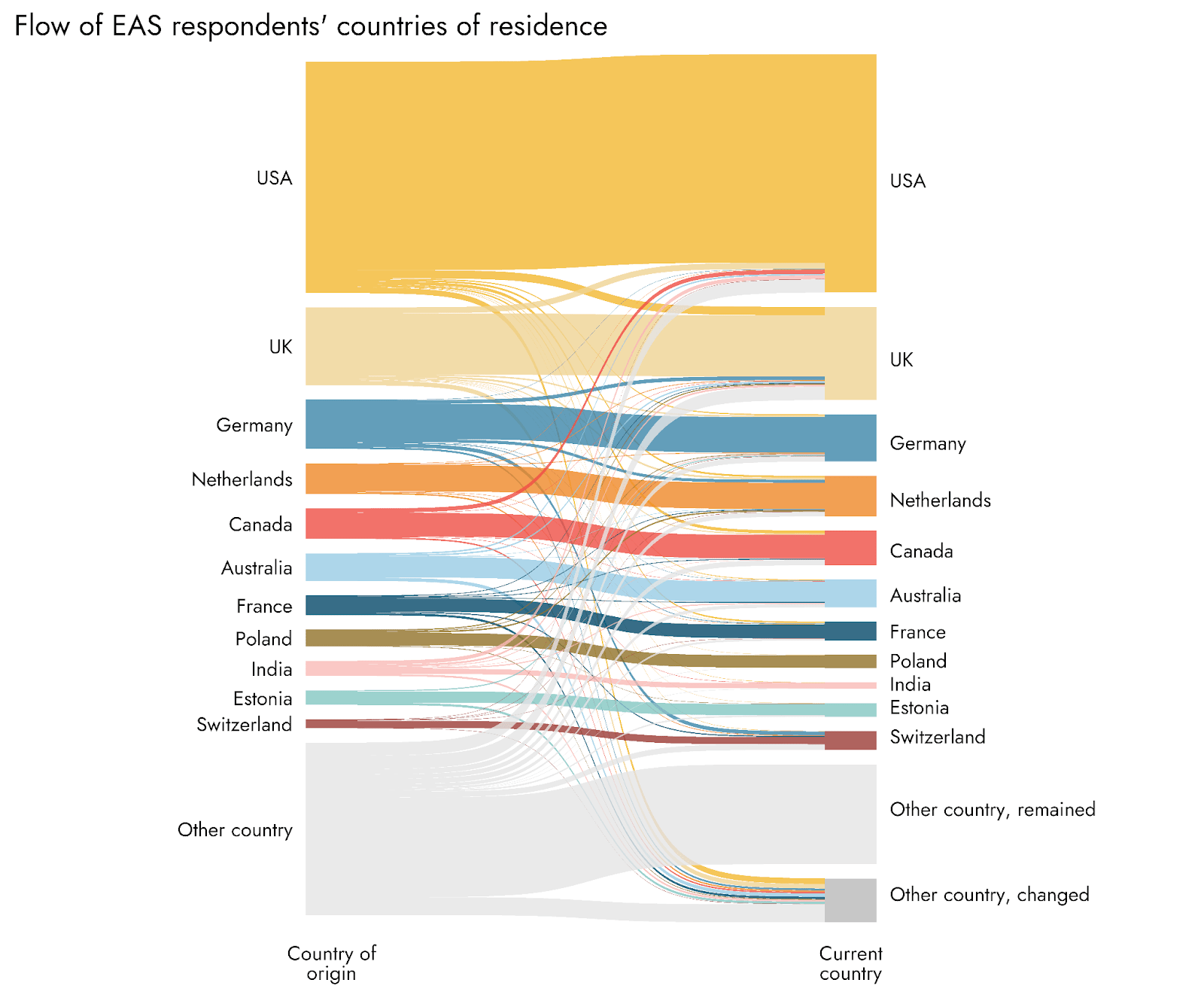
As can be seen in the Sankey diagram, there is considerable flow between countries in terms of whether people originated or currently reside there. Those countries that represented the largest share of current countries of residence also tended to be those with the largest proportions as countries of origin for respondents. However, this does not mean that most of the people residing in the country also originated there, and there is considerable variability amongst countries in this respect. For example, the USA had 12.4% of respondents originating from another country, whereas this percentage was 34.1% for the UK. Switzerland stands out as having an exceedingly large percentage of respondents who originated in other countries (mostly from nearby Germany, followed by France). The Netherlands, New Zealand, and Canada also had large fractions of immigrants/expats of approximately one-third. In contrast, almost all respondents from Poland also originated there.
Totals per city
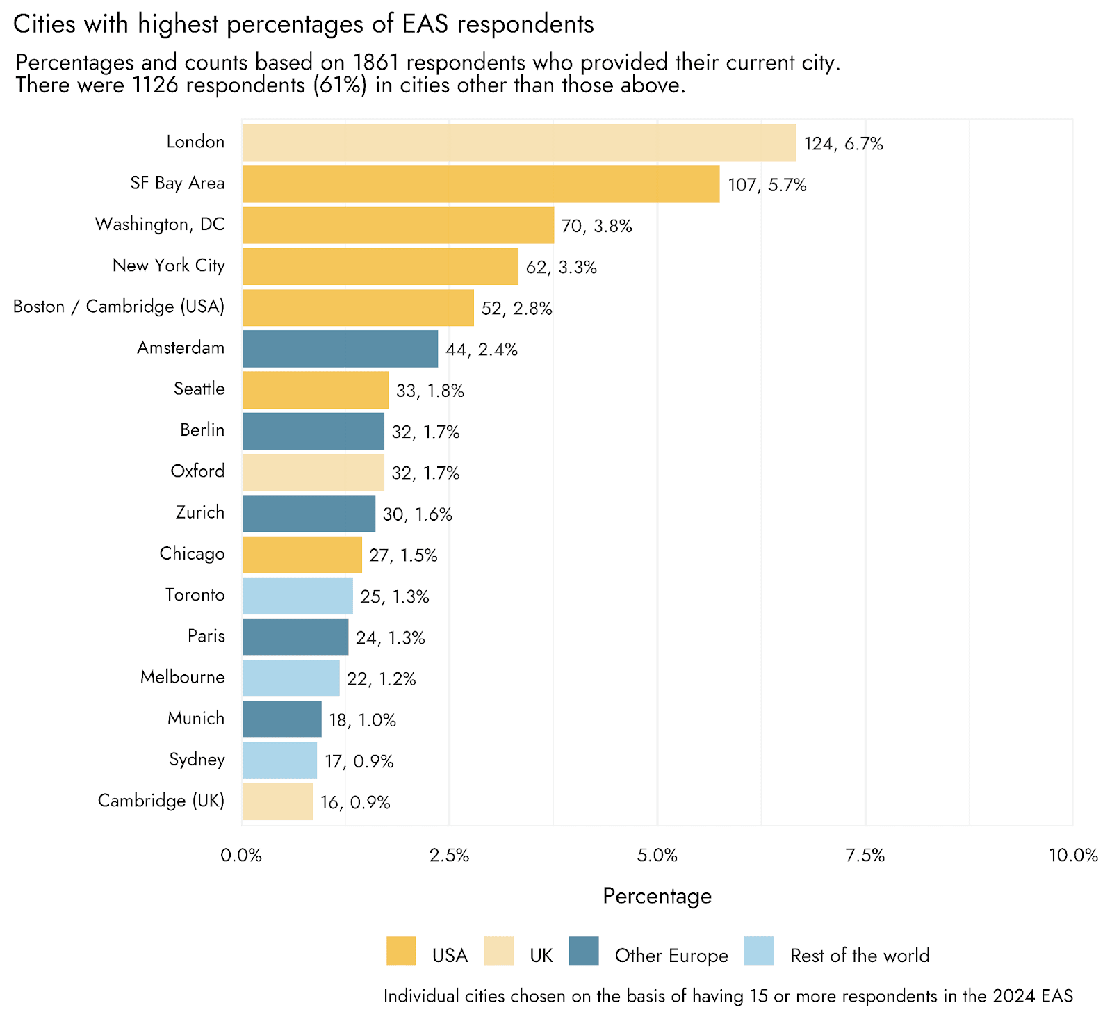
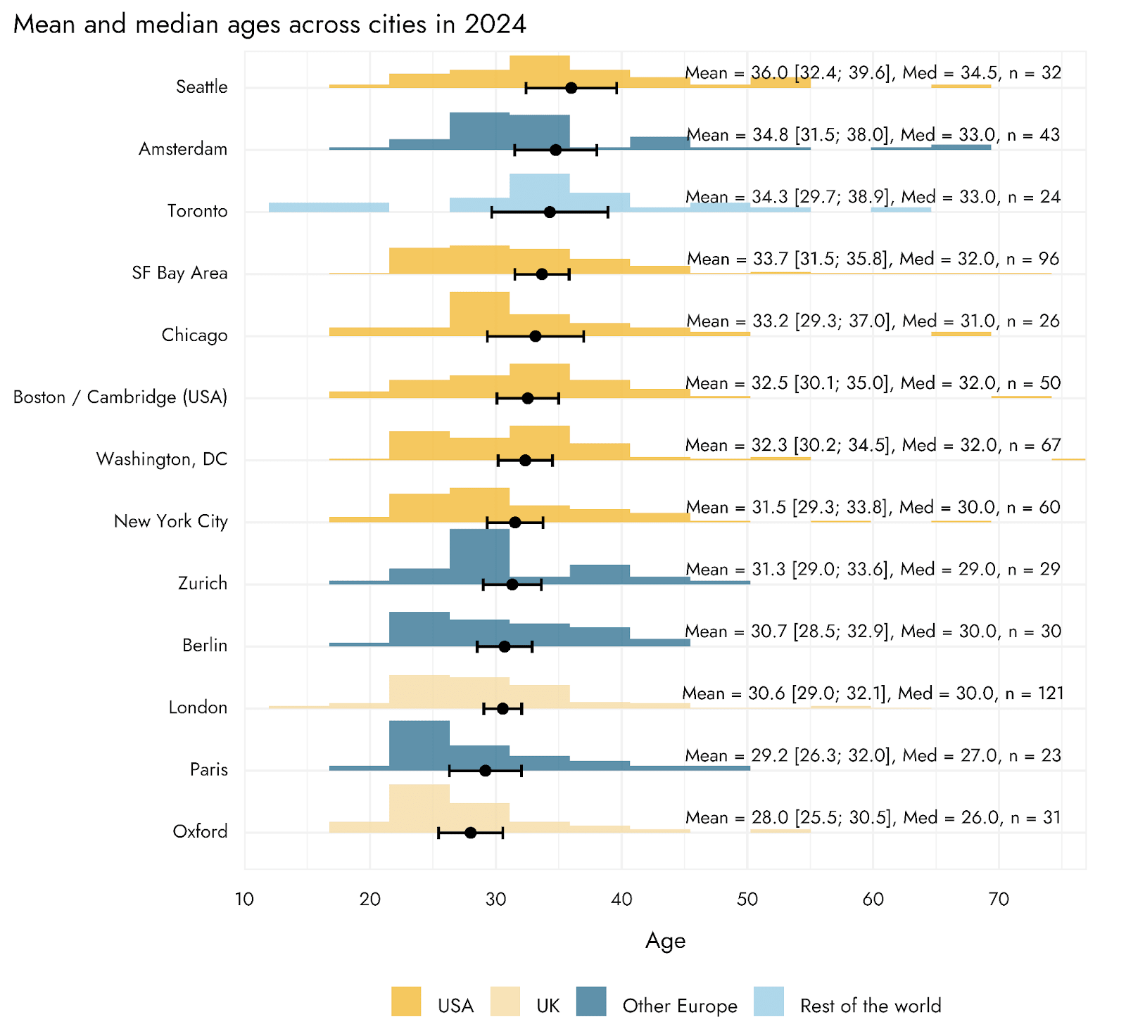
As might be expected, the most prominent hubs for EAs within countries are predominantly capital cities and other major metropolitan areas, or centers of major economic or academic activity. London was the city with the single largest share of survey respondents, followed by four cities/areas of the USA - with the Bay Area only slightly behind London.
As with countries and regions, we can see how the percentages of EAS respondents residing in the top 15 hubs have changed over survey years. Note, however, that it is not possible to interpret changes over time as direct reflections of growth, variability/consistency, or clear decline of different major hubs. Such hubs may be particularly responsive to efforts by local leaders and groups to have people respond to the EA Survey, which might exaggerate or obscure changes in the number of community members in that location. With this caveat in mind, we note that London has maintained a relatively high percentage of respondents over time, whereas the percentages for the other most substantial hub - the SF Bay area - has been lower in recent surveys relative to earlier years of the survey. Besides a spike in 2015, the percentage of respondents residing in Washington DC has been rising since earlier years, perhaps reflecting an orientation towards policy-related work.
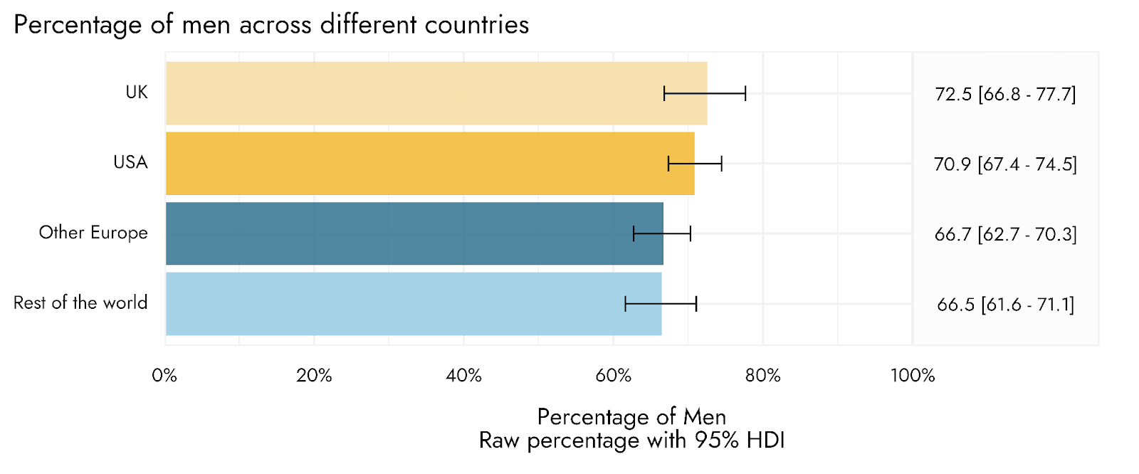
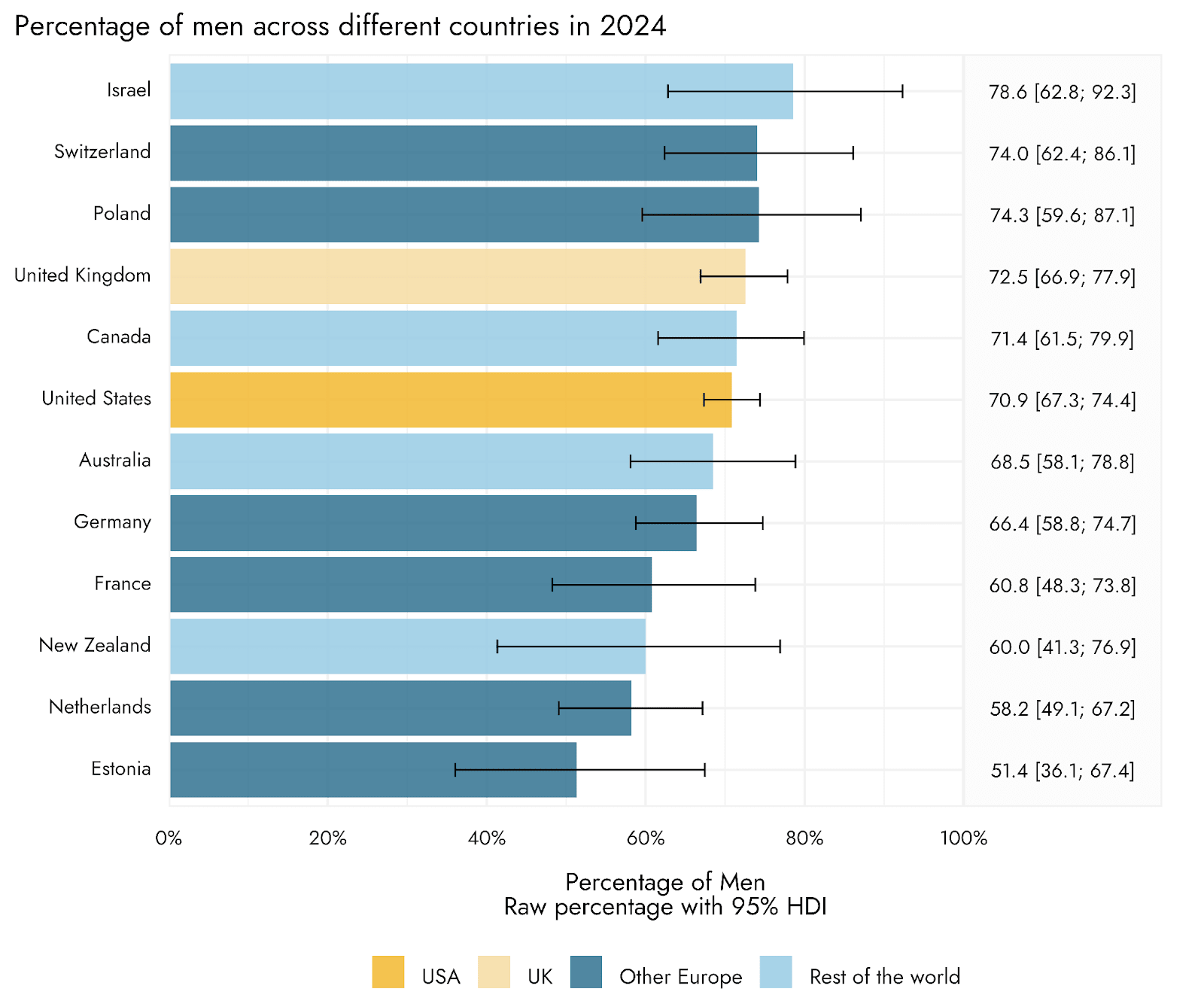
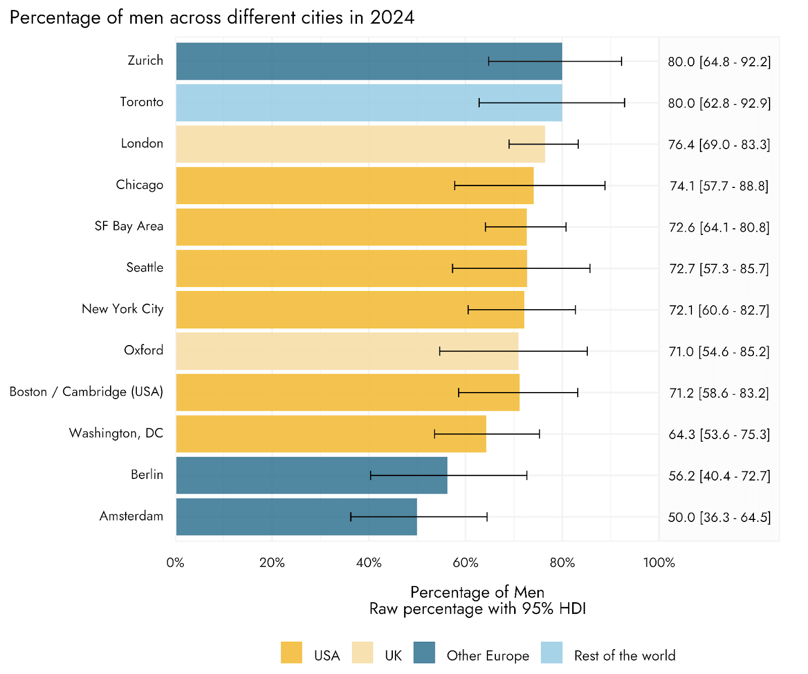
Gender
Across regions, there were about twice as many men relative to women or other identifications who responded to the survey, in line with our earlier demographics post. We also examine variation at the country and city level, but note that many of these estimates are very imprecise due to small sample sizes for each individual geographic area.
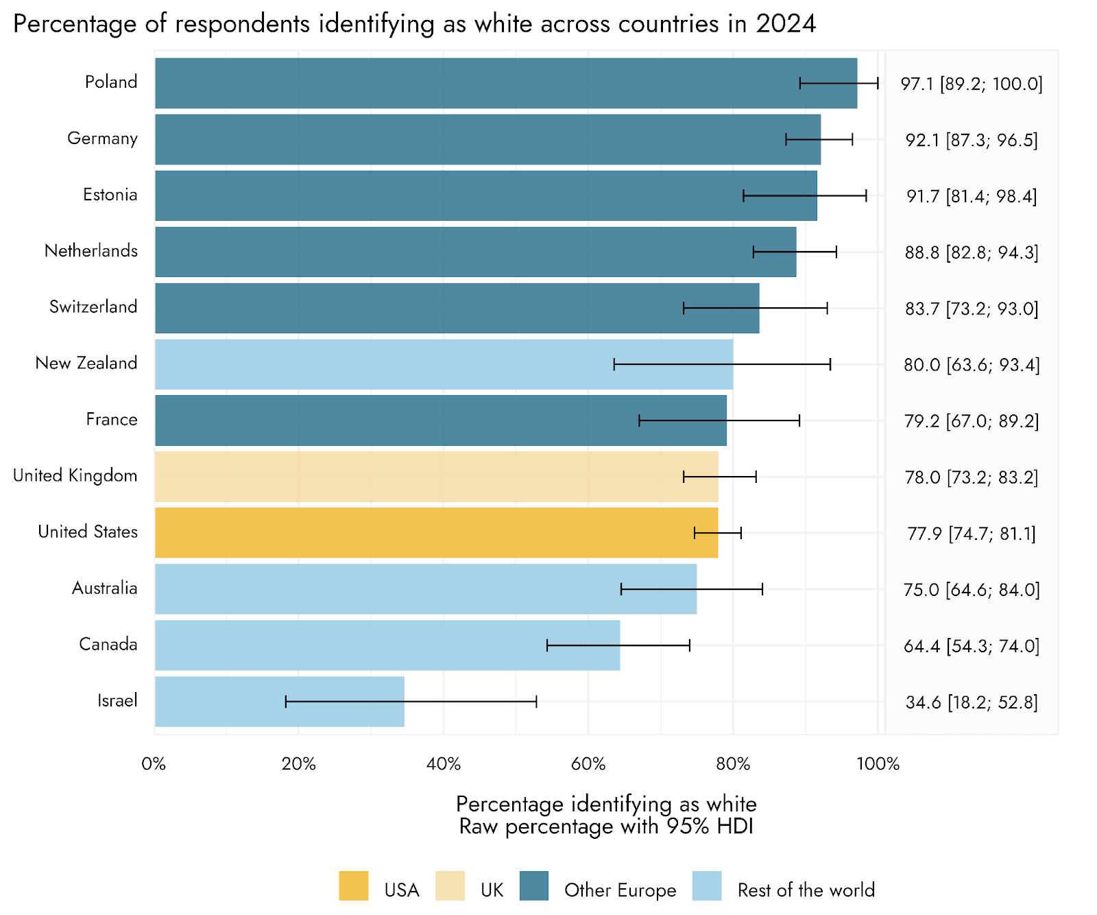
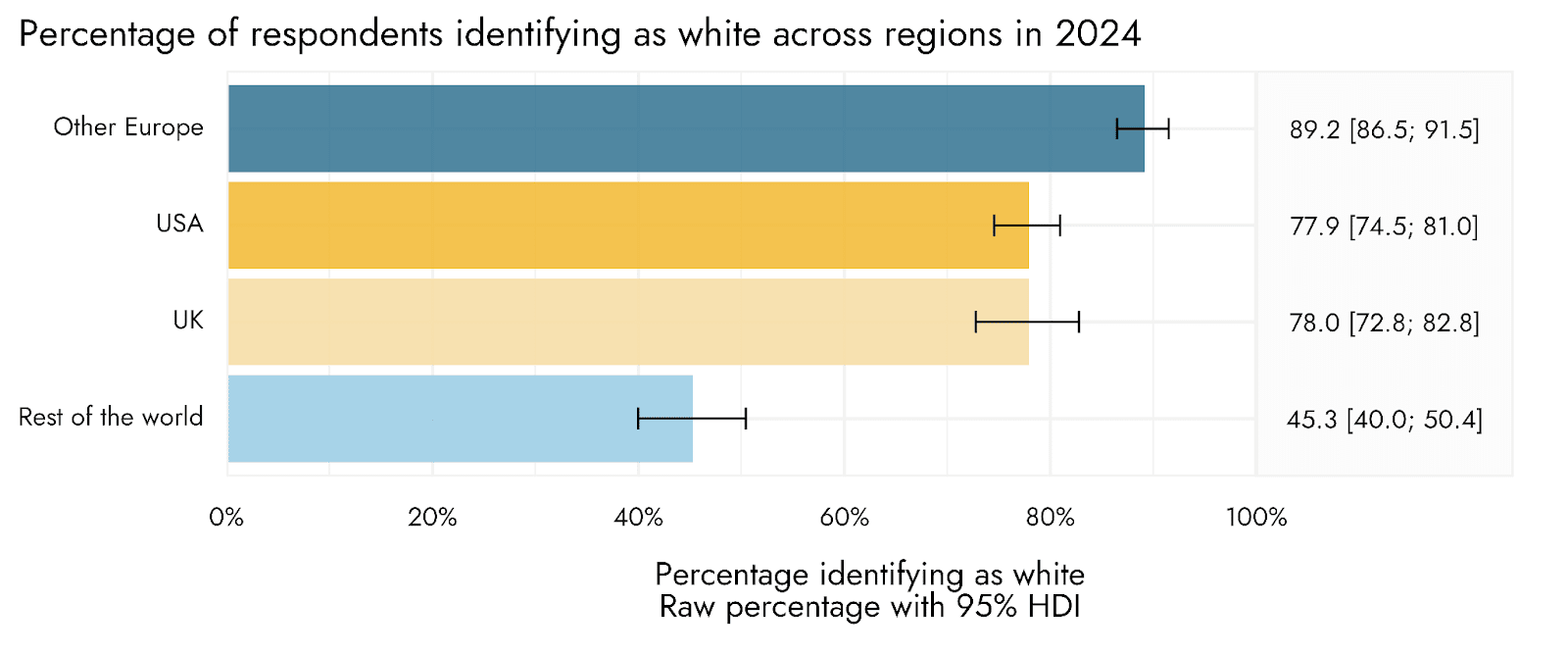
Race
Racial identification across locations showed considerable variability. Respondents with white racial identification are typically the overwhelming majority in European countries. Respondents identifying with an Asian ethnicity were more common in several predominantly English-speaking countries (UK, USA, Canada, Australia, and New Zealand).
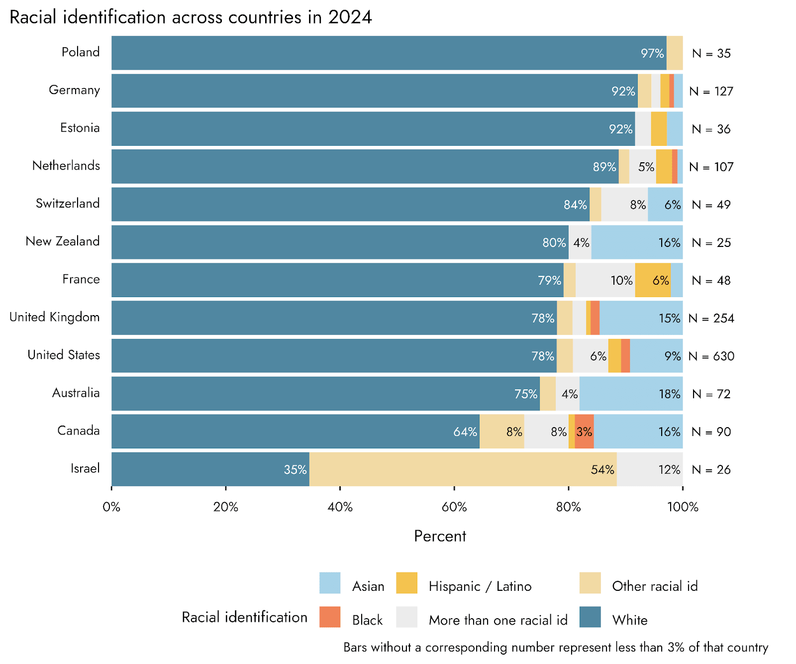
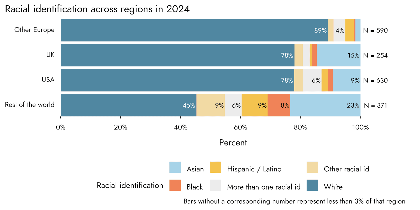
UK and US hubs such as London, Seattle, Chicago, Toronto, and New York City tended to have the highest ethnic diversity among top hubs.
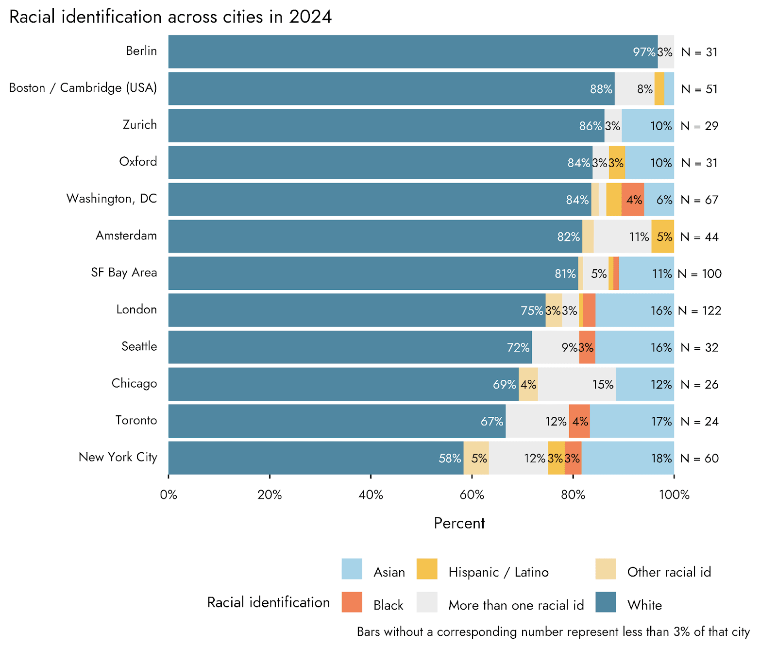
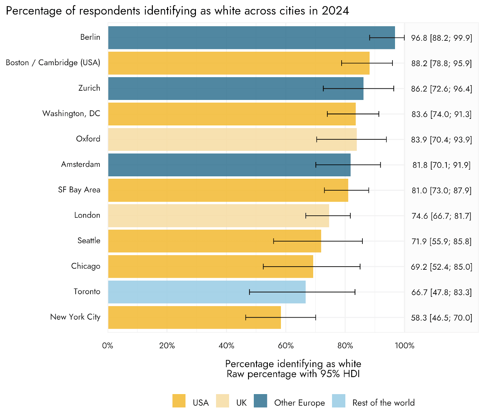
When considering these racial identification results, at least two things should be noted. Firstly, although respondents were able to provide their own description, the default categories provided were based upon racial identifications primarily from the US, and may not translate especially well to other locations. Secondly, it may not be as informative as it would first seem to compare the racial identification of EAS respondents with the general population in the different locations. Although we can see that there is a general tendency for the racial diversity to increase with higher racial diversity in the broader population, more specific deviations from this background population level may reflect other characteristics that are over-represented in the EA community that are also associated with race, and to different degrees in different areas (for example, income and education).
Age and time in the EA community
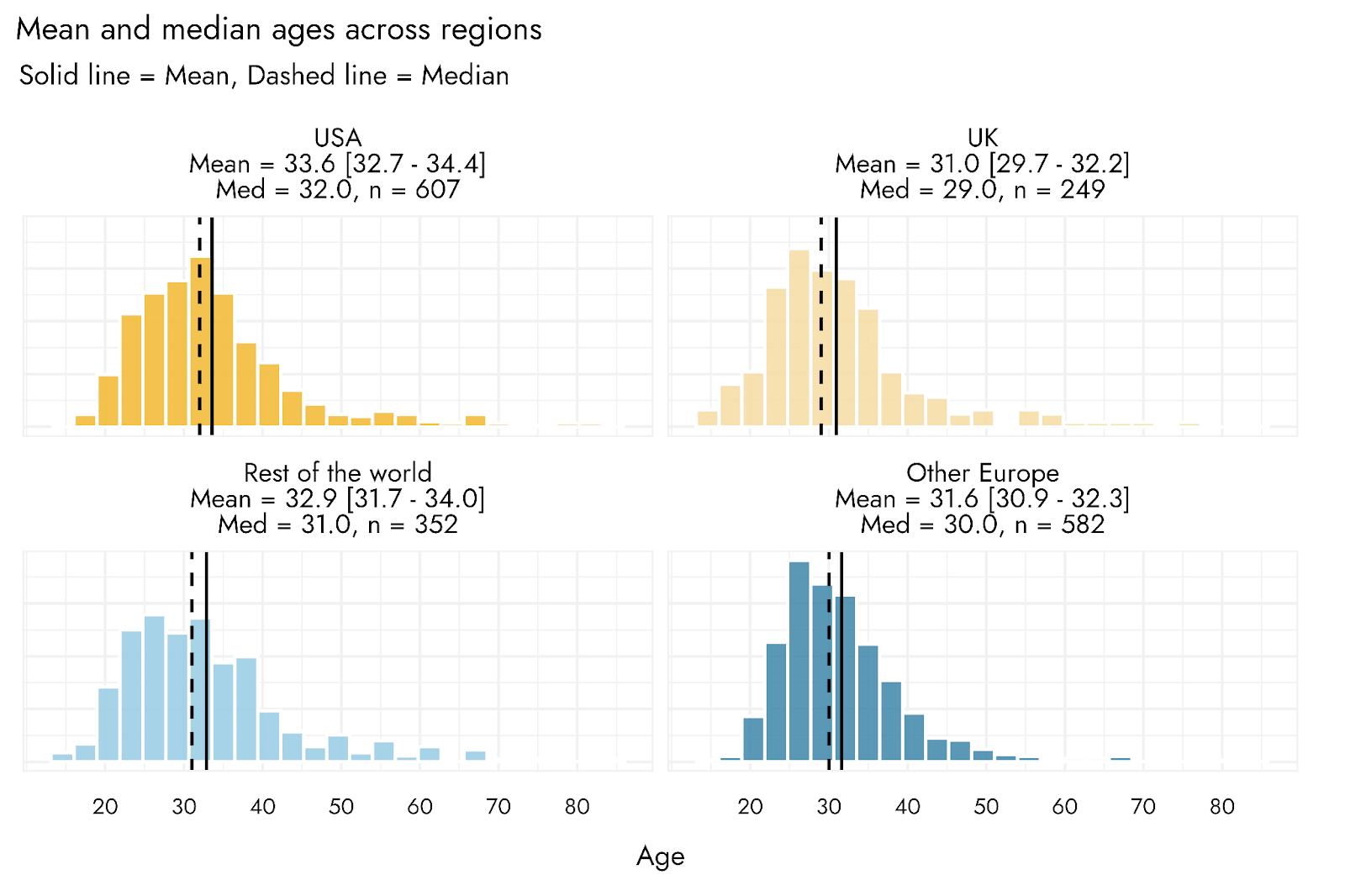
The ages of respondents to the EA Survey tend to skew quite young, with most respondents aged between 20 and 40 years of age. There is, however, some variation in ages across locations. Compared with respondents in the USA, UK respondents were on average about 2½ years younger.
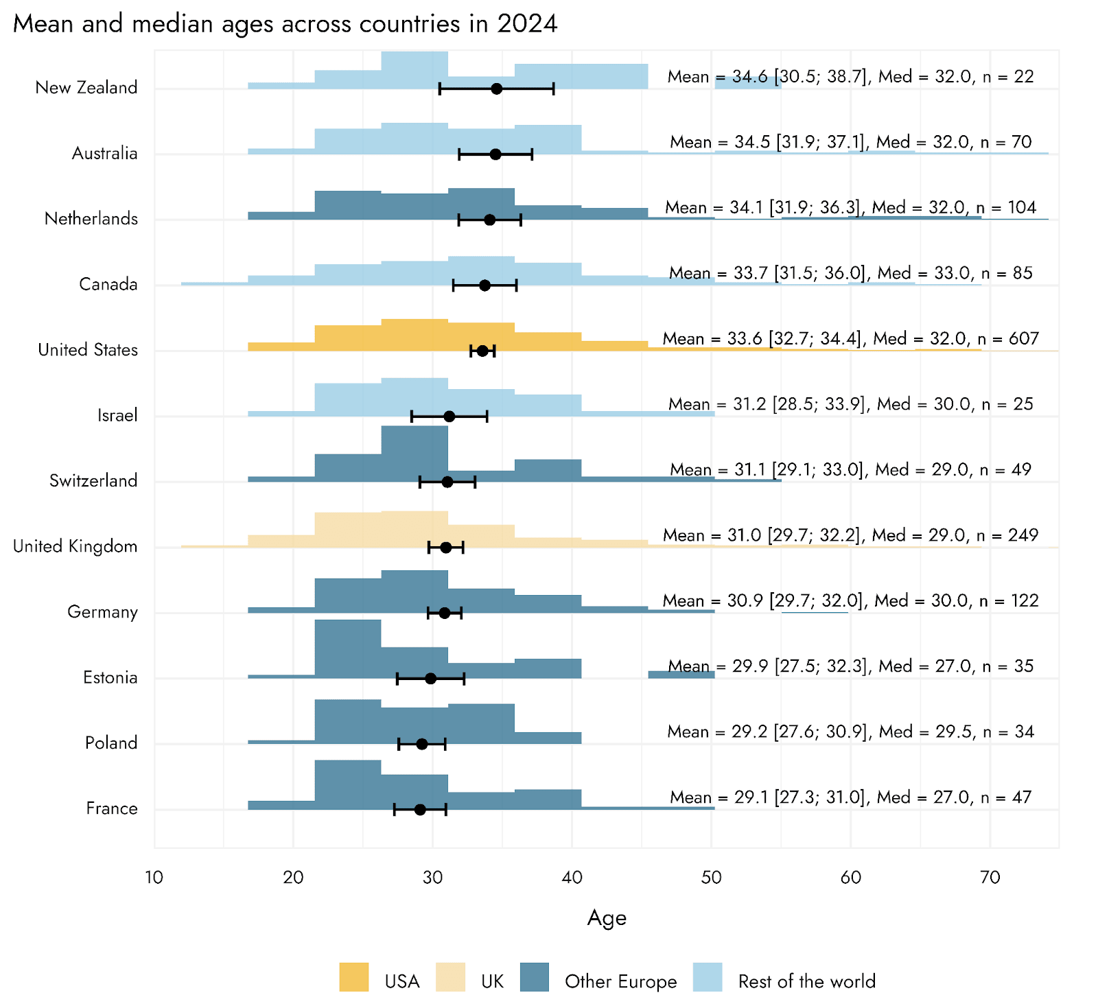
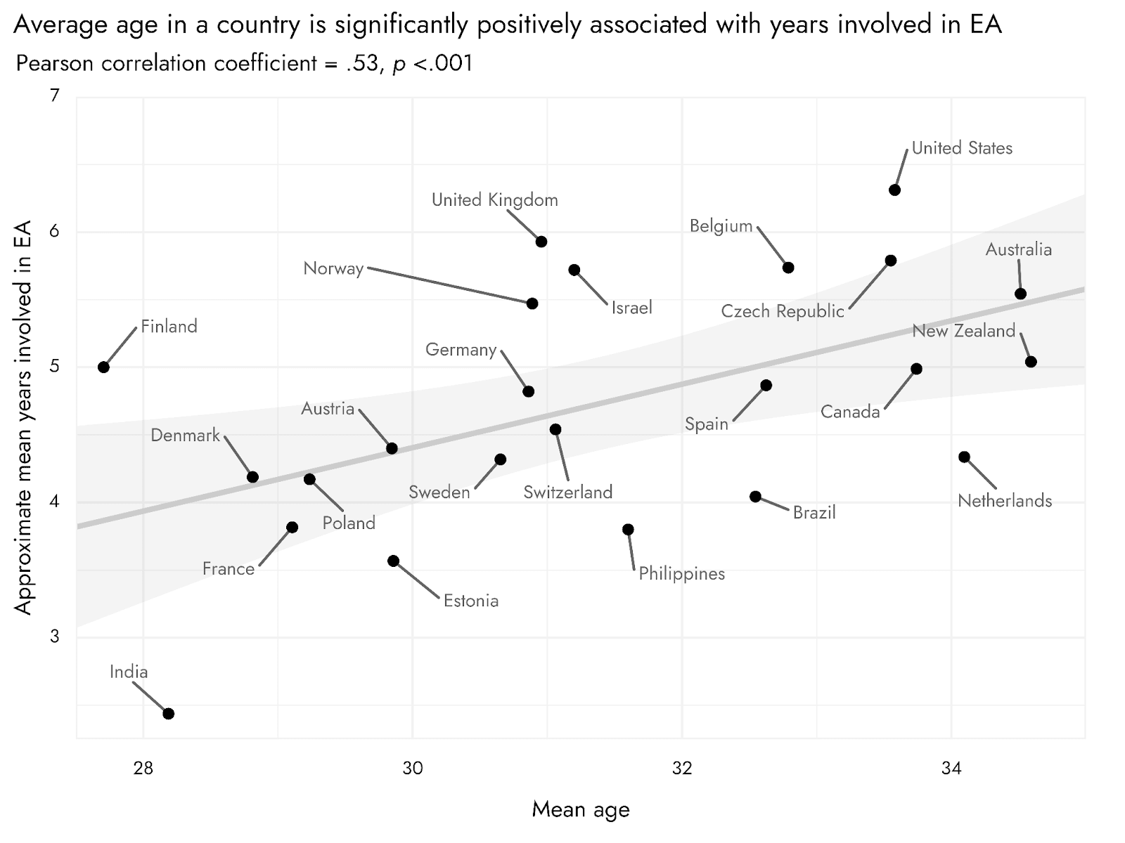
Of countries with at least 25 respondents, it is interesting to note that among the 5 countries with the highest average ages, 4 are predominantly English speaking (and the Netherlands has a top ranking in English proficiency). One partial explanation for this may be that such English speaking countries were more natural early consumers of EA-related content (which has been mostly written in English), and that the older ages reflect longer tenure of those countries’ residents in the EA community. Indeed, many of these same countries have respondents with longer average ‘tenure’ in the EA community.
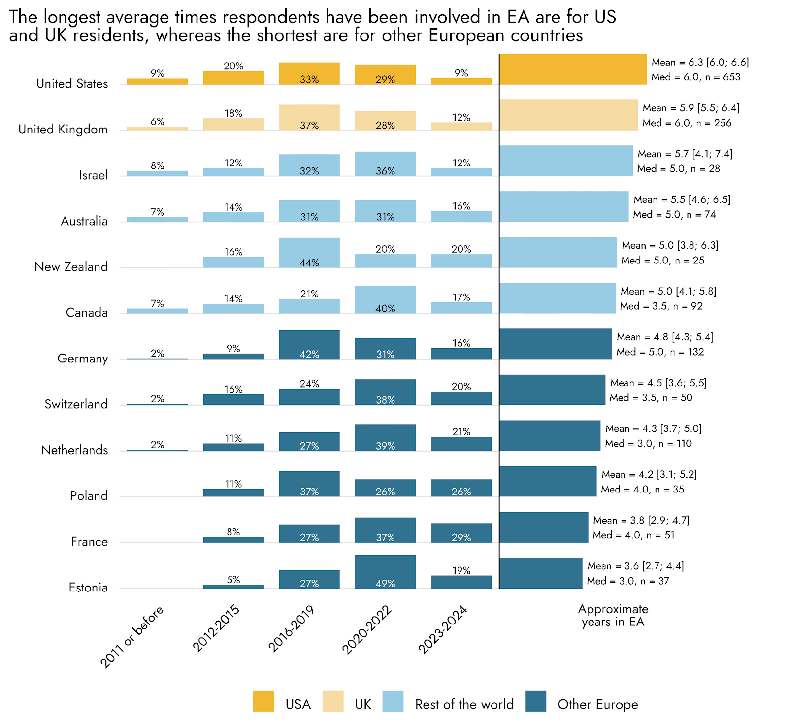
An assessment of the relationship between the average age per country, and the average tenure in EA, also supports the idea that typical time in the EA community and the age of community members in each country are positively correlated with one another. Countries such as the USA and especially the UK stand out in these plots as having long typical time in EA relative to their average ages, perhaps reflecting the role of these countries in the early stages of EA, with initially young EA community members who now have spent a long time as part of the EA community. The Netherlands is the opposite, with relatively older community members, on average, relative to the typical time spent in EA (it can be seen in the section below that the Netherlands also has a low percentage of students).
Student status
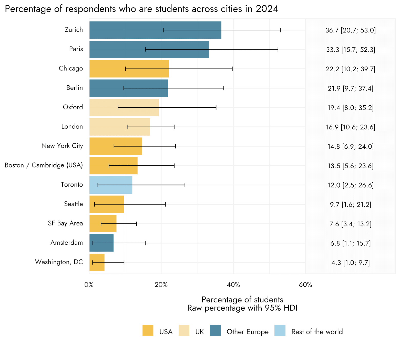
Student status varied considerably across different regions and countries. Looking at the region-level, the US and UK tended to have lower percentages of students than other European countries or the rest of the world, with the US reliably lower than all other broad regions. Indeed, among the top countries, the US had the lowest percentage of students. Switzerland and France, and their corresponding major hubs of Zurich and Paris, had the highest percentages each with at least a third of EA Survey respondents having been some kind of student.
Engagement
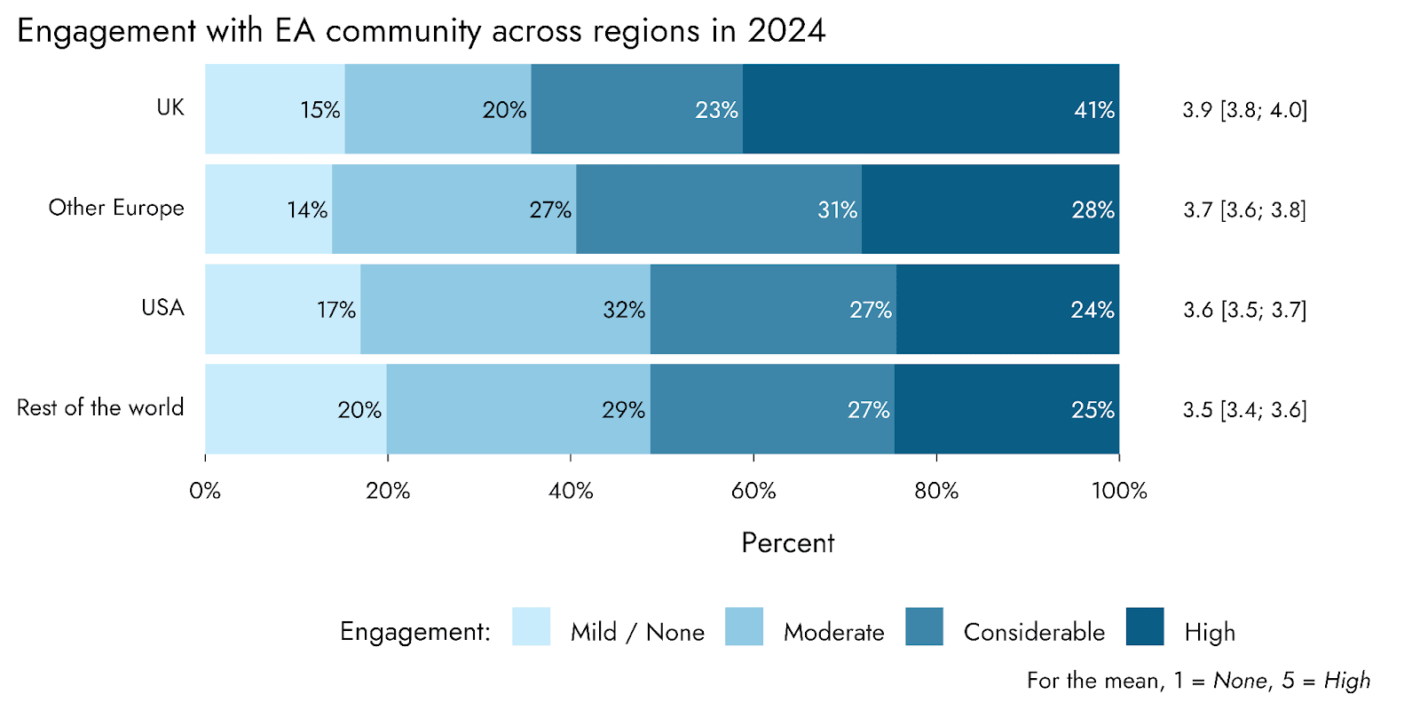
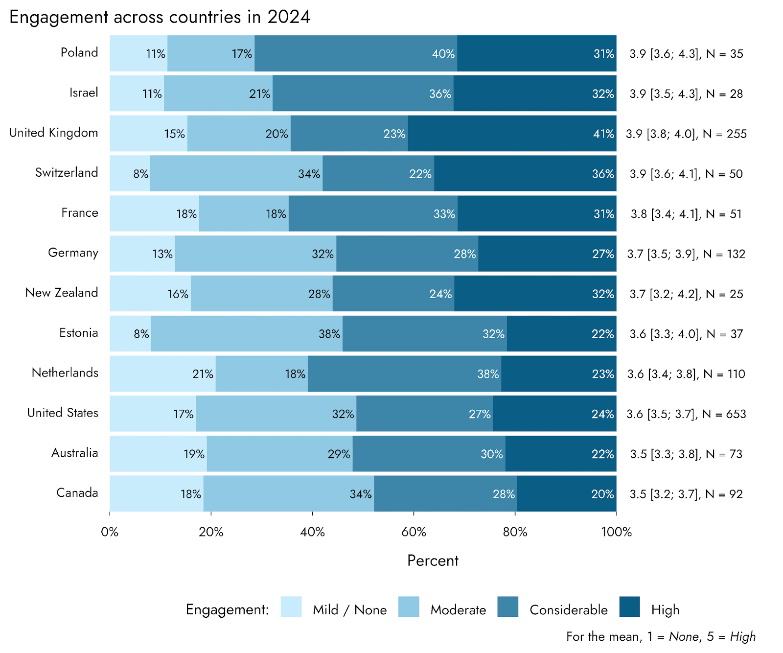
Amongst countries, the UK had the greatest percentage of respondents placing themselves in the top category of engagement, and the joint highest mean engagement level. Taking countries with large sample sizes (100 or more) and comparing their engagement levels, we found that UK respondents reported significantly greater engagement than respondents from both the US (p < .001) and the Netherlands (p = .02) (these tests were unplanned and the significance levels are not corrected for multiple comparisons). The high engagement apparent in the UK is at least partially driven by Oxford, which stands out amongst hubs as having a tremendously high percentage of respondents placing themselves in the top tier of engagement (72%), although the UK retains significantly higher engagement than the US even when Oxford respondents are removed.
Two other major hubs, London and Washington DC, also have very high percentages of respondents placing themselves in the top engagement tier (49% and 51% respectively). In contrast, Toronto and Seattle stand out as having relatively less engaged respondents, with the modal response being Moderate engagement.
Satisfaction
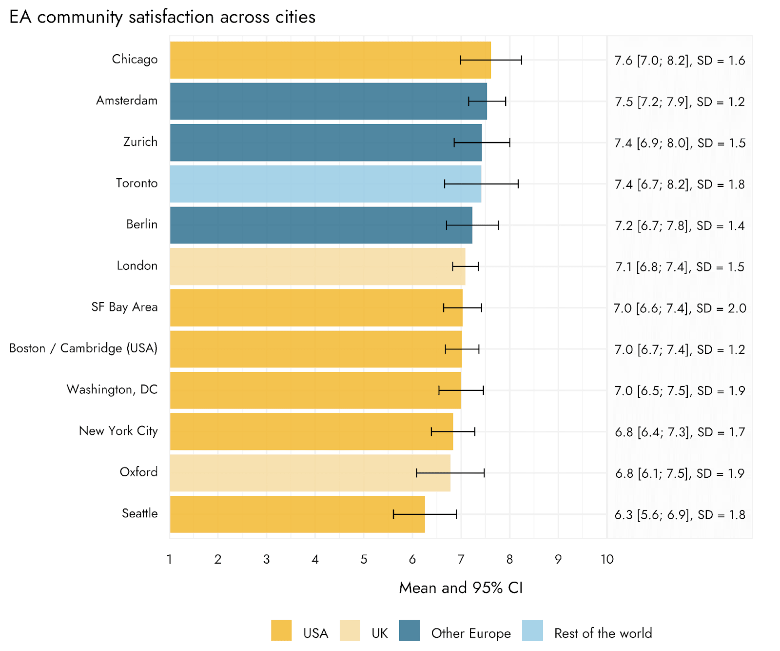
As we saw in the previous EA Survey, the USA and the UK (which have the largest number of respondents) have the lowest average community satisfaction ratings. This average is still relatively high, however, at around 7 out of 10. None of the major countries or hubs reached an average of 8. Other European countries and hubs tended to rank higher in satisfaction than countries/hubs in other regions, although Chicago notably bucks this trend, being in the lowest satisfaction country but the hub with the highest average satisfaction rating.
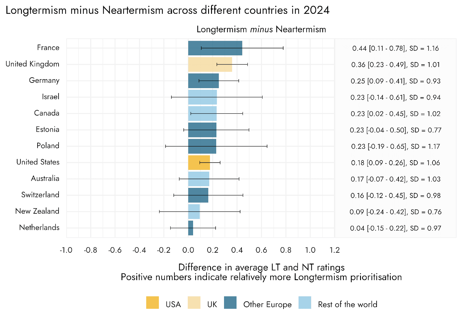
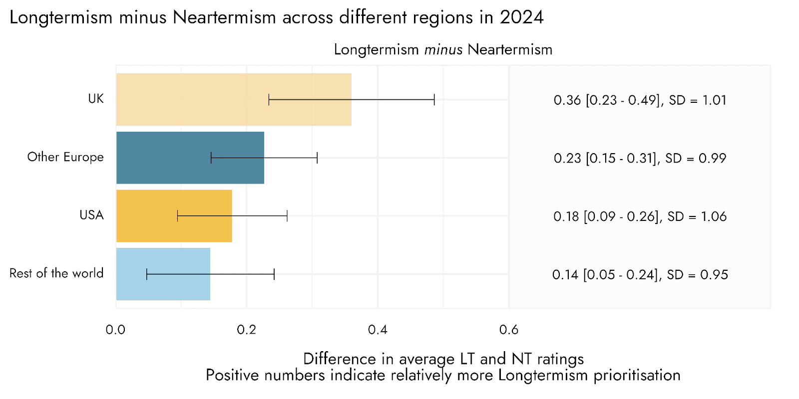
Cause Prioritization
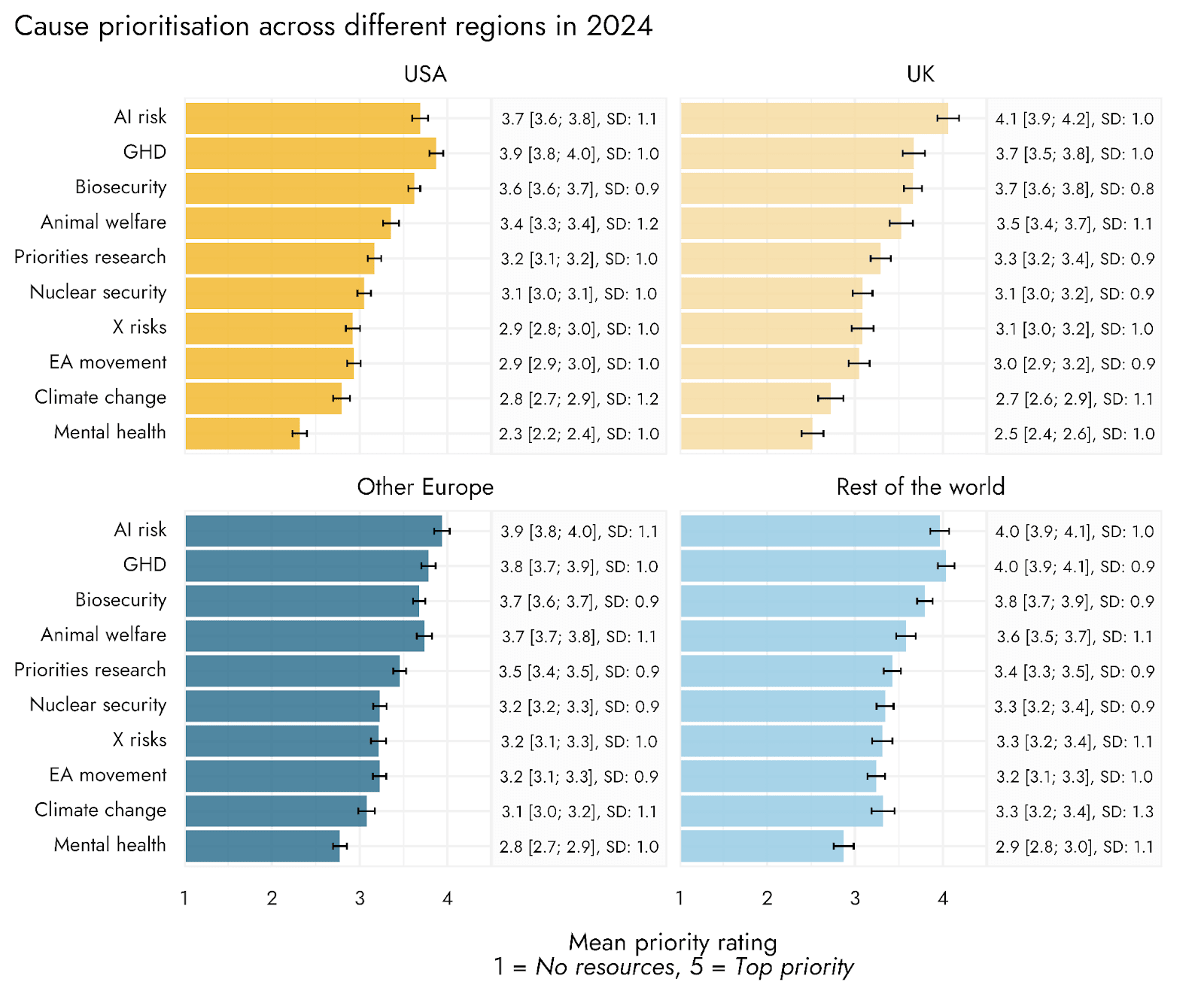
As we have done in previous years, we followed an approach to summarizing cause prioritization ratings that aims to assess leanings towards broadly ‘longtermist’ vs. more traditional ‘neartermist’/global health and wellbeing cause areas. We did this by calculating the average of cause prioritization ratings for biosecurity, nuclear security, AI risk, and existential risk to indicate prioritization of ‘Longtermist’ cause areas, and the average of global poverty / global health, and mental health to indicate prioritization of ‘Neartermist’ cause areas. There was relatively little variation amongst top countries in this metric. Among countries with decent sample sizes (100 or more), the UK was found to have a significantly greater LT > NT score than the USA (p = .018) and The Netherlands (p = .005). Though significant, these differences seem substantively quite small (the mean difference between UK and the USA, for example, being around .18, with standard deviations in each country around 1).
EA Group Membership
Finally, in the figures below, we present the percentages of 2024 EA Survey respondents who reported being members of a local EA group, across different countries and cities. As we saw in the 2022 survey, the US and UK - which have the largest and longest-established EA communities - had the lowest percentages among the top countries of people reporting being members of EA groups. Amongst major hubs, London and especially the SF Bay area stood out as being both large and having low percentages of respondents as EA group members.
However, as we’ve noted previously, the percentages for relatively smaller countries (such as Estonia) could be somewhat inflated: when there are relatively few EAs overall responding to the survey from a particular country or city, encouragement from group leaders in those places could lead to nearly all the people who are part of an EA group answering the survey. At the same time, in many smaller or newer communities, it may be that almost the only EAs in a given city or country are the members of a local group. Conversely, more established geographic communities may contain a larger number of (potentially older) EAs who continue to engage with the community but not with groups. That said, these results could also reflect differences in levels of investment, activity, and strategy of local groups in different areas, and we think that this data should be considered holistically, along with other information, by movement builders.
Further research
This report summarizes general trends and differences across the community, but many results of interest may concern examining the results for individual local communities in more detail. We have already produced a number of bespoke reports for particular country or city level communities, and if other movement builders would find this useful, we would encourage them to reach out.

This post was written by Jamie Elsey and David Moss. We thank all of the survey respondents for taking the time to complete the survey, as well as Sarah Negris-Mamani for their feedback on this post.
Rethink Priorities is a think-and-do tank dedicated to informing decisions made by high-impact organizations and funders across various cause areas. We invite you to explore our research database and stay updated on new work by subscribing to our newsletter.
Micaella @ 2025-08-06T08:16 (+4)
Heya. Thanks for this - very interesting.
Would it be possible to see a breakdown for some of these metrics specifically for LMICs? I think this is a meaningfully distinct group, and it would be interesting to know how demographic data, cause prioritisation, satisfaction differ in these contexts vs HICs (if they do). Another way to do this would be to have some regional analysis (e.g., sub-Saharan Africa, South Asia, Central America).
David_Moss @ 2025-08-06T13:44 (+7)
Thanks Micaella!
We'll give some thought to the best way to approach this. One complicating factor is that the LMICs are very heterogeneous (e.g. we might expect substantial differences between the results for Brazil, China, and Afghanistan).
Overall, before looking into this more, I can note that all LMICs make up about 7% of the total sample, and about half of these are Brazil, India, China and the Philippines.
MvK🔸 @ 2025-08-05T05:36 (+4)
Very interesting!
Have you also analysed what countries have the highest percentage of EAs relative to their population?
You seem to focus mostly on total numbers - I'd be curious to see if the UK/US dominance is less pronounced when taking this into consideration. I'd be especially interested in which countries "punch above their weight[1]" (Switzerland?) and which do not (China? India?). This would also be interesting for smaller (cities) or bigger units of analysis (geographic regions).
- ^
There might be a few outliers that are caused by extremely low population sizes but I still expect this to be useful data.
David_Moss @ 2025-08-05T08:45 (+4)
Thanks!
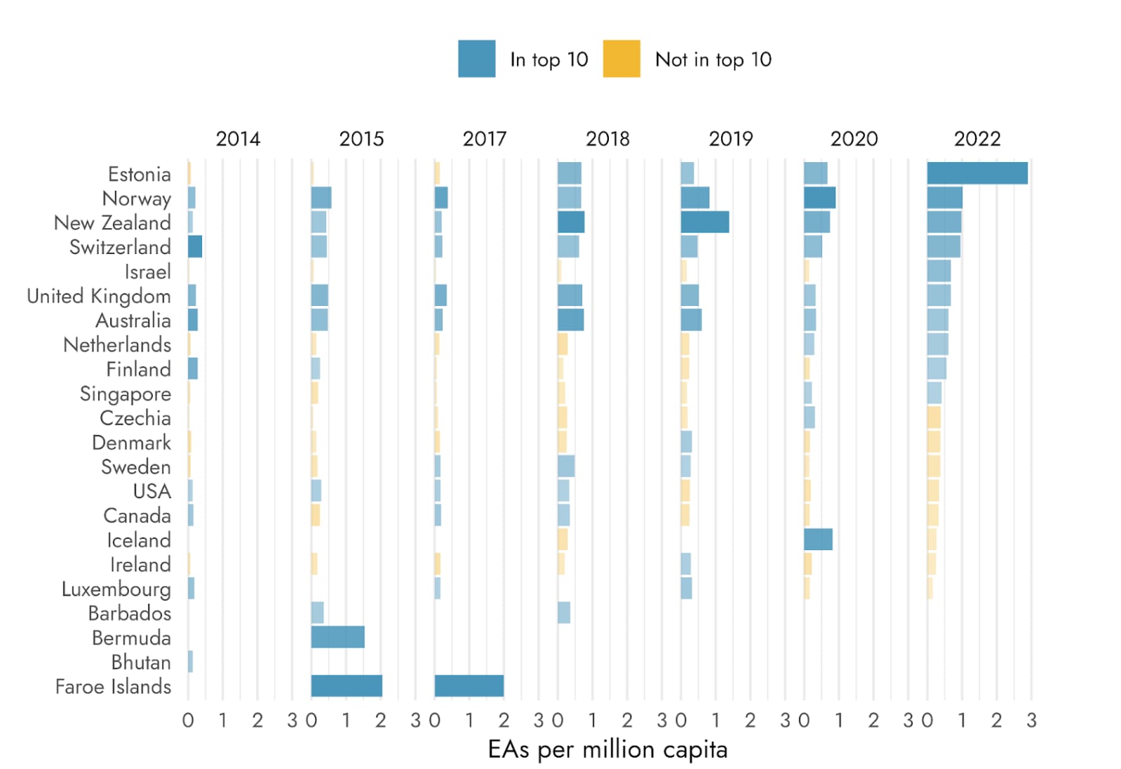
Yes, we might do a separate post about EAs per capita across years. But, as we've commented previously, the metric risks being very noisy. So, when you are looking at the countries with the highest EAs per capita, within any single year, you will often see some smaller countries appear to be enormous over-performers, and then not the next, when there's only 1 or 2 respondents difference either way.
David_Moss @ 2025-08-05T08:54 (+12)
For example, here are the countries in the top 10 across years, excluding the most recent year (this is from an earlier private report we did).
As you can see, there's some consistency, but also a lot that would likely be misleading if you only looked within a given year's data. Many of these countries go from literally 'top 10 EAs per capita' one year to 0 EAs the next.
OscarD🔸 @ 2025-08-05T19:20 (+7)
Seems like this should be solvable by just having some minimum number of EAs in that country to be included? Perhaps 5 or 10 or so.
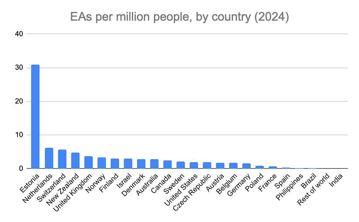
I updated my previous sheet from that post with the new data. Here is 2024's graph:
And here is the rank-order mapping from 2024:2022. Seems fairly stable!
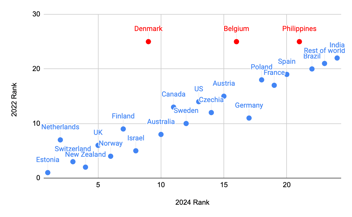
(Countries in red were not listed in the 2022 data I have access to.)
David_Moss @ 2025-08-05T20:09 (+4)
Thanks Oscar!
Unfortunately, I don't think that simply excluding smaller countries would be a valid approach. This would lose important data and potentially unfairly exclude smaller countries that are consistently over (or under) performing. And it would potentially distort the true relationship between different predictors and EAs per capita, when we're trying to interpret the pattern of results.
Below, I've shown the rank-order correlations between EAs per capita across years, which are reasonably strong- there is some real consistency, as I noted above- but not amazing, as we see in my plot above.
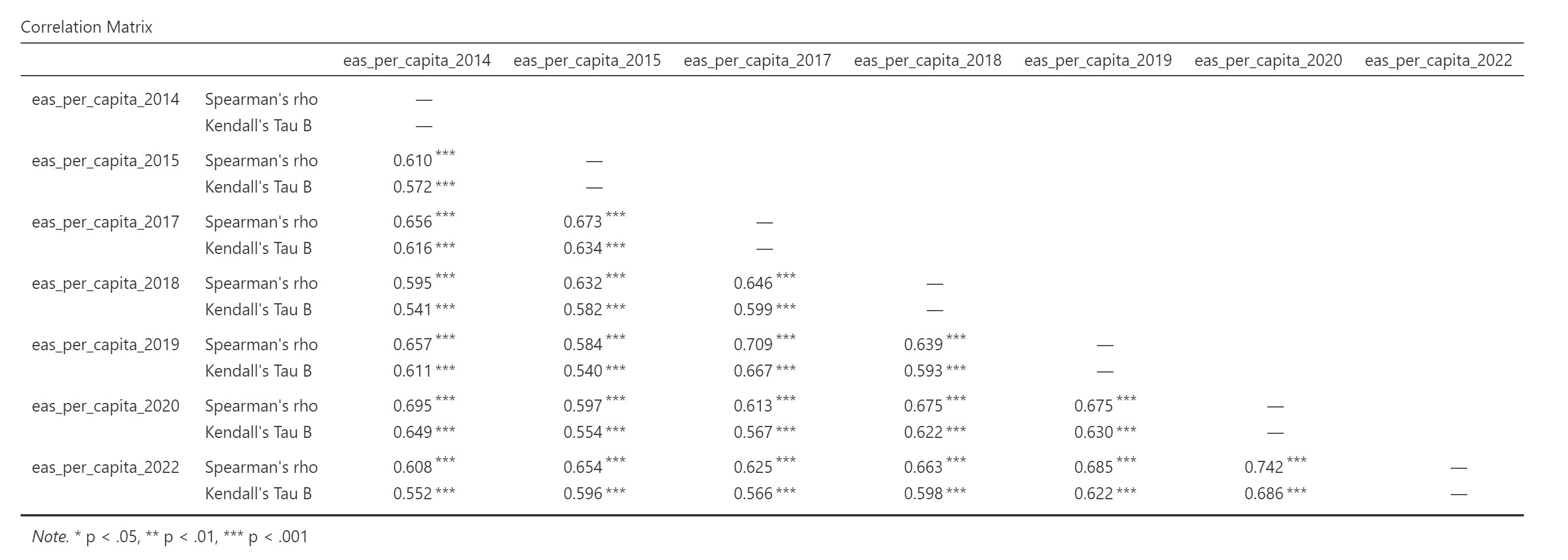
I think, on the whole, simply looking at the highest EAs per capita countries within a given year is a risky endeavour for the reasons above, and it's better to look at patterns across years and across the full range of countries.
MvK🔸 @ 2025-08-05T12:59 (+3)
Ah yes, this is sort of what I expected. Thanks for sharing!
GideonF @ 2025-08-05T08:32 (+2)
My guess is Estonia looks particularly good by this metric (population just over 1 million but 1.9% of survey respondents)