Announcing the launch of Open Phil's new website
By Aaron Gertler 🔸 @ 2022-06-07T20:32 (+47)
We just launched a new version of our website!
We think the new design will make our content easier to navigate, so that readers have an easier time learning about our work and our thinking.
As part of the launch, we’ve updated language on a number of core pages to better reflect how our work has evolved in the years since our previous website was created.
This includes updates to our mission statement, which had been in place since our incubation as a project of GiveWell. The new statement is more concise, and we think it better reflects the breadth of our work:
“Our mission is to help others as much as we can with the resources available to us.”
Other updates include:
- The ability to sort and filter much of our published content, including blog posts, research reports, and notable lessons.
- Statistics on our giving in each of our focus areas.
- A new page explaining the difference between our two grantmaking portfolios (Global Health & Wellbeing and Longtermism).
- Pages for our newest focus areas, South Asian Air Quality and Global Aid Policy.
If you experience any issues using the new site, or see something you think should be changed, we would appreciate your feedback. Contact webrequests@openphilanthropy.org (or comment on this post) to get in touch.
Habryka @ 2022-06-08T04:26 (+68)
I like the content changes. I think the design seems worse than the previous one. In-particular the information density has gone down a lot, which feels in-tension with OpenPhil's target audience. See e.g. this screenshot:
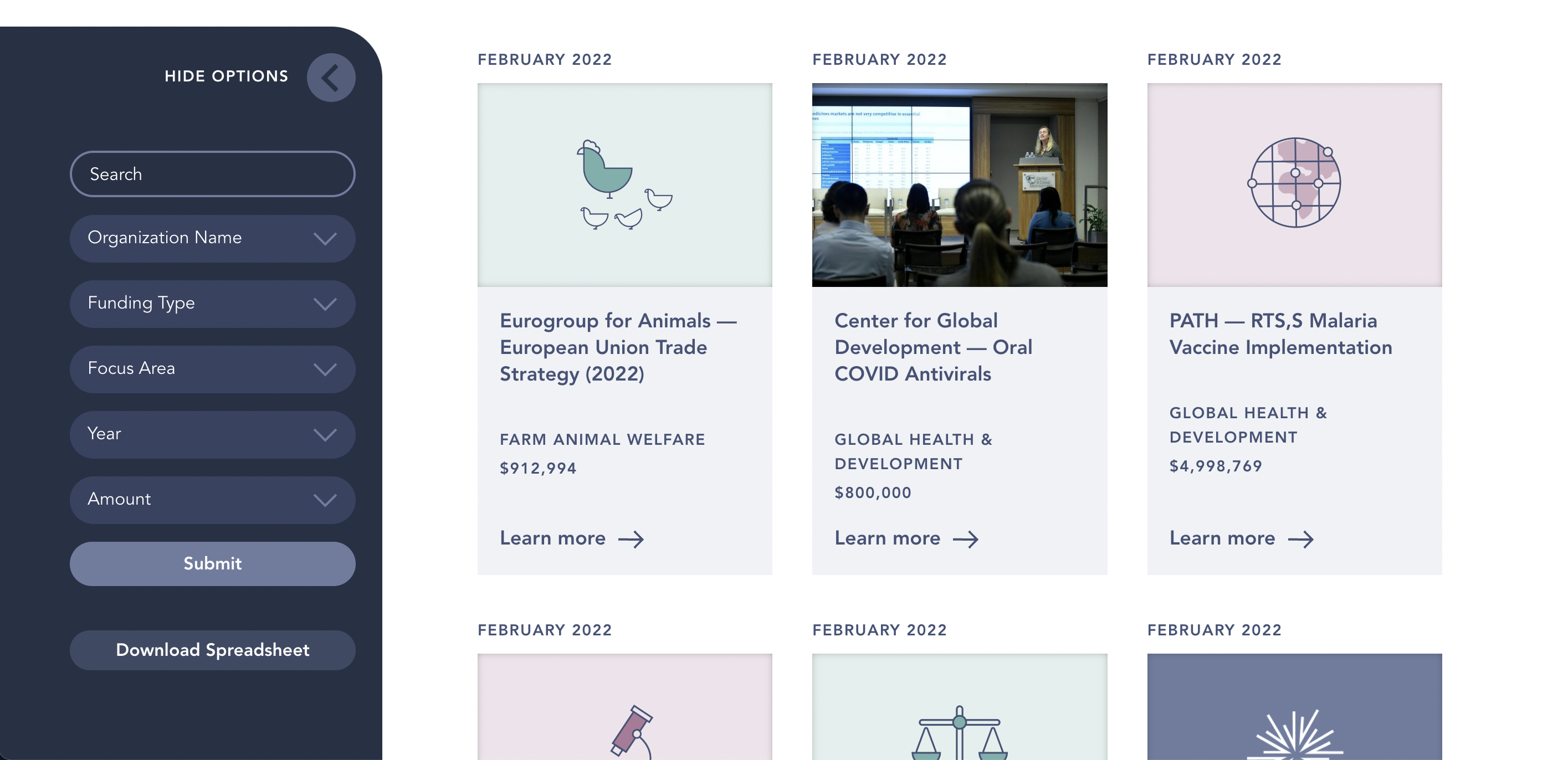
This screenshot feels to me almost like a screenshot from a tablet, but it's taken from my pretty zoomed out and large laptop screen. The site starts feeling a lot less cluttered and navigable at 75% zoom to me:
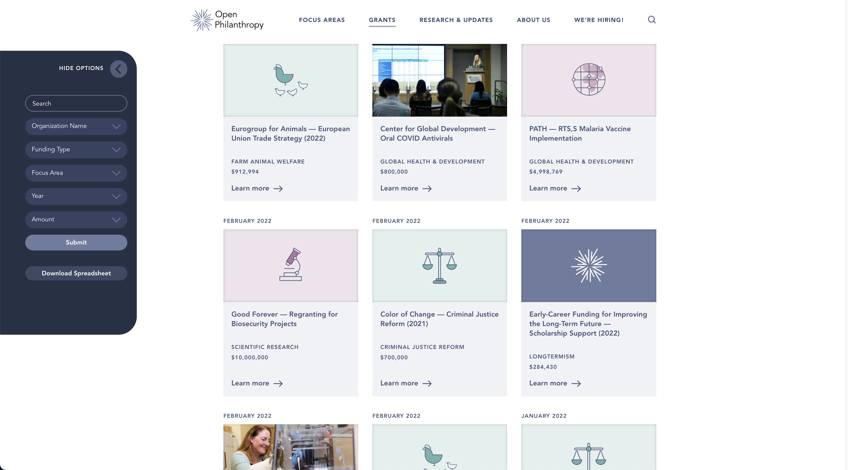
Some other comments:
- I don't think I like the new logo. I am not exactly sure why, but my first reaction to seeing it was something like "this is a logo for a Christian church". I think the cross-shape in the middle, and just the general association of "radiating light" with "christianity" seems like a candidate. I preferred the previous logo here. The logo is also just generically non-distinct (i.e. if you gave me just its outline on a piece of clothing or paper, there is little chance I would be able to recognize it as the OpenPhil logo). It's also almost completely invisible and indistinguishable in my tab-bar, which is another litmus test I use for logos.
- Overall the site feels like it's gotten slightly harder to navigate. There is lots of padding, whitespace doesn't seem to be used super effectively, and text-contrast issues are more present than in the old site (for example, on the frontpage, the navigation at the top has pretty bad contrast against the first image that's displayed in the carousel).
- A lot of pages feel kind of unpolished. The team page is just a giant list of names in a layout that feels very overwhelming and not well-optimized for this number of items in the list.
- The site is extremely slow, given that it's just a static site that presumably doesn't have a lot of reason for dynamic content. When I click on a menu item, I have to wait (on a fast interconnection, on an M1 laptop) for almost a two full seconds until I see a page transition, and then another 500ms for the page transition to complete. Generally, clicking around on the website feels very sluggish.
- I feel like a lot of content hierarchy isn't very clearly established. The grants database, which is the page I use most frequently, now has a white header with lots of white UI elements that blend into each other as you scroll, without any drop-shadow, that make me very confused where different containers are supposed to be located (I like playing with whitespace in order to establish hierarchy, but I think the current design fails at that)

- Bullet lists in-particular seem to have kind of bad formatting:
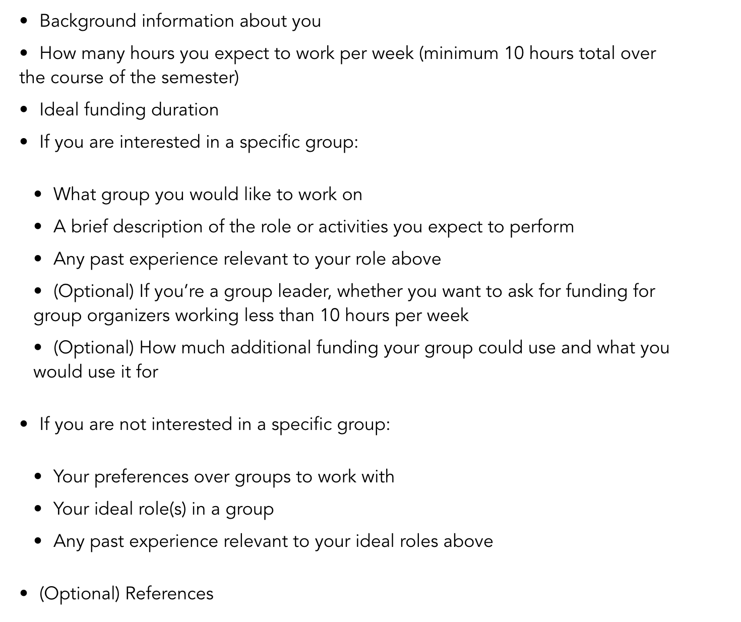
- The link styling is (IMO) both overwhelming and not super intuitive, with the the primary way links are made distinct is by giving them a black underline. I think it's pretty standard across the internet to have links be colored, and one should stick to that style unless there is a good reason. Potentially the links could look better if the underline was a bit further below the text, and dashed or something, but probably the links should just be colored (I've tried making underline-only links work on LW, and gave up after a while)
- The tag section has kind of bad text contrast, and feels a bit hard to read to me (grey text on grey background)

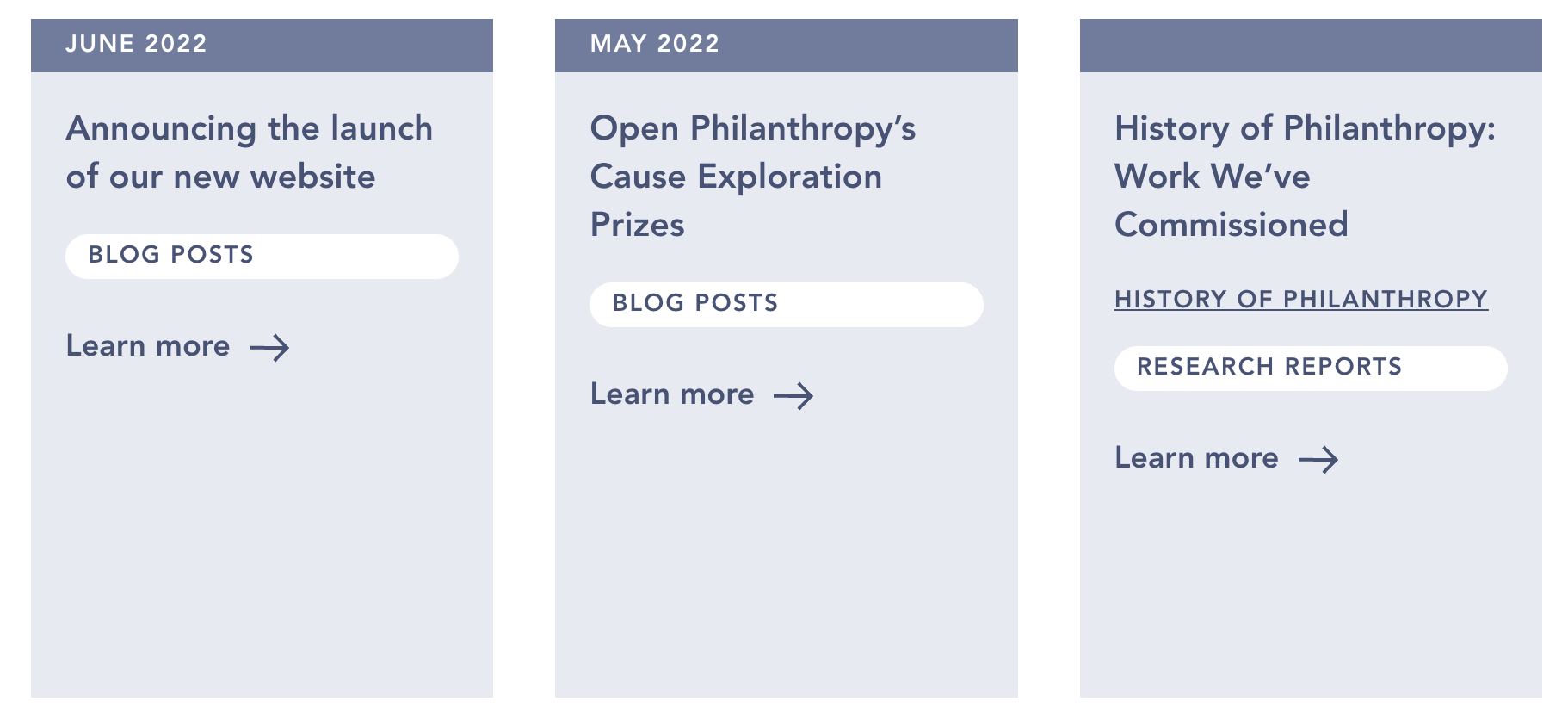
- Why do all three of these items have like 200px of whitespace at the bottom? I think it looks bad, and contributes to the overall low information-density on the site:
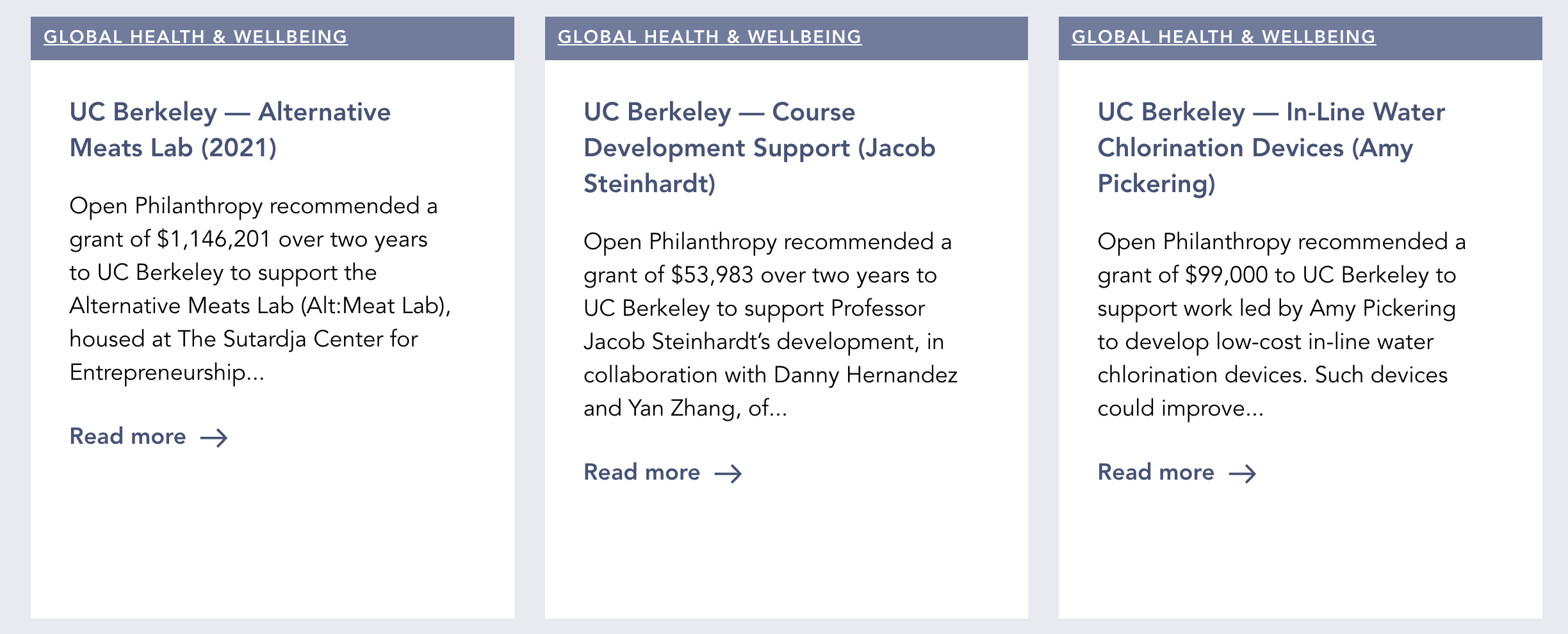
- It's worse here:
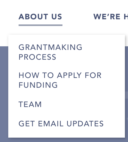
- These menus have an inconsistent click area. E.g. the whitespace to the right of the text "TEAM" should be clickable, but it's not, and this has caused me to click into nothingness many times while playing around with the site:
Content wise:
I like the site more, and it seems to more accurately convey what OpenPhil is about. I could probably leave more comments on content, but I figured I have a particular comparative advantage about commenting on webdesign.
Aaron Gertler @ 2022-06-11T01:50 (+10)
Thanks for all of this feedback! Lots of good points to consider moving forward, and exactly the kind of thing I hoped to get from this post.
This website was a weird project — passed around between owners and developers over a period of ~2 years. I think there was a good amount of usability testing before my time, but I'm not sure how much of that was holistic and focused on the final design (vs. focused on specific elements). I agree with most of your points myself and also trust your experience in this area.
Charles He @ 2022-06-17T00:35 (+2)
Uh...
So I'm just going to say that, at this point, it seems like Open Phil should just consider a wholly new redesign, basically make a new website.
The considerations for "cost benefit analysis" for making a new website:
- Maybe a lifespan of 5 years?
- The time opportunity cost or value to current users
- As one of many valuable things, the grant page is a big deal. It seems like a good design on just this feature would have a lot of value to many people
- A nice "PWA feel" would be good for the grant page and others (I don't know that much about web design but the idea is something like the UX of this, which has instant response to user input)
- There's many other theories of change, like outreach or communicating to new donors or EAs, that would benefit from a good web page
- I think each cause area can get a little more focus and polish (in addition to the polish described by Habryka's, which seems to be a given).
- This requires attention from a dedicated professional or team.
- A good website is just good for morale of employees and EAs?
I think the budget justified by the above is large. Obviously, time cost or opportunity cost is a consideration.
So, like, maybe they can make Aaron Gertler like a super project manager ("Director Gertler"? "Executive Vice President Gertler"?) and give him a big budget. Then he can get bids, hire an agency and get a service agreement, etc.
This work isn't trivial, but presumably this should be possible for some up front effort without further encumbering him too much.
Aaron Gertler @ 2022-06-17T10:37 (+6)
Despite the real visual + other issues, I still think the website is very reasonable!
The changes to make, including some to the grant page, are tiny relative to the overall size of the project. It seems very easy to find our grants and other content, and overall reception from key stakeholders has been highly positive. OP staff seem to like the changes, too (and we had tons of staff feedback at all points of the process).
If you have other specific feedback, I'm happy to hear it, but I don't know what e.g. "a little more focus and polish" means.
Charles He @ 2022-06-20T05:19 (+4)
TL;DR I spent more time looking over the website (particularly on mobile) and I think I’m mostly wrong/bad in my comment above. There might still be some value in a redo, and I guess it is 30% likely to be valuable.
I am not a web designer, but I’ve interacted with several in the past. I guess my comments below are about “50% true”.
Why I changed my mind from my message above:
- I was in the mindset of my initial impression and Habryka's comment, which seemed quite negative. I tried the website again, on mobile. The website “just works”.
- The website seems much much faster than I remember, it seems like someone tuned or put some effort to fixing this
- Your message that the key stakeholders like it, is a big update.
Why I think there could be a redo:
- For redoing the grants page, I think that redesign or work can be deceptively large and might involve touching many other places on the site (a similar filter menu appears on other pages).
- I think in some situations in similar seeming project, it seems like an entire redo ultimately occurs, even when the original changes seemed small originally. This is because of the dependencies or costs of trying to accommodate existing content.
- I think the changes might be minor in some sense, but I think this still needs a very experienced designer to go over the details.
- There is some chance (30%) this assistance can be expensive or difficult to arrange, compared to just getting a new website from scratch.
- There’s patterns of design being used that are different than ones I see (see comments below)
In some sense, Open Phil is a major expression of the heart and machinery of EA. So having a highly polished page that is highly professional is valuable.
I think some viewers of the site, will be really picky, especially newcomers and some kinds of talent (experienced professors). They might be judgmental and take on impressions, even if they can’t consciously articulate it.
Charles He @ 2022-06-20T05:24 (+2)
So, uh, I have comments below:
These comment on the intro page, and the about page, as they seem like natural places where a newcomer would try to come to "gauge credibility based on a website".
I think this comment is lower value and I sort of don't expect many people to read it, I'll just put it here for completeness.
I emphasize I’m not a designer. But it’s easy enough to just present these ideas to an actual designer and see what they say, so it’s low cost to be wrong and just have people read this.
No header bar, front page content up against top of screen
For the front page, there's no header bar and that seems unusual.
As below, the image and content is right up against the top of the screen, with hamburger bar sharing the space space.
So the image with the scientist on a microscope, is in place of what often is the header image.
(By the way, the bright color in the image is slightly obscuring the logo and title.)
For contrast, see Oxford's site on mobile:
Room for scrolling seems like a desirable pattern
Many modern websites “give space” for scrolling on mobile. So a user loading a page, who often instinctively scrolls down, has a lot of content to see.
In contrast, the mobile site right now is pretty dense and there’s not much room to scroll down to find more content. For example, "cause selection" is right below the first section of content.
So I claim this is sort of fighting the “modern” tendency for people to scroll down a mobile website.
If you go on Square’s site and scroll down, you’ll see a long narrative with many pictures breaking up the text. This room seems desirable.
You can also see this with the Gate’s foundation:
https://www.gatesfoundation.org/
It’s true that the target audience isn't the same as the average TikToker, but I still think many people are familiar with mobile sites like this, and expect a roomy scroll.
Charles He @ 2022-06-20T05:29 (+2)
There’s other things that make this look different than a 100% polished page.
The about page on Open Phil is pretty dense with text.
In contrast, if you go to the above sites, for example, the Gates site, there’s a lot more visuals and "roominess":
Our Story | Bill & Melinda Gates Foundation
(I don’t have any prior interest or affinity to the Gates foundation, it just seems like a good reference).
In contrast, Open Phil’s about page is text heavy without pictures, and also the text doesn’t flow as naturally.
Each of these changes individually seem small, but I think there's many details like this.
I think they might add up and justify getting a designer to spend a lot of time doing revisions.
As mentioned in the top comment, a full redo might be valuable.
I think I'm 20-50% certain about what I said in these comments.
Pablo @ 2022-06-08T11:45 (+10)
These menus have an inconsistent click area.
I thought this was particularly surprising because the width of the click area doesn't even match how far the text stretches to the right. Instead, it's a function of whether the text consumes more than one line. So 'Grantmaking process' has a wider click area than 'Get email updates', despite the latter being wider, because it stretches over two lines.
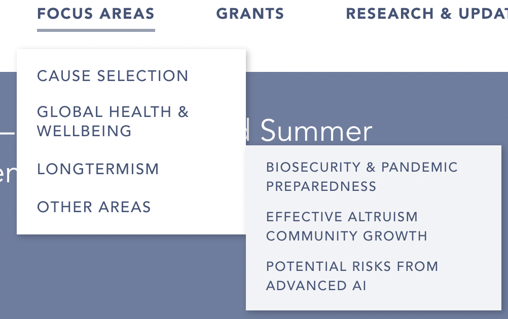
Another inconsistency with the menus is that the click area doesn't coincide with the hover area. For example, to click on 'Longtermism', the mouse pointer has to be above the text, but one can expand the menu that lists the three longtermist sub-areas even by hovering over the whitespace to the right of 'Longtermism'.
Greg_Colbourn @ 2022-06-08T09:16 (+19)
One bit of feedback about the grants database spreadsheet (.csv download) - I think it's always been like it currently is, but it would be good if the amounts were formatted as numbers to make sorting and totalling up possible. Also, linking to a Google Sheet would be a nice bonus.
Aaron Gertler @ 2022-06-11T01:58 (+4)
This is very good feedback — I'll look into making that change.
Ben Pace @ 2022-06-08T07:28 (+8)
Habryka left a lot of the relevant comments. My main positive is the separation of blogposts and research reports, I think that is likely pretty helpful when looking just for the high-effort research. My main negative was the information density decrease on the grants page, a page for a few years of my life I used to check regularly. Comparing on iPad right now with the way back machine, I used to see 8 grants on a page, but now I only see 2, so a 4x reduction.
Ben Pace @ 2022-06-08T07:32 (+2)
Feedback that the following page had like 1-2 letters width of horizontal scroll when I loaded on iPad.
Added: this page too:
https://www.openphilanthropy.org/open-philanthropy-course-development-grants/
Aaron Gertler @ 2022-06-11T01:44 (+4)
Thanks for this feedback. The horizontal scroll is a matter of having long email addresses on those page, and I'll clean that up after checking with page owners.
Agree with info density dropping on the grants page — I think there's an easy improvement or two to be made here (e.g. removing the "Learn More" arrow), which I'll be aiming to make as the new site owner (with input from others at OP).
evelynciara @ 2022-06-07T23:01 (+8)
I'm gonna miss the old site, but at least the new one isn't all blue and white! And the new logo looks 😎
Does the Creative Commons license no longer apply to the new site?
Aaron Gertler @ 2022-06-08T00:27 (+8)
The license still applies! We'll have it back up on the footer soon.
anson.ho @ 2022-06-09T16:37 (+7)
Hi! I noticed that many footnote links don't work my laptop's Chrome - e.g. both of the following links in the semi-informative priors report link to the same thing
- https://www.openphilanthropy.org/research/semi-informative-priors-over-ai-timelines/
- https://www.openphilanthropy.org/research/semi-informative-priors-over-ai-timelines/#footnote1_mph26jj
Also:
- The footnotes don't seem to work until footnote number ~140 of the report, but later numbers do
- The footnotes seem to work on an older version of the website, so I'm guessing something happened during the website update https://web.archive.org/web/20220302181733/https://www.openphilanthropy.org/semi-informative-priors
Not sure if this is just a problem on my end though, anyone else encountering the same issue?
Aaron Gertler @ 2022-06-11T01:44 (+3)
A couple of reports had their footnotes get jumbled — a fix is in progress. Thanks for the note!
JP Addison @ 2022-06-07T22:06 (+7)
I love the front-and-center emphasis on cause prioritization :)
Chris Leong @ 2022-06-08T05:27 (+5)
Finding a list of grants that you can apply for is unintuitive since its under About Us rather than Grants.
Charles He @ 2022-06-08T02:24 (+3)
Beautiful website. There's so much great work done!
I think the first page and cutting to object level content right away is brilliant.
The logo is great and more fitting than the previous one.

As a crazy internet person with crazy internet opinions, some comments or ideas below:
Please don't ban me.
Analytics
Maybe this is being done, but especially given the text focus, I would closely check out analytics and how much time people spend reading and what pages they transition to.
Trying to understand this seems good. It's also interesting to see what people read.
Not sure the analytics should be shared publicly (but it would be cool to know).
I think one win with analytics is to understand the effort and actual time spent over the text, for all of time the EAs writing all this content.
Meta comment: the customer focus
I guess my view of these comments is sort of focused on:
"I'm a very HNW donor, who might not spend a lot of energy reading text.
I want to get some warm fuzzies, or strong signals this is really promising organization.
Also, I'm marginal to EA and not committed 100% yet."
I'm probably being a bit extra, and overengineering this.
But yeah, it makes sense to think of the highest marginal impact for the website, I guess.
Also, I may have absolutely no clue what the true purpose of the website is and it may have important roles I don't understand, making all my comments irrelevant.
Charles He @ 2022-06-08T02:26 (+19)
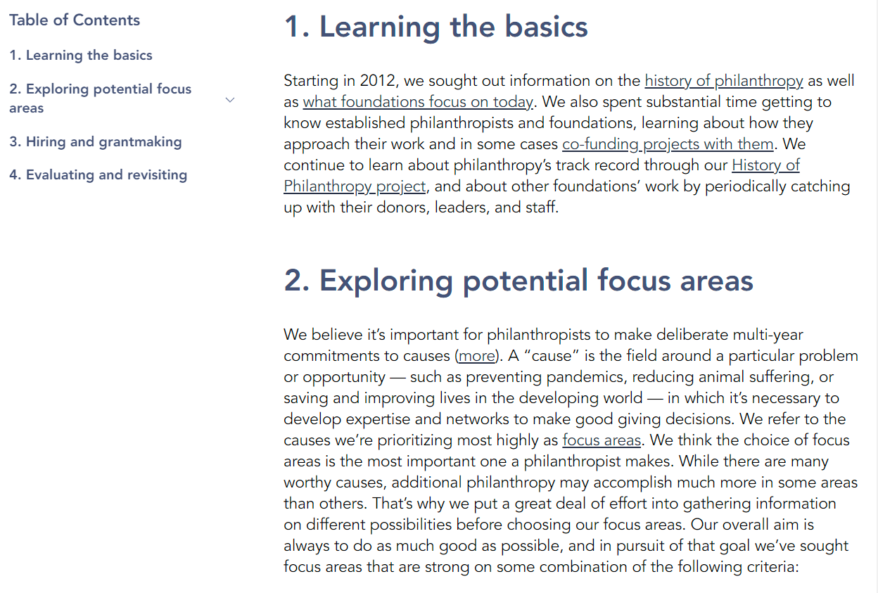
Text spacing is sort of tight
I think the line spacing (maybe kerning too, I'm not sure) results in a dense text that is less friendly. The sans serif, and the minimalist vibe (the logos) adds to this "cooler feel".
Current:
Old:
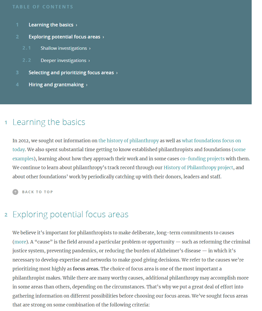
The previous text spacing feels a little warmer and easier on the eyes.
Charles He @ 2022-06-08T02:28 (+6)
Logos not slam dunky
Well, I guess the logos are just not a slam dunk.
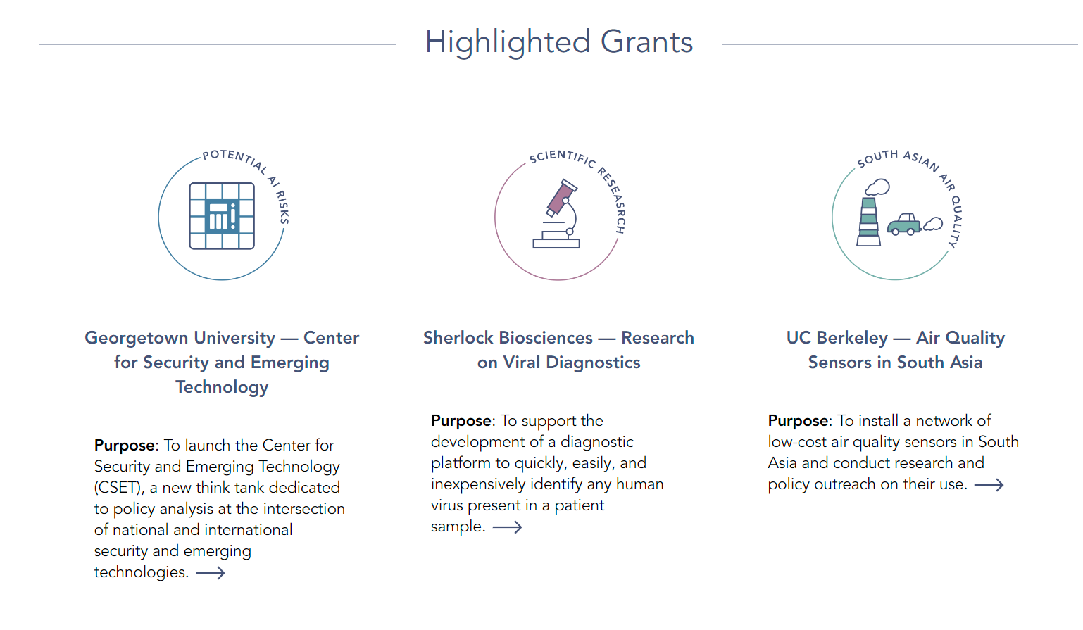
I think logos are probably an approach that might be hard to get right. I would consider a different approach, like maybe carefully designed stock photos?
- For example, it's hard to tell that CSET is a chip. It looks a bit like a minimalist version of Monopoly.
- Air pollution seems a little too cartoonish/cliched (agricultural fires play a big role.)
Charles He @ 2022-06-08T02:30 (+5)
Note that in FAW, there is a lot of space and room taken up by logos.
This is more than just appearances, it sort of gates information flow.
There isn't a lot of information content in these logos. For example, I think many people would like to know about new events and updates in the topics they represent.
It seems harder to discover this content, as having to click through the logo to a new page, is slower.
It feels like it adds unnecessary friction, especially if people are already wading through a lot of text in general.
I could see a lot of fall-off in traffic here.
Maybe some interactivity, with information popping up on hover would be useful?
E.g. you hover on "Cage-free reforms" and get a gentle fade-in pop up:
We believe that cage-free systems have much higher welfare potential than battery cages for layer hens.
Battery cages cause suffering by depriving hens of three of their most basic needs: nests, perches, and enough space to move around.
56 GRANTS MADE $68.5 MILLION GIVEN
Latest grants include: [ description ]
Click to read more
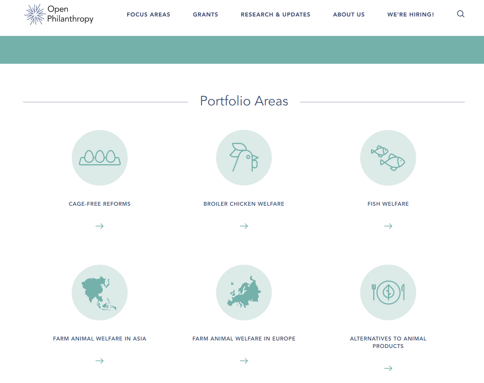
Also, fish welfare's numbers are wrong, these numbers are for all of FAW:

Also, in FAW, around the middle of the page, there is a lot of space because of the extra items in the right column, I would consider moving one or both of this content to the main column.
Peter Wildeford @ 2022-06-09T19:33 (+2)
I found a few bugs:
-
The link to Cash Callaghan's, Adeline Sinclair's, and Harshdeep Singh's bios on https://www.openphilanthropy.org/team/ doesn't work
-
Under "What can I do now to prepare for a role at Open Phil later?" on https://www.openphilanthropy.org/careers/ there is a bullet point that is just "."
-
There's an inexplicable black box on https://www.openphilanthropy.org/about/team/javier-prieto/
Aaron Gertler @ 2022-06-09T22:29 (+2)
Thanks, all resolved!
justaperson @ 2022-06-08T00:31 (+2)
Congrats on the new site! I'm excited to check it out!
I feel compelled to offer feedback on the new mission statement — if only to improve communication and comprehension.
“Our mission is to help others as much as we can with the resources available to us.”
It’s a short and simple sentence, but I believe it would be unclear to many unfamiliar with Open Phil or EA.
The statement doesn’t say what you do to "help" others, which could be interpreted as anything from grants for college to lobbying on healthcare to a smoother commute.
Similarly, “resources” is only contextualized by “available to us.” This doesn't really give the reader any information.
This is probably nitpicky, but “as much as we can” changes the rhythm of the sentence (up and down), and takes up too much space for its purpose.
The impact (or results) of your work is also missing from the statement I.e. “We help X do Y to achieve Z.”
Ideally, you should be able to put your mission statement on your homepage and a new visitor would know exactly what you do and why they should lean in to learn more. I don't think this statement does that.
Here are some ideas:
- "Our mission is to leverage accessible resources to improve the lives of others."
- "We leverage existing resources to improve the lives of others."
- "We deploy available funds and useful resources toward bettering people’s lives."
- "Our mission is to use radical empathy and innovative ideas to better others' lives."
- "We combine data, resources, and empathy to improve the lives of others."
- "We help improve the lives of others through data, resources, and empathy."
- "Our mission is to direct more attention and resources to better others' lives."
These were quick sketches, so I'm not advocating for any one in particular -- and it’s not my intention to take liberties with any of the crucial information in your mission statement. (For example, you may have intentionally put “others” instead of “people” as a way to encompass all living beings.) The samples are more for springboarding ideas that could help you develop and refine the statement a little further.
MichaelDickens @ 2022-06-23T20:37 (+11)
To piggyback on this, "with the resources available to us" is tautologically true. The mission statement would have identical meaning if it was simply "Our mission is to help others as much as we can."
Taking a step back, I don't really like the concept of mission statements in general. I think they almost always communicate close to zero information, and organizations shouldn't have them.