Against a Happiness Ceiling: Replicating Killingsworth & Kahneman (2022)
By Charlie Harrison @ 2024-05-28T16:28 (+171)
Epistemic Status: somewhat confident: I may have made coding mistakes. R code is here in Markdown (with plots), or here in Github if you feel like checking.
Introduction:
In their 2022 article, Matthew Killingsworth and Daniel Kahneman looked to reconcile the results from two of their papers. Kahneman (2010) had reported that above a certain income level ($75,000 USD), extra income had no association with increases in individual happiness. Killingsworth (2021) suggested that it did.
Kahneman and Killingsworth (henceforth KK) claimed they had resolved this conflict. They hypothesized correctly that:
- There is an unhappy minority, whose unhappiness diminishes with rising income up to a threshold, then shows no further progress
- In the happier majority, happiness continues to rise with income even in the high range of incomes
1) refers to Kahnemann’s leveling off finding; 2) refers to Kllingsworth's continued log-linear finding.
(More info on this discussion can be found in Spencer Greenberg’s thoroughly enjoyable blog post. Spencer goes into the correlation/causation debate which I don't go into here.)
Here, I reproduce these findings from KK (2022) using a different dataset – the 2012 Health Survey for England. This dataset is smaller (n= 7,179, rather than 33,391), and uses a different collection technique. The NHS’s wellbeing variable was collated from 14 individual responses to a self-questionnaire, whilst the KK variable uses experience-sampling: i.e. pinging participants at random points in the day. KK regard experience sampling as the gold-standard, and whilst the NHS data had around 100,000 data points on wellbeing, the KK data had over 1.7 million experience-sampling reports.
So, you might be thinking: why bother to replicate the paper with worse NHS data? The first answer is a mixture of convenient access through my uni and personal curiosity.
Though, I also think this analysis had some useful insights for others too. The KK paper looked solely at hedonic wellbeing – asking participants, “how do you feel right now?”. Whereas, the wellbeing scale here (WEMWBS) looks to capture hedonic and eudaimonic aspects, including questions about immediate emotional experience and life satisfaction. (More about the variable is here.[1]) Given this, taken together with other minor differences – e.g. surveys versus experience pings; UK adults, rather than US employees –I felt it would be somewhat surprising if the KK findings replicated on the NHS data.
… And, they did.
Summary of Findings
Overall, I found similar results to Killingsworth and Kahnemann (2022) in 4 notable respects:
- There is a linear relationship between log income and median happiness, although this relationship is small
- For a large proportion of the population (i.e. at p=50, 70, 85), this log-linear relationship continued above a fairly high income threshold (£50,000 in 2012), and:
- For a small minority (p=85) the slope of the log-linear graph increased slightly (although not significantly)
- For a large minority of the population (p = 5, 10, … 35), extra income had no association with increased levels of happiness.
This constitutes a small update towards the KK findings, and thus against the view that there is a ‘happiness ceiling’ which the happiest in society have already reached.
Results
Before going into the results, I want to clarify two terms here:
- Relative Leveling Off: the slope of the happiness against (log) income plot decreases after a certain income threshold.
- Absolute Leveling Off: the slope of the happiness against (log) income plot is indistinguishable from 0 after a certain income threshold.
The 2022 paper uses an income threshold of $100,000. Accounting for historic exchange rates and inflation, I use an income threshold of £50,000. This is roughly equal to $110,000 today. [2]
KK use ‘quantile regression’. This is like OLS, but estimates a certain percentile (not necessarily a quantile) of a response variable rather than the mean.
First, I investigate leveling off at the median, then at various percentiles.
Median Regressions
Figure 1 gives the results from KK (2022), and my results (below). Both estimate median wellbeing in the population, which is standardised.
Figure 1
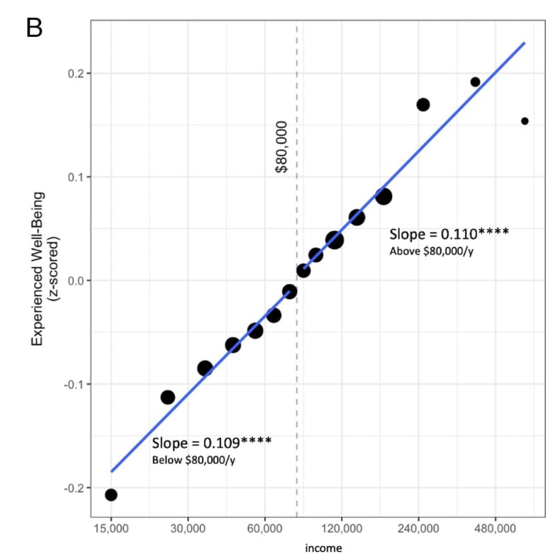
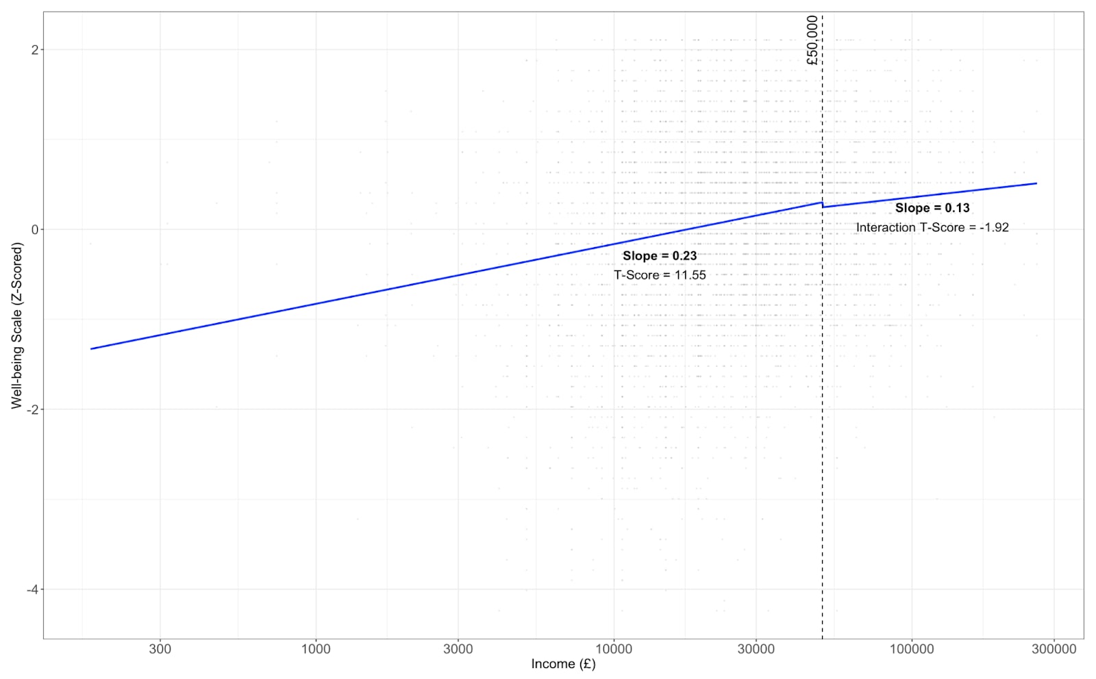
The overall shape I found look fairly similar. Both slopes – before and after £50k – are small. The 2022 paper found that the difference in median happiness for households with income $15,000 and $250,000 was about five points on a 100-point scale. I found a corresponding difference of around 4.85 on a 14–70 point-scale for £15,000 and £250,000.
I found more evidence of relative leveling off after £50,000 – although the slopes are statistically indistinguishable at 5% (p = 0.055). However, the slope above £50,000 was significantly greater than 0 (i.e. no absolute levelling off).
Regressions at Various Percentiles
In Figure 2, above, I give results from Kahnemann and Killingsworth.
They found no relative or absolute leveling off amongst the majority of the population. For the 30th, 50th, and 70th percentile the slopes were statistically indistinguishable before and after the income threshold, and were significantly greater than 0: i.e. their curves look just like the global log-linear curves found above.
The 15th percentile saw absolute and relative leveling off – the slope decreased above £50,000 and was statistically indistinguishable from 0.
Figure 2
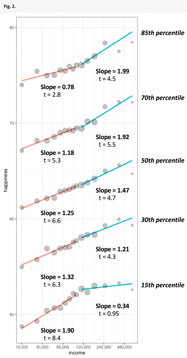
- Note: t-values are given for the slope for individuals with income above the threshold, not for the interaction. This is unclear in the KK graph.
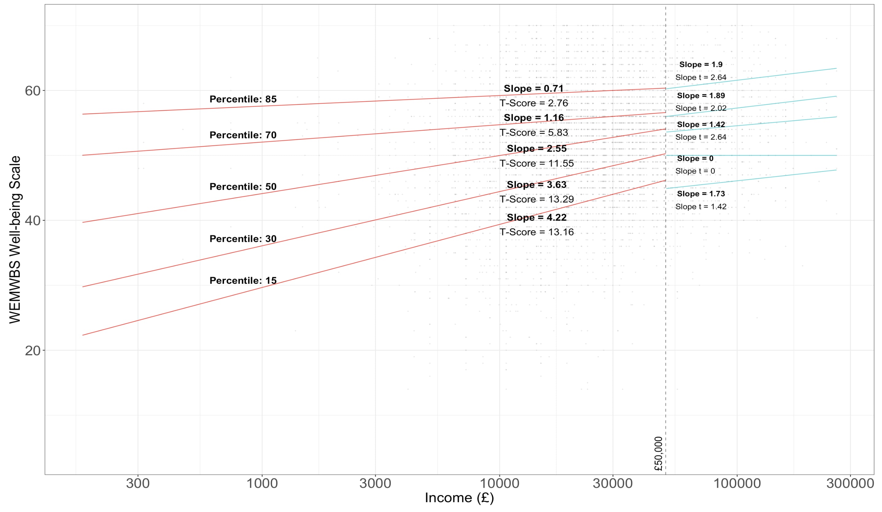
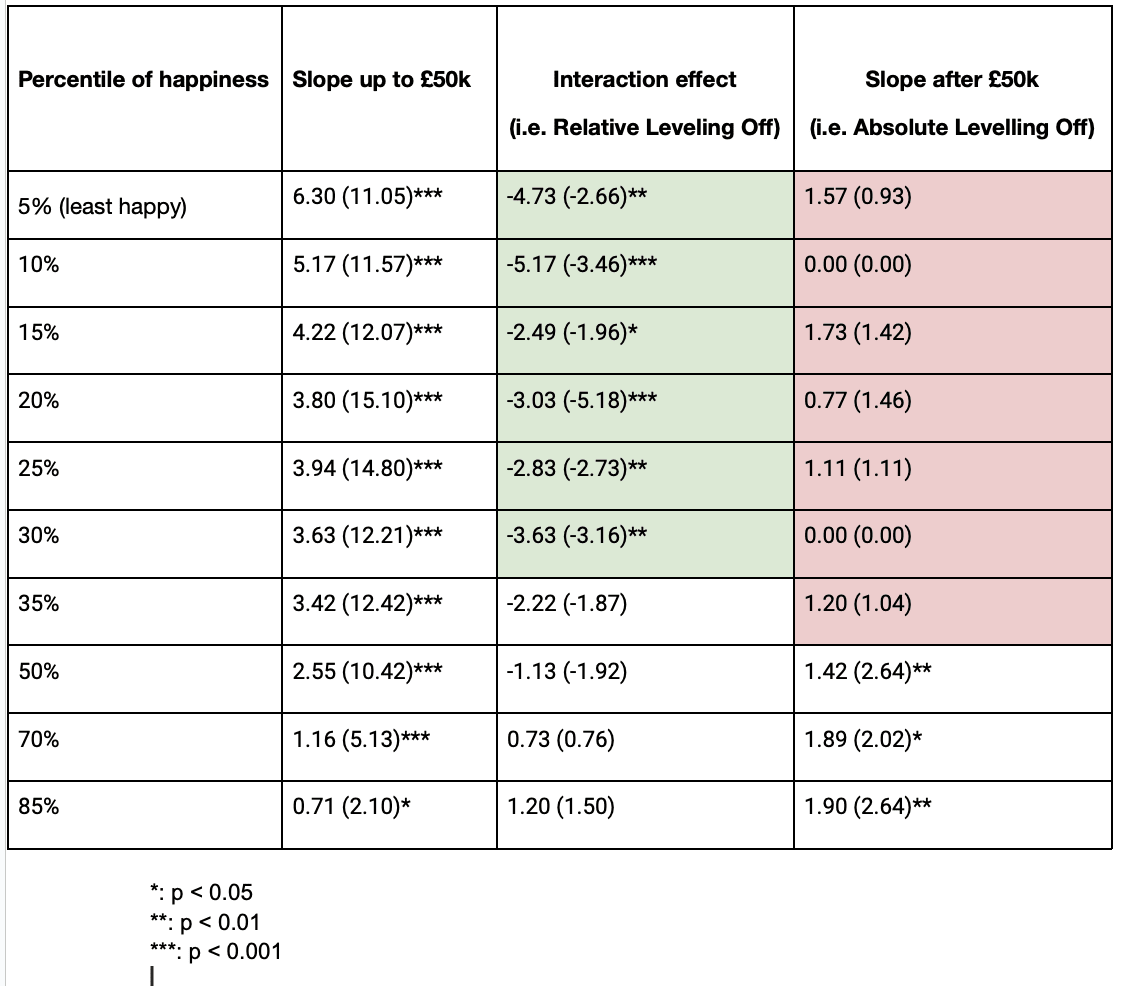
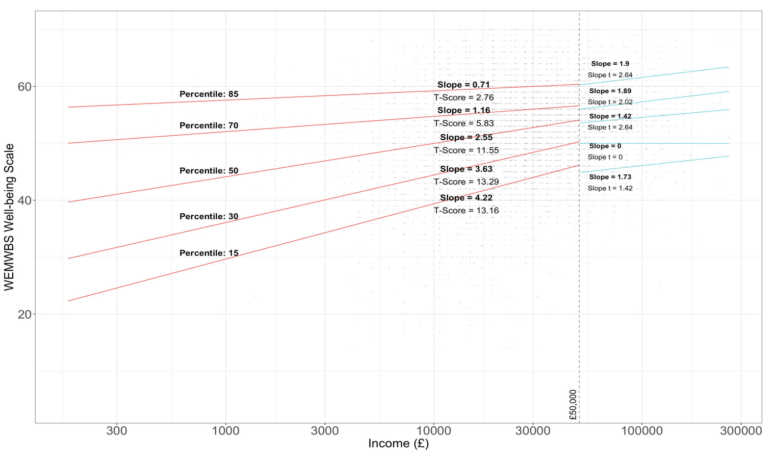
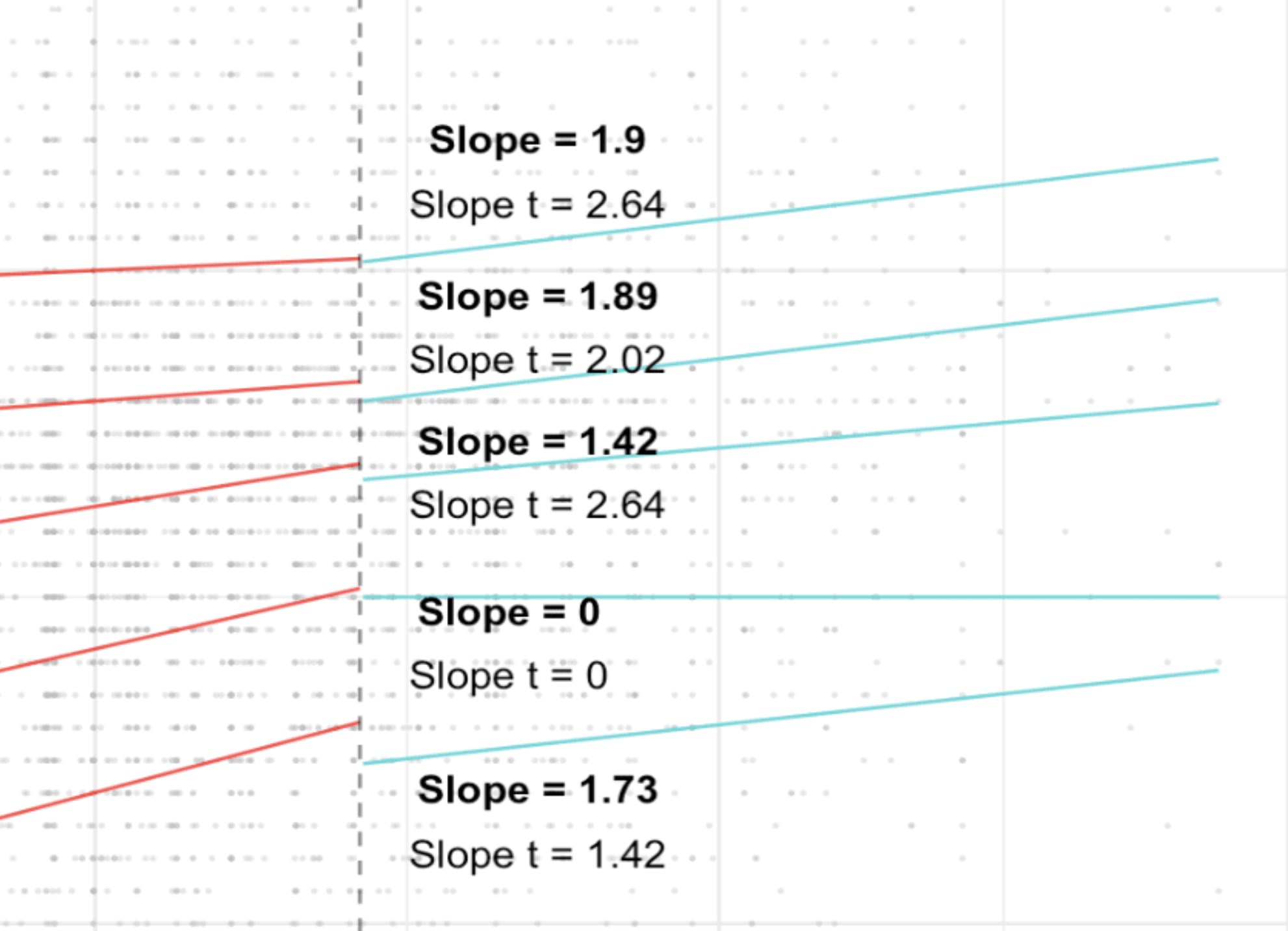
In Figure 2, below, I give my results for the same percentiles. Overall, I found a similar shape to KK – that is, for incomes below £50,000, happier percentiles had lower slopes than less happy percentiles; for incomes above £50,000 happier percentiles generally had higher slopes.
(KK found monotonic increases in the slopes across percentiles above the income threshold; I didn't.)
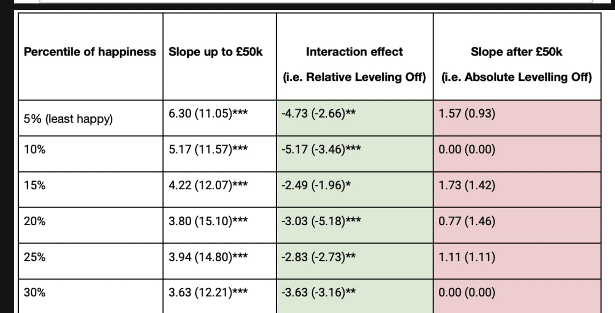
There was evidence of relative levelling off, with significant decreases in slope above £50,000 for the 5th, 10th …, 35th percentiles (see Table 1).
I also found an increase in slope above the income threshold for 85th percentile, approaching significance (p = 0.13). However, this does not mean that the marginal utility of each extra £1 increases, contrary to common economic assumptions, since the x axis is in log units.
There was more evidence of absolute levelling off: none of the slopes for percentiles 5, 10, ..., 35 being significantly positive. In contrast, slopes for the 50th, 70th,and 85th percentiles were positive. This is indicative of a happy majority for which extra money is associated with extra income.
Some of the slopes above £50,000 had 0 slopes and t-values, which seems slightly strange. I suspect this could be an issue with a lack of data – there were only 1332 respondents with income above £50,000.
Implications
To recapitulate, I found similar results to Killingsworth and Kahnemann (2022) in 4 notable respects:
- There is a linear relationship between log income and median happiness, although this relationship is small
- For a large proportion of the population (i.e. at p=50, 70, 85), this log-linear relationship continued above a fairly high income threshold (£50,000 in 2012; >$100,000 today), and:
- For a small minority (p=85) the slope of the log-linear graph increased slightly (although not significantly)
- For a large minority of the population (p = 5, 10, … 35), extra income had no association with increased levels of happiness.
This was notable because the NHS happiness data used a variable which looked to capture eudaimonic and hedonic aspects, and was collected using a different technique in the UK.
So it was somewhat surprising I got similar results. Particularly, since replications in psychology/economics are fairly rare. So, this led me to slightly update towards the Killingsworth and Kahnemann paper’s results.
I think the most interesting implication of the KK paper comes from what we can draw from (3) and (4). As they write,
The acceleration at the 85% percentile and the flattening at the 15th percentile are contrary to the trend that would be expected from floor or ceiling effects (e.g., a ceiling effect would predict a diminishing slope at the high end of the happiness distribution, not an acceleration).
That is, there isn’t a ceiling to happiness which the happiest in society are nearing – continued percentage increases in income from economic growth may lead to higher levels of happiness (from 3). Continued economic growth may also more inequality of happiness, given that for the unhappy minority (like 20-35% of the population), extra income has no effect above a certain level (from 4).
Table 1: Happiness at Different Percentiles (above, KK; below, me)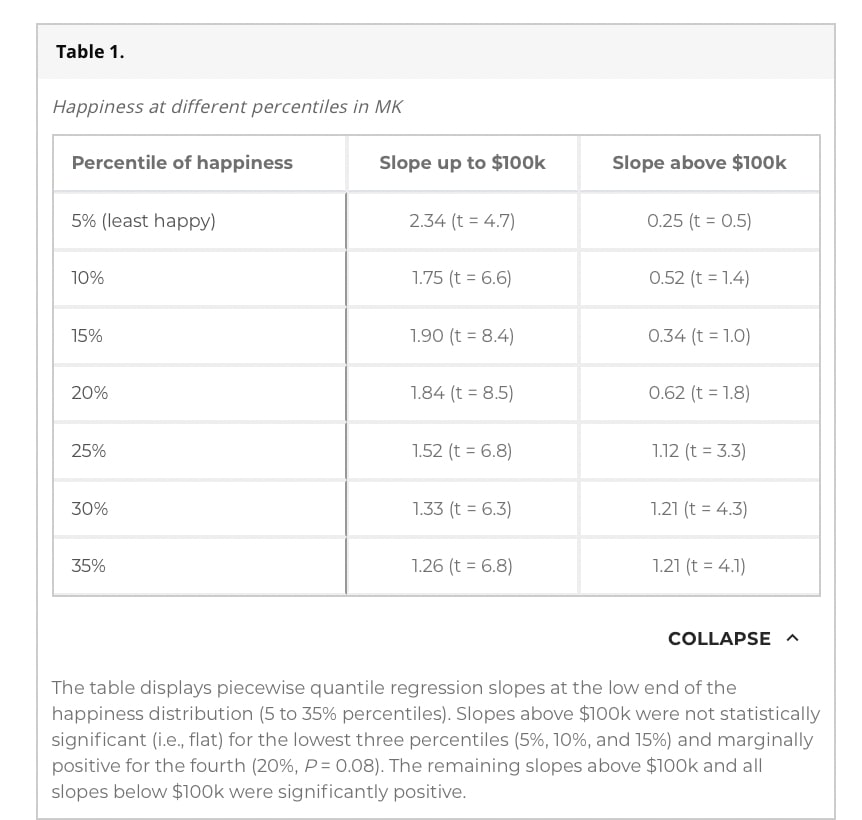
- ^
- ^
Kahneman’s original paper from 2010 uses a threshold of $75,000. Accounting for inflation, in 2012, this was worth $80,264, or around £51k 2012 UK pounds (at historic exchange rates £1 = $0.631 in 2012. Call it £50k for aesthetics.
Larks @ 2024-05-28T23:53 (+19)
Nice work, good job spotting the opportunity to do this replication on an important subject and then, well, actually doing it!
Arepo @ 2024-05-30T02:25 (+5)
Seconding. This is one of my favourite kinds of post on the EA forum (and well done on keeping it relatively short!)
One quibble - why present the R code in a Google doc, rather than on a Github repo?
charlieh943 @ 2024-05-30T10:02 (+3)
Thank you! I haven’t used GitHub much before ... Next time 🫡
charlieh943 @ 2024-05-29T08:17 (+3)
Thanks Larks!
John Salter @ 2024-05-28T19:16 (+7)
Strongly upvoted. Replications are really underrated, and so is sharing your code so people can check your work!
charlieh943 @ 2024-05-28T23:51 (+5)
Thank you John, I appreciate it :)
Ozzie Gooen @ 2024-05-29T19:31 (+6)
Some quick point:
1. Thanks for doing this replication! I find the data pretty interesting.
2. I think my main finding here is that the "giving money to those who are the least happy, conditional on being poor" seems much more effective than giving to those who are more happy. Or, the 15 percentile slopes are far higher than the other slopes, below 50k, and this seems more likely to be statistically significant than other outcomes.
I'm really curious why this is. The effect here seems much larger than I would have imagined. Maybe something is going on like, "These very unhappy poor people had expectations of having more money, so they are both particularly miserable, and money is particularly useful to them."
In theory there could be policy proposals here, but they do seem tricky. A naive one would be, "give money first to the poorest and saddest," but I'm sure you can do better.
3. From quickly looking at these graphs, I'm skeptical of what you can really takeaway after the 50k pound marks. There seems to be a lot of randomness here, and the 50k threshhold seems arbitrary. I'd also flag that it seems weird to me to extend the red lines so far to the left, when there are so few data points at less than ~3k. I'm very paranoid about outliers here.
4. Instead of doing a simple linear interpolation, split into two sections, I think I'd be excited about other statistical processes you could do. Maybe this could be modeled as a guassian process, or estimated using bayesian techniques. (I realize this could be much more work though).
charlieh943 @ 2024-05-30T09:40 (+7)
Hey Ozzie!
1) Thank you!
2) < Or, the 15 percentile slopes are far higher than the other slopes > Agreed, this is probably the most robust finding. I feel pretty uncomfortable about translating this into policy or prescriptions about cash transfers, because this stuff was all correlative; and unearned income might affect happiness differently from earned income.
3) < 50k threshhold seems arbitrary > This is explained in the second footnote. It is worth >$100 USD now, I believe.
< I'd also flag that it seems weird to me to extend the red lines so far to the left, when there are so few data points at less than ~3k > Do you mean from an aesthetic point of view, or a statistical one? The KK (2022) paper uses income groups – and uses the midpoints for the regressions – which is why their lines don't extend back to very low income.
< I'm skeptical of what you can really takeaway after the 50k pound marks. There seems to be a lot of randomness here >
I think this depends on what claim you are making. I think there is pretty strong evidence for relative levelling off – i.e. significant decrease in the slope for lower percentiles. You can look at the Table for t/p values.
[Editted: didn’t phrase this well]. Though, I agree with you that there is less evidence for absolute levelling off (i.e. 0 slopes above 50k). The fact that the slopes for lower percentiles weren't significantly positive might be because of a lack of data. 0 slopes for p=10, 30 seems to corroborate this.
Although, if the problem was a generic lack of observations above £50k, then we wouldn’t see significant positive slopes for the higher percentiles. Perhaps, the specific problem was that there wasnt many unhappy rich people in the sample. I will add something to the summary about this.
I haven't checked for outliers via influence plots or the like.
4) Yeahh, I feel like that would be cool, but would be better to do on the bigger dataset that Killingsworth used. The usefulness here was to use the same methods on different (worse) data.
Ozzie Gooen @ 2024-06-01T13:26 (+2)
Do you mean from an aesthetic point of view, or a statistical one?
At least, from one of showing the plot. I'm more skeptical of the line, the further out it goes, especially to a region with only a few points.
I think this depends on what claim you are making. I think there is pretty strong evidence for relative leveling off – i.e. significant decrease in the slope for lower percentiles. You can look at the Table for t/p values.
This data is the part I was nervous about. I don't see a great indication of "leveling off" in the blue lines. Many have a higher slope than the red lines, and the slope=0 item seems like an anomaly.
charlieh943 @ 2024-06-01T17:10 (+3)
At least, from one of showing the plot. I'm more skeptical of the line, the further out it goes, especially to a region with only a few points.
Fair.
This data is the part I was nervous about. I don't see a great indication of "leveling off" in the blue lines. Many have a higher slope than the red lines, and the slope=0 item seems like an anomaly.
To be clear – there are 2 version of levelling off.
- Absolute levelling off: slopes indistinguishable from 0
- Relative levelling off: slopes which decrease after the income threshold.
And for both 1) and 2), I am referring to the bottom percentiles. This is the unhappy minority which Kahneman and Killingsworth are referring to. So: the fact that slopes are indistinguishable after the income threshold for p=35, 50, 70 is consistent with the KK findings. The fact the slope increased for the 85th percentile is also consistent with the KK findings. Please look at Figure 1 if you want to double check.
I think there is stronger evidence for 2) than for 1).At percentiles p=5, 10, 15, 20, 25, 30 there was a significant decrease in the slope (2): see below. I agree that occurrences of 1) (i.e. insignificant slopes above £50k) may be because of a lack of data.
I also agree with you that the 0 slope is strange. I found this at the 10th and 30th percentiles. I think the problem might be that there wasnt many unhappy rich people in the sample.
VictorW @ 2025-04-15T21:04 (+1)
If we take the premise that income is the single most important factor correlated with happiness, then I think the acceleration effects do seem to imply that there is no happiness ceiling. However, I'm not sure how reasonable this premise is in the first place. I suspect we're zooming in on a well studied effect and if we zoom out a bit, there are many plausible hypotheses for why acceleration effects does not rule out a happiness ceiling, namely that other factors impact the high end of the scale more.
I notice this being muddied in the references to the happiness ceiling. On one hand, the happiness ceiling is only being defined or evaluated in the income sense, and on the other, the conclusions are described as though the income-happiness-ceiling is the only effect and therefore equivalent to all possible models of the happiness ceiling.
A separate question: how does the mathematical relationship relate in practice, e.g. if I have 9/10 happiness, then 10x my income, then am "only" 10/10 happy because I can't exceed 10? I haven't seen this explained before, and I have some concerns about whether it's valid to draw conclusions about this part of the curve without more complicated design. (In other words, I think the extreme end of the scale is an exception and that different study design is required to understand it more objectively.)
Charlie_Guthmann @ 2024-06-11T18:28 (+1)
Great work - tangential and sort of a philosophical complaint about these happiness studies, but I worry that for some % of the people getting pinged about how they feel right now, they do include a bit of the "life satisfaction" in what number they choose. I wonder if others have this same worry? I think the life satisfaction stuff is a pretty poor measurement because I think it largely just turns into a measurement of envy and jealousy.
Charlie Harrison @ 2024-06-19T12:05 (+1)
thanks, Charlie! Seems like a reasonable concern. I feel like a natural response is that hedonic wellbeing is only one factor within life satisfaction. Though, I had a quick look online, and one study suggests they're pretty strongly correlated (r between 0.8 and 0.9) https://www.sciencedirect.com/science/article/abs/pii/S0167487018305087
SummaryBot @ 2024-05-29T13:41 (+1)
Executive summary: Replicating Killingsworth & Kahneman's 2022 findings using UK health survey data, the author finds similar results suggesting no absolute "happiness ceiling" for income, though extra income has diminishing returns for happiness in an unhappy minority.
Key points:
- The author replicates Killingsworth & Kahneman's (KK) 2022 findings using 2012 UK health survey data with a different well-being measure.
- For the median and majority of the population (50th, 70th, 85th percentiles), happiness continues to increase with log income above a high threshold (£50,000 in 2012).
- For an unhappy minority (5th to 35th percentiles), extra income has no association with happiness above the £50,000 threshold.
- The replication is notable given differences in the dataset and provides a small update in favor of KK's findings against a "happiness ceiling".
- The findings suggest continued economic growth may increase happiness for most but also increase happiness inequality.
This comment was auto-generated by the EA Forum Team. Feel free to point out issues with this summary by replying to the comment, and contact us if you have feedback.