Forum feature updates: add buttons, see your stats, send DMs easier, and more (March '24)
By Toby Tremlett🔹 @ 2024-03-01T12:09 (+41)
It’s been a while since our last feature update in October. Since then, the Forum team has done a lot. This post includes:
New tools for authors
- See all your stats on one page
- Add buttons to posts
- Improved tables for posts
Improved notifications, messaging and onboarding
- More comprehensive and interactive notifications
- Subscribe to a user’s comments
- Improved onboarding for new users:
- Redesign of Forum messaging
Other updates and projects
- Job recommendations
- Making it easier to fork our codebase and set up new forums
- Giving Season
- A Giving portal
- A custom voting tool for the Donation Election
- An interactive banner
- Forum Wrapped 2023
- Miscellaneous
- You can now hide community quick takes
- Clearer previews of posts, topics, and sequences
- A new opportunities tab on the Frontpage
New tools for authors
See all your stats on one page
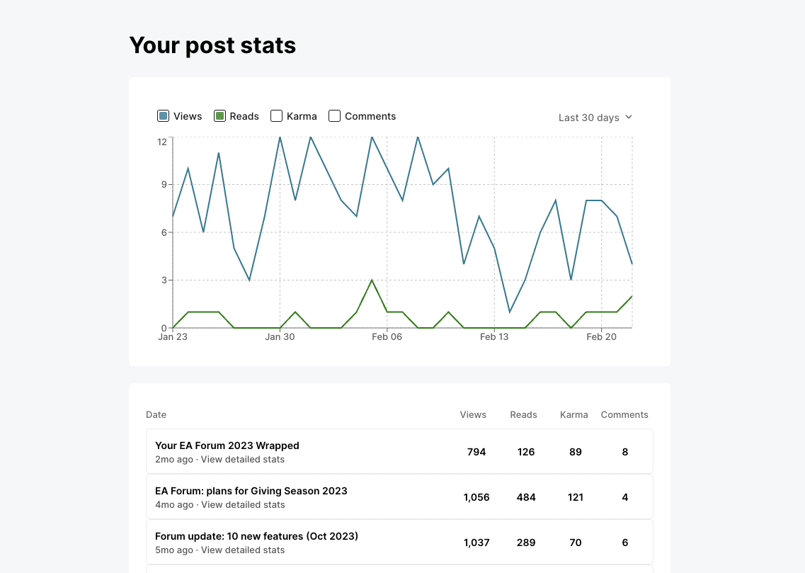
We’ve built a page which collects the stats for your posts into one overview. These stats include: how many people have viewed/read your posts, how much karma they’ve accrued, and the number of comments. You can access analytics for a particular post by clicking ‘View detailed stats’ from your post stats page.
Add buttons to posts
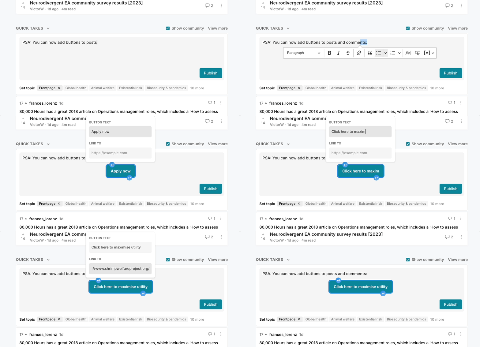
If you have a “call to action” in a post or comment, you can now add it as a button. Your button could be a link to an application, a survey, a calendar, or any other link you’d like to stand out.
Improved tables for posts
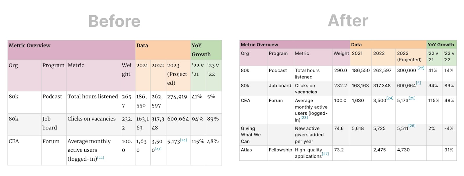
We’ve improved tables to make them much more readable and less prone to awkward word cut-offs such as “Wei
ght”
Improved notifications, messaging and onboarding
More comprehensive and interactive notifications
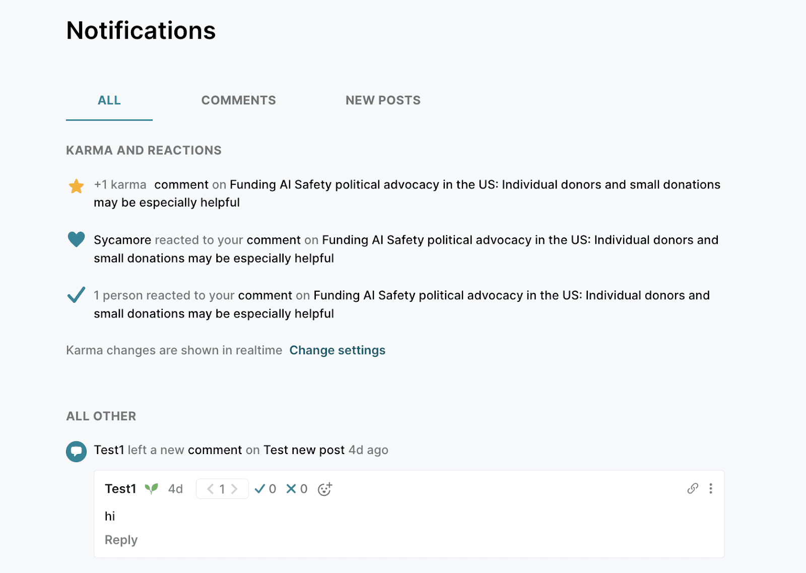
Notifications now have their own page, accessed by clicking the bell icon:
On this page, you can directly reply to comments.
We have also:
- Created notifications for Reactions
- Moved message notifications from the notifications list to this symbol
in the top bar.
- Made a notifications summary showing on hover so that you can check your notifications before clicking the bell to clear them (pictured below)
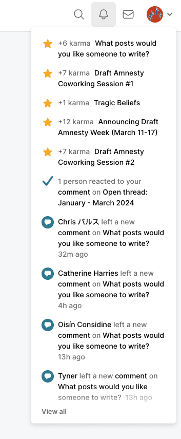
We aim to make notifications informative without making them addictive or incentivising behaviour you don’t endorse. If notifications bother you, you can:
- Change your settings to batch your notifications differently (or not be notified at all).
- Give us feedback.
Subscribe to a user’s comments
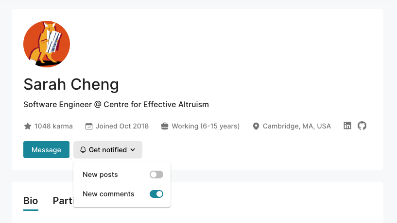
You can now subscribe to be notified every time a user comments. We’ve also clarified subscriptions' functionality, with a new “Get notified” menu.
Improved onboarding for new users
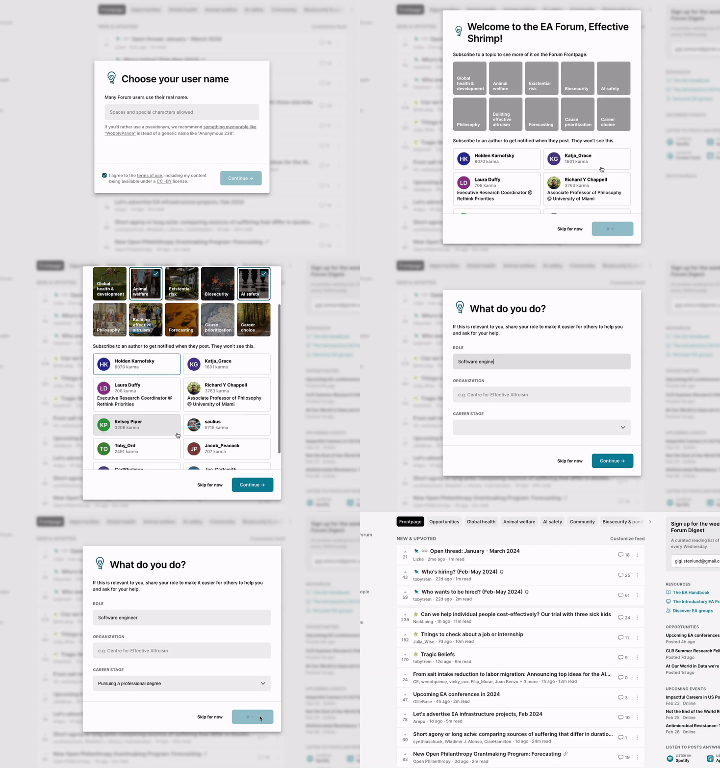
We’ve changed the process a user goes through when signing up for a Forum account.
This has already increased the number of users giving information about their role, signing up for the Digest, and subscribing to topics.
The new process looks like this:
Redesign of Forum messaging
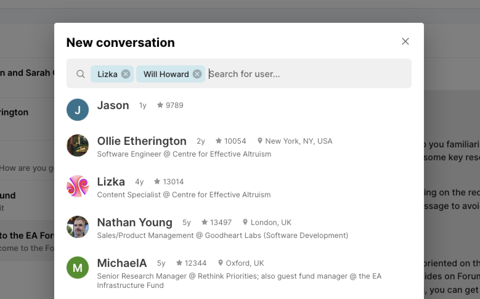
The DM page has undergone a total redesign, making it easier to start individual and group messages and navigate your message history.
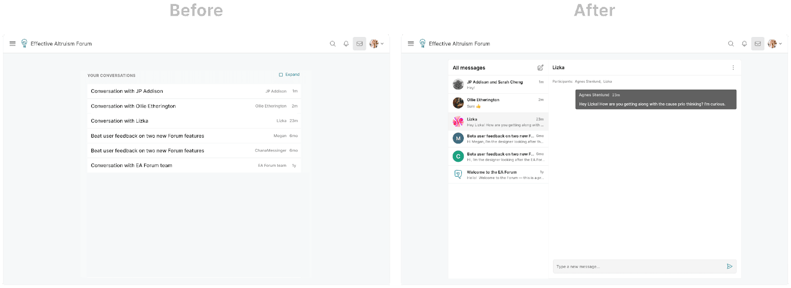
You can now create a new message by clicking the new conversation symbol (
Other updates and projects
Job recommendations
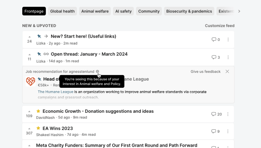
You may have noticed that we’ve recently been exploring ways we could help Forum users hire and be hired. As part of this project, we’re experimenting more with targeted job recommendations.
We’re selecting high-impact jobs and showing each job to a small set of users that we have reason to believe may be interested in it. For example, if the job is limited to a specific country, we use your account location to help determine if it’s relevant to you.
We’ll continue to iterate on this experiment (and are always looking for feedback).
Making it easier to fork our codebase and set up new forums
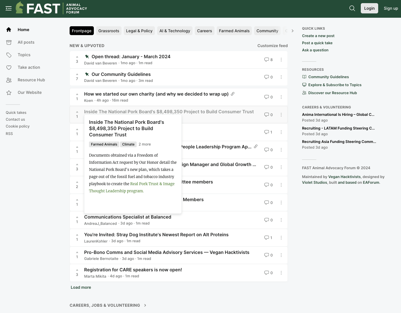
We recently helped an EA-adjacent company attempt to build a community forum based on the code we share with LessWrong. In the process, we made our codebase easier to fork so that people could more easily create new forums based on our code.
FAST recently created the Animal Advocacy Forum based on our codebase. If you’re interested in doing the same, feel free to contact us with any questions.
Giving Season
Giving season was a busy time for the whole team. Over the month, we shipped:
A Giving portal
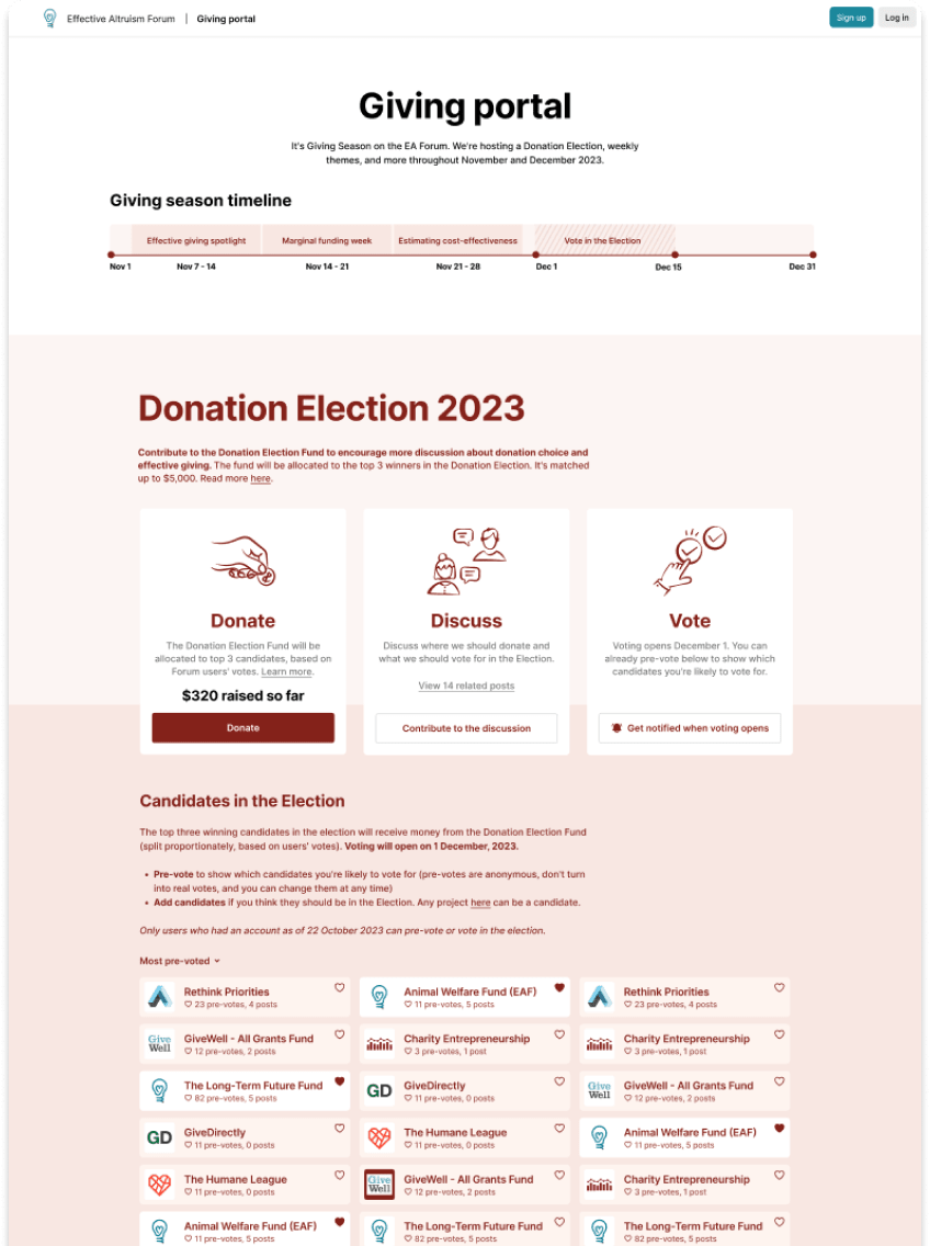
This page contained a timeline for Giving season events and information about the Donation Election. It collected relevant posts and allowed users to donate and pre-vote for candidates in the Donation Election.
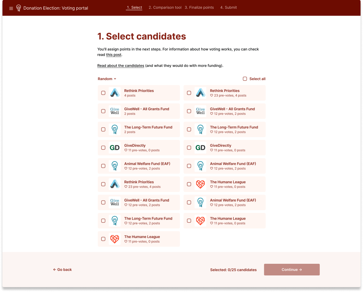
A custom voting tool for the Donation Election
The voting tool (more details here) was used by 341 people to vote on allocating the $34,856 donated to the Donation Election Fund.
An interactive banner
It was heart-warming to see so many people being public about their donations! (sorry)
We might find more use for interactive banners like this in the future (let me know if you have ideas!)

Forum Wrapped 2023
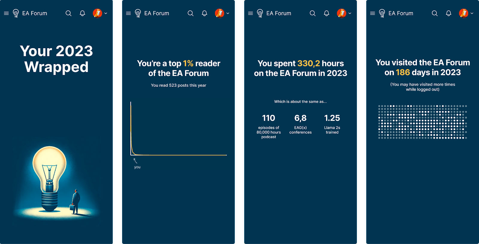
We released this year’s Forum wrapped on December 30th. The page summarises users’ Forum activity over the year, telling them who their most-read authors were, how long they spent on the Forum, and more.
The day after it was released, 1363 users visited the page. If you haven’t seen it yet, it’s still available here.
Miscellaneous
You can now hide community quick takes

Clearer previews of posts, topics, and sequences
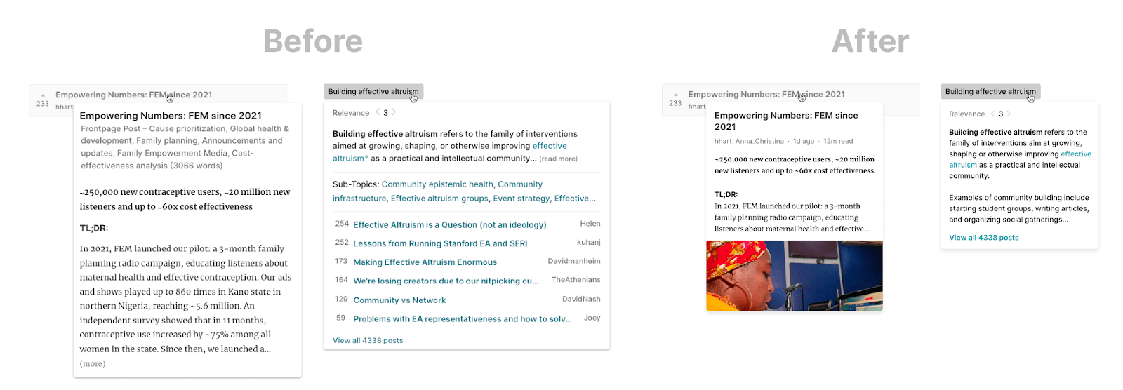
When you hover over a post, topic or sequence title, you get a sneak peek of what it contains. This feature was a bit slow, big and messy, so we redesigned it to be more concise, contain images, and show more relevant info.
A new opportunities tab on the Frontpage
This gives Forum readers a shorter route to take in order to see opportunities posted recently on the Forum.

(We might remove this later, depending on usage.)
Share your feedback
Let me know if you have feedback or questions about these changes. You can comment on this post or reach out to us another way. You can also share feature requests in the feature suggestion thread.
Thank you to everyone who gave input on these features, to the Forum team, and to all of you who use the Forum!

