Forum feature update: reactions, improved search, updated post pages and more (July 2023)
By Sharang Phadke @ 2023-07-19T22:34 (+79)
We’ve introduced a number of new features in the last two months based on two high level goals of improving discussion dynamics and helping users find and engage with high quality content relevant to their interests. Highlights include:
- Reactions on comments
- Improved search and the ability to sort search results
- A page to find posts you’ve saved, read, and voted on
- A feature that nudges post authors to consider running criticism past the people being criticized
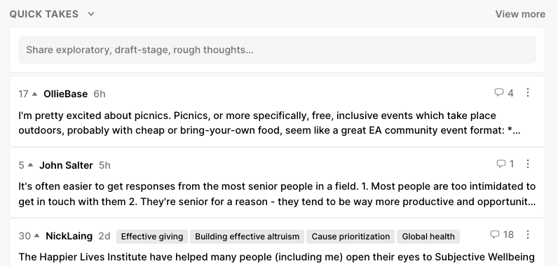
- The “quick takes” section on the Frontpage
- And more!
Reactions on comments
We’re launching a set of icon reactions with the goals of giving users a richer way to participate in discussions and an easier way to give positive feedback. We outlined our goals for this feature in detail here, and appreciate everyone who gave feedback on our design questions. We decided to launch a trimmed down set of reactions at the comment level and merge the experience with agree/disagree voting. For now this will only be applied to new posts, but we may update old posts to use the new reactions voting system in the future. Here’s what the new experience looks like:
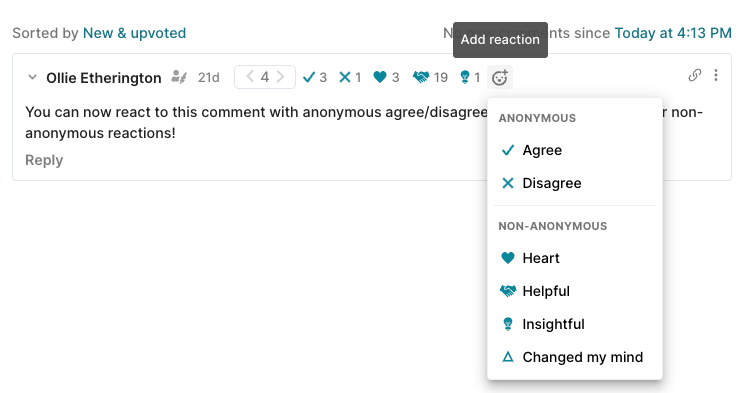
- You can no longer strong agree or disagree.
- Agree/disagree reactions (and regular upvoting/downvoting) continue to be anonymous, while other reactions will be non-anonymous.
- We’re starting out with this feature at the comment level, and plan to consider expanding it to the post level after we see how it goes. (We may also roll back reactions depending on how this test goes.)
Better tools for finding that post you’ve been looking for
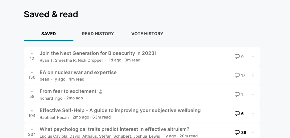
See your saved posts, read history, and vote history
We’ve updated the saved & read page (formerly known as bookmarks) to show your saved posts, read history, and your vote history.
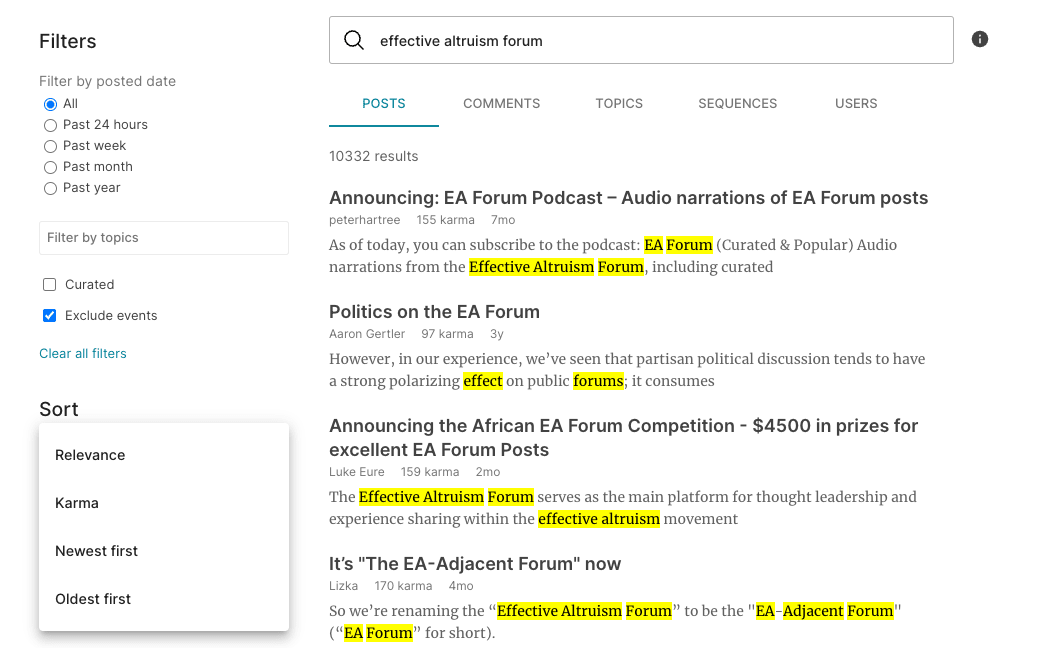
Updated search, including sorting options
We’ve updated the search functionality to include the ability to sort by relevance, karma, and date. We also changed the entire backend infrastructure that powers search, so please let us know if you see surprising results!
Nudging users to share criticism
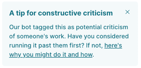
We’ve developed the opinion that criticism is often more productive when shared with the people being criticized before it is published, and that some people who publish criticism would have run it past people if they’d thought of it. We were worried that heavy-handed interventions might deter useful critical writing, so have implemented small nudge on the draft page; a “tip” about this that appears on drafts of criticism and shares a link that might be useful. This is powered by a model that identifies posts as “criticism.”
Updates to post pages
We’ve made a number of changes to post pages, and are still experimenting.
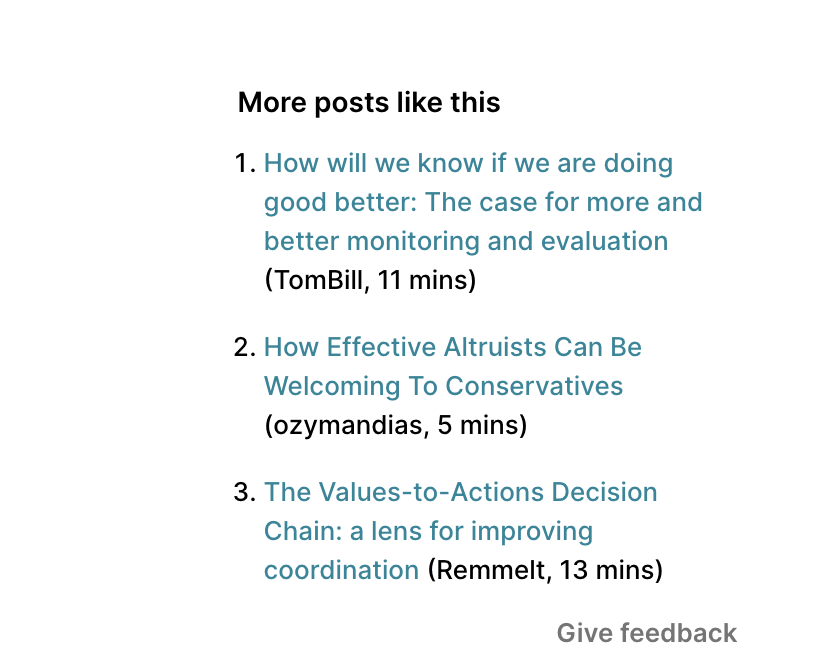
Recommendations on posts
As mentioned here, we’re experimenting with better ways to help readers find high quality posts relevant to their interests. Authors often tell us they feel disappointed when their posts get visibility for just a few days on the Frontpage and then drop off into oblivion, after tens or hundreds of hours of work. We’ve been experimenting with recommendations on post pages first, and may also consider personalized recommendations on the Frontpage. Our first experiments with recommendations at the bottom of post pages were promising, but we realized most users don’t get to the bottom of pages, and are experimenting with showing them on the right side of post pages. We plan to monitor both user feedback and click rates to decide how to proceed.
Updated post header
We updated the headers of post pages to create more space for post titles and separate information and icons from post tags, and add a more familiar way to share posts.
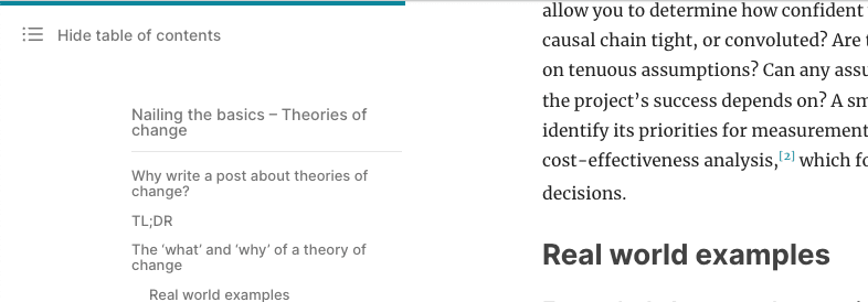
Reading completion bar and table of contents
We’ve added a teal reading completion bar at the top of post pages that tracks your progress along the length of the post body (but not comments), and made it possible to hide the table of contents. The text column is also now centered on the page (similar to most news and blog sites) instead of being shifted to the right.
New Frontpage sections
We’re experimenting with a few different sections on the Frontpage, and have some bigger experiments coming soon. We’ve rolled out the quick takes section (formerly known as shortform) to all users. See more in our announcement here.
We’re also experimenting with a section that highlights popular comments, which are currently hard to find without clicking into most popular posts. We’re rolling this out to beta users first to collect feedback[1]
Other updates
- We streamlined the top navigation bar to take up less space, particularly on mobile, and cleaned up the navigation dropdown behind the user icon.
- You can now explicitly set the social preview text for your post (this is the text that shows up when you share a post on social media).
- Coming soon
- We’re experimenting with a new sidebar for the Frontpage which will show users particularly useful resources and types of posts (opportunities, events near them, unread saved posts).
- We’re working on an improved stats dashboard for authors to help them track the impact of the hard work they put into their posts much better than our current post analytics page.
- We’re planning to conduct a light impact evaluation and a supporting user survey to help ground our understanding of the Forum’s impact.
Your feedback is welcome
As always, we welcome feedback on all of these changes - you can comment here or contact us another way. Thanks for your continued support!
- ^
Did you know anyone can sign up to be a beta user by going to account settings > site customizations and checking the box for “Opt into experimental features”?
Rockwell @ 2023-07-20T13:48 (+15)
These are great updates, thank you for all your work on them! I'm especially excited about being able to search for posts by chronology. Two notes:
1. I would like to be able to search for a phrase, rather than just one word, using quotation marks like you can on Google. E.g. When I search "united nations" and look by time posted, I get a number of results with just the word "nations" and for "New York City" I get results for "new" and "city." Being able to search with quotation marks around the full phrase would be very useful.
2. If you do add personalized recommendations to the front page, please only make it a small part of the page and very clear that it is user-specific. I like that I know what other users are generally seeing when they come to the Forum and I'm annoyed by e.g. news sites that show me overly catered results.
We’ve been experimenting with recommendations on post pages first, and may also consider personalized recommendations on the Frontpage.
Sharang Phadke @ 2023-07-21T22:26 (+1)
Hey Rocky, thanks for these thoughts
- Searching with quotations is actually supported, and it does give you the desired behavior. The issue is that the snippets of text from posts that we're highlighting are not properly focusing in on the search term. We're planning to fix this soon.
- Thanks for this feedback, we'll keep that in mind. We definitely won't overshadow the main common-to-everyone components of the frontpage.
Nathan Young @ 2023-07-20T16:14 (+9)
Feels like the forum is adding a lot of features recently good work team and good work Lightcone.
I really appreciate that the forums shows me more of what the best version of me would want rather than maximising engagement.
Can we have emoji reactions to individual paragraphs?
Yonatan Cale @ 2023-07-27T13:57 (+4)
I have a crazy opinion that everyone's invited to disagree with: Often long comments on the EA forum would better be split up into a few smaller comments, so that others could reply separately, agree/disagree separately, or (as you point out) emoji-react to separately.
This is a forum culture thing, right now it would be weird to respond with many small comments, but it would be better to make it not-weird
What do you think?
Nathan Young @ 2023-07-30T14:08 (+2)
I strongly agree, but people don't really like this. There are, I sense two modes of thinking about comments:
- There to start discussion
- There to find concensus
Long/interesting comments are good for the former. Short, clear comments are good for the latter.
Sharang Phadke @ 2023-07-21T21:59 (+2)
Thanks Nathan! Do you happen to have an example of another site that does paragraph-level reactions well? The main question that pops to mind is is clutter vs value
SiebeRozendal @ 2023-07-21T17:16 (+5)
Nice to see the forum keeps being innovated.
I would really like to see agree/disagree votes on posts! I think they've added a lot to the comment section, and will be similarly meaningful to posts (even though many posts are complex and make multiple claims).
I also wouldn't view a "confused (?)" react as negative, and as comment writer would actually find it very useful to know when I should edit a comment to clarify!
Sharang Phadke @ 2023-07-21T21:57 (+5)
Hi there, thanks for expressing your interest in post votes. I am pretty excited about trying them out on posts after lots of people gave us good reasons for this in our last feedback post. A major reason we started with the comment level was that turned out to be technically much easier, and we thought we'd be able to learn and iterate faster before considering the post level.
Yonatan Cale @ 2023-07-25T17:15 (+2)
- I'm really excited about the emojis! I think this has potential to push the forum further towards "a social network but done well, optimizing for high quality discussions". I thought the agree/disagree was a great idea and I'm happy you're continuing exploring similar directions
- Regarding writing the post itself: Consider maybe adding descriptions for the screen shots, especially for people listening to the nonlinear-library (text-to-speech) version of the post (as I did originally, and then I came here to see the specific emojis)
